


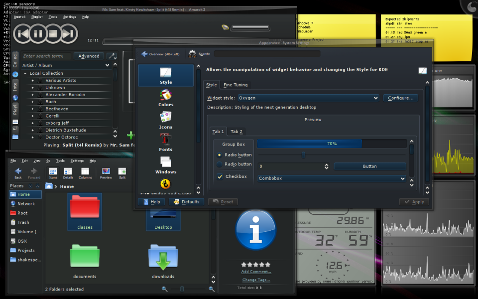
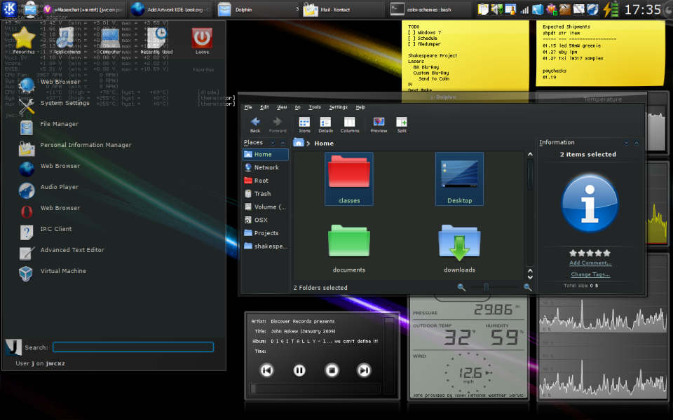
It began as a mixture of various light-on-dark color scheme from KDE-Look. I discovered that these themes make text much more readable. Slowly, I've customized the scheme to my own (perhaps poor!) taste. It's still very much a work in progress, and will likely continue to be so until I stop using KDE (which is likely a long time from now
 ).
).The theme is primarily grayish, but active objects have a hint of blue. Highlighted objects are a stronger blue color and hovered objects have bright blue borders. I use the theme on the highest contrast settings, but saner people might want to keep the contrast lower.


Ratings & Comments
3 Comments
I absolutely love this color theme :-) So either you have a good eye for color, or we share the same kind of poor taste ;-)
Very nice. I like it.
Thanks very much! Glad you like it. :)