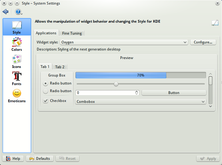
Description: Understated is a soft colorscheme that targets readability without punishing your eyes with contrast. Colors are entirely picked from the Oxygen color palette. Additionally, this looks and works best with the default window and widget styles.
Recommended Changes - Enable Apply inactive window color effects from the Options tab - Disable Inactive selection changes color from the Options tab - Set shading contrast to 2 or 3 from the Options tabLast changelog:
6.1.0: Updated for alternate text and selection styles 6.2.0: New palette for pretty much everything
...this is far from optimal the way it is
now.... however, I believe the kde team
has some more serious bugs to handle before
they consider this... it's good we now
have this graphically pointed out as a
flaw tho :)


Ratings & Comments
7 Comments
9 +
...this is far from optimal the way it is now.... however, I believe the kde team has some more serious bugs to handle before they consider this... it's good we now have this graphically pointed out as a flaw tho :)
mmmmkay, great, wrong contents.... ...nope, not drunk, just... ....lost :D
now i'm curious what you were talking about!
Much easier on the eye than the low contrast glare that is the std colour scheme.
Thanks, now if only Kate/Kwrite supported easily exportable/importable color profiles.
I'm pretty sure you can import and export schemas (color schemes) from Configure -> Editor -> Fonts and Colors.