


Understated
kaotikzen


Source (link to git-repo or to original if based on someone elses unmodified work):
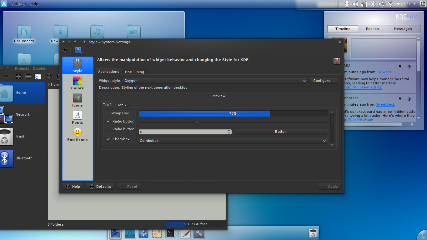
2.0: Colors
2.1: Realized the blue I chose was nothing short of obnoxious, and painful on the eyes after more than a few minutes of use. Trying a new blue.
3.0.0: Bug fixes. Better contrast palette.
3.9.0: Revisiting darker colors. Throwback to v2 
4.0.0: Rewrite of theme for fresher feel using better contrast
4.0.1: Cleaned up alternate backgrounds to be less eye-burning
4.1.0: Changed tooltip colors to stand out more from windows
5.0.0: New lightbodied view areas


Ratings & Comments
4 Comments
Do you happen to still have a copy of 2.0 (or 2.1)? I lost it today, and kind of prefer it over 3.0
Unfortunately not really. I'm redoing the entire theme currently, and it'll be much more akin to 2.
I've uploaded what I've been testing with a few of my friends. I'm still hunting down the right palette for view text options. Hope you enjoy it.
Finally, a dark color scheme that suits me. I've tried doing my own but could never get it just right, and the many I've downloaded never quite did it, so thank you.