* Brighter things are more noticeable than darker things
* More saturated things are more noticeable than less saturated things at the same luminosity
* Primary and Secondary colours in the center of vision should not differ by more than a ratio of 3:1
* Colours present in non-peripheral sight should be no different than a ratio of 1:10 (hence the mid-grey theme; people in bright environments should lighten this theme, and people in pitch black locations should darken this theme)
* Green is seen more or less equally across the eye, while other colours tend to become desaturated in the peripherals
* Blue is ineffective as a foreground colour
* Red-Orange on Cyan-Blue improves reading retention
* Modern monitors are generally a colour temperature of 6500K (this theme was made 1' cooler in hue because of this)
Sources:
* http://www.sangrea.net/ohs_dbase/colour-color.htm
* http://www.fast-consulting.com/color/cp_toc.htm
In version 3, I remade it from sratch, tempering these ideas with the following:
* Cones in the eyes become tired seeing one particular color over a prolonged time, so it's possible the green tinting of previous versions could make green colors on your computer appear less vivid simply because your eyes' green cones would be tired.
* Maximise the contrast within that 3:1 limit, with no control leaving it
* Start with selection text, making the background 50% grey and text 100% white
It may not be perfect yet (and probably isn't), so I will update it every so often if I make changes to it.
Feel free to derive from this; it's released under the Creative Commons Attribution Share-Alike license, as noted below.
Enjoy!
Notes:
* I would also suggest using a medium-dark Plasma theme
* I would also suggest changing your window glow-colour if you are using Oxygen. Active glow: #BFBFBF | Inactive glow: #545454
* As with all dark themes, some non-darkly themed websites (e.g. Facebook, among others) may end up with a light font on a light background. I suggest either theming Firefox and then using a different gtk2 theme, or using the Firefox plugin "Stylish" (also available for Chrome and Opera) to theme the webpages themselves.
* The following file will fix the above problem in Firefox, if saved as "~/.mozilla/firefox/profile.default/chrome/userContent.css" (note that "profile.default" will probably not be the name of your current Firefox profile): http://pastebin.com/iYGXgucB








Ratings & Comments
25 Comments
It would be super if you made it as an 'Gnome/GTK Application style' package to so we could get a full unified look . I am thinking of this in plasma settings unter 'application style'
10 10 the best Thank You Very Much for your work.
10 Colors are enjoyable and do reduce eye strain
Hey ther @Sweyn78, thanks for the great job. 2 questions: Is the KDE Color Scheme part of the OpenDesktop specification? Is there a tool you use to comprehensively edit colors? In my case I made a personal Color Scheme starting at yours (just a little change on Focus and Hover Decoration), but I had to spend around half hour on trial/error search to get to the Focus and Hover variables. Is ther an easier way to do that? Like a tool with a clickable area to change the variable that corresponds to that area? Thanks in advance,
sorry about the there(s) misspellings
9 I would gladly give a ten but wanted to be honest. I need a little more contrast on the selected radio button or check box. But appart from that the greatest color scheme ever, way better than breeze dark or highcontrast
9 +
Can you please post your Qtcurve config?
Sure, I'd love to! I'll reply again when it's up. :)
I too appreciate your efforts, but I still need a few points to be clarified: 1. On Qt-only (i.e. non-KDE) apps (note takers, LoNote and zNotes) texts inside the text field are still black. Text colours need to be configured individually in such apps I gather? 2. Though I'm not a developer or something I occasionally need to edit or read some config files in Kate and its syntax highlighting helps, but your theme makes those highlighted (coloured) parts hard to read. To alleviate this Kate too should be configured accordingly? 3. LibreOffice (Writer) became ugly outside of the text field (decorations, toolbars, conf. dialogues etc) and the text field itself isn't effected by your theme. 4. Text field of Calligra (Words) isn't effected by your theme either. It's still black on white. 5. Cantata (an MPD client compiled with KDE support) gets your theme in its main window, but not in its play-que panel (still black on white). This may be an issue for that app though? 6. It's not possible, I guess, to get grey (Optimal) web page backgrounds either in Firefow or Rekonq? 7. Could you please tell where to find and change these options: "I would also suggest changing your window glow-colour. Active Windows | Inner Colour: #D1DFD1 | Outer Colour: #777F77 || Inactive Windows | Inner Colour: #767C7F | Outer Colour: #3B3F3B" Thanks for the fine gift.
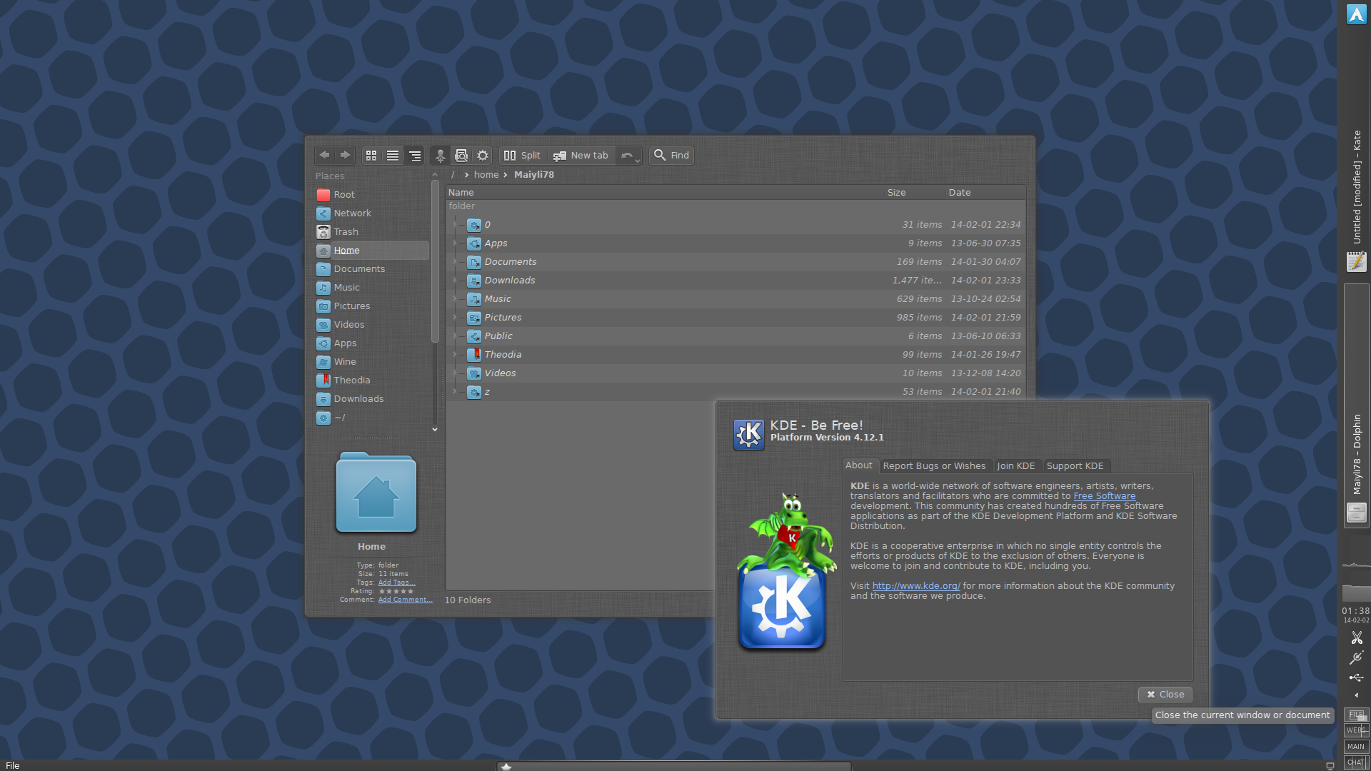
I'm afraid a lot of these problems you mention are due to the limitations of KDE and the limitations of dark themes. Most apps are made for light themes, and you may indeed need to configure each one individually in order to get them to look perfectly. Non-KDE apps sometimes don't get the right colors, which is a pain, but usually fixable. Kate is just fine for me, but I believe I configured it some time ago, which would explain why. I don't remember it being a huge task; I didn't have to go and change the highlighting for each language, but rather just a few general values. The black-on-white textfields on apps that should receive proper coloring from your currenct KDE colorscheme are probably bugs. They have not been fixed yet most likely because the majority of people using them probably use light themes (and therefore aren't aware of the issue and able to report it). As far as grey backgrounds for pages in web browsers, I can only refer you to Stylish. Find some good themes. I have most sites that I frequent quite similar to Optimal. Generally, and mid-dark theme will do just fine. ModernWiki-Night is a great one for Wikipedia. I can't think of the others I use off the top of my head, but you should have no trouble finding them if you're willing to search through Userstyle's themes long enough. I'll probably get around to posting links to the ones I use on here eventually. And to answer your final question, you change those options in the settings menu for whatever your window decorator is. If you don't know what yours is, it's Oxygen. In System Settings, click on Workspace Appearence and then configure decoration. A window will appear. For Oxygen, it's probably the second tab from the right in this new window. Just plug the values in and your window glows will be properly themed. :) Anyway, I'm glad you like Optimal. I'm going to try and get the other parts of my desktop available for download, too (like my QtCurve theme, as seen in the first screenshot here). Let me know if there's anything else you need. :)
Thanks a lot for the detailed clarification. And posting your desktop conf. etc., as you said, would help, though configuring individual apps would not be much of a trouble (maybe except for LibreOffice). Sorry for the silly question about the window decoration; have forgotten its place among the zillion other options of KDE (I'm a rather –potentially– new KDE convert).
Well, LibreOffice issu stems from the lack of LibreOffice-KDE package failed to be installed by Muon previously. Sorry for the unintentional misrepresentation on that one.
Thank you for taking the time to do the research. Whether or not this color scheme is pretty is purely subjective, but either way -- it really is easy on the eyes.
I'm glad it's working for you! :) I've updated it to be more aesthetic, so you may want to take a look at the new version.
Great work, thanks.
Quote:* I would also suggest changing your window glow-colour
Any particular colors you'd recommend?
For Active Windows: Inner Colour: #40AB40 Outer Colour: #489348
Thanks. I had just been using the default glow colors with the green and blue values swapped. This is a bit darker and less blue. I also ended up inverting the value on the view text. I wanted dark text, but I'm not sure how that particular choice worked, especially when I applied it to the selected text.
Thank you all for your kind words! I'm glad you're all enjoying it! :)
Seems nice, thank you! :)
Good work, and good rationale behind it. Keep it up!
This is scientifically-designed-relaxation-for-my-tired-eyes. Thanks a lot
Hi, thank you very much for this theme, love it! Out of curiosity, which plasma theme are you using? I'm trying aya now, but i'd like some advices on different dark themes.
Androbit. I like its finesse. :)