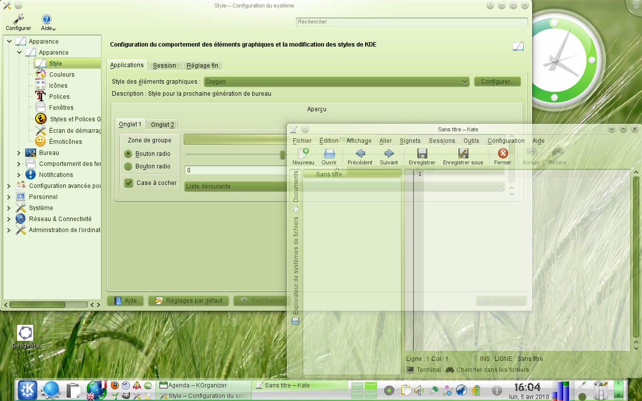
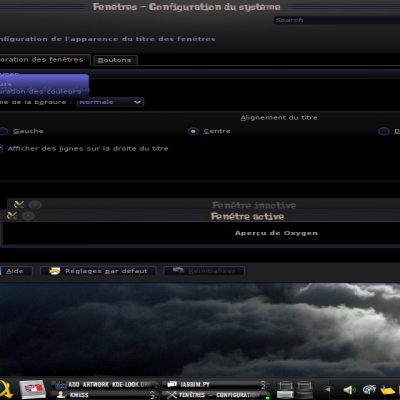
Description: Kamélayon is a green color scheme who don't use shadow colors like DarkRed. I create Kamélayon on KDE 4.4.2 and I use Gaia Recycled plasma theme with my color scheme.
I create a green theme because i'm on OpenSUSE Linux 11.2 and the name is Kamélayon because it's on KDE and the OpenSUSE's mascot is a chameleon (in french: caméléon).
It's a good theme if you like nature wallpapers (forest for example).
So if you have any ideas of a color sheme, I can create a new color scheme with your favourites colors. You can send me a message, I answer you with the color scheme.
Sorry for my English and it's my first color scheme without shadow colors.
I like it a lot! I don't use openSUSE but I like this subtle green! I can't wait to use it with firefox! ( I plan to support custom color schemes too in my firefox theme :D )
Thanks ... this is how it looks your colour scheme in firefox using my theme in the next release (just by reading the kde color settings)..
http://img130.imageshack.us/img130/10/greenfirefox.png
I think it looks great!
The overall shade of green (esp. of the window background) is nice and it looks very pleasant. But it is too much green for me, and with shades that don't seem to match completely. I also find it odd that checkboxes are in a darker green, but the active background color is so light. If you turn those two around, and improve on the contrast between the dark green backgrounds and black texts (maybe use a dark yellow or even a beige for the text), it would look pretty good and professional! Keep going, good job!
Hello, I change buttons colors (the colors of the buttons are the colors of the checkbox in KDE color schemes), tell me if you think it's good. If other persons think it's better, I put the 0.3 version today ;).
Link to the color scheme:
http://www.fantasy-waves.toile-libre.org/temp/kde/kamelayon.zip
It looks a little better in terms of contrast. I have tried it and messed around with it for a while. I don't have webspace to upload it, but I can give you color code. Maybe that will help you understand what I mean. My take might not be the best, but it's what I could come up with for now.
I like a few contrasts, so I made the following changes:
-button background color=window b.c.
-selection text to white
-selection background to maybe something like #858E50 (which is a darker version of yours) or #6C9945 (which makes for a nicer contrast, but deviates from your theme a little), or something in the likes.
What do you think?
I create Kamélayon_light_0-1 with your ideas because it's not like my first idea. So i put the name "light" because the button and selection are differents.
You can see the theme based on Kamélayon before I post the color scheme with this link:
http://www.fantasy-waves.toile-libre.org/temp/kde/kamelayon_light.zip
Yes, this is a lovely theme, and would look great on SuSE. I don't use SuSE any more, although it's still a very good distro. It's now on my Gentoo box, newly installed, displayed on my digital TV screen. So much more relaxing than the inevitable blue themes from MS and others.


Ratings & Comments
15 Comments
My favourite colour scheme! Thank you for making it :)
I like it a lot! I don't use openSUSE but I like this subtle green! I can't wait to use it with firefox! ( I plan to support custom color schemes too in my firefox theme :D )
Thank you a lot, i love your firefox theme, it's a really good idea to do an Oxygen style for firefox ;) (I use it on my firefox :p)
Thanks ... this is how it looks your colour scheme in firefox using my theme in the next release (just by reading the kde color settings).. http://img130.imageshack.us/img130/10/greenfirefox.png I think it looks great!
Yes I think too, thanks for this screenshot ;)
even though I am not a fan of green, I loved this scheme. thank you
The overall shade of green (esp. of the window background) is nice and it looks very pleasant. But it is too much green for me, and with shades that don't seem to match completely. I also find it odd that checkboxes are in a darker green, but the active background color is so light. If you turn those two around, and improve on the contrast between the dark green backgrounds and black texts (maybe use a dark yellow or even a beige for the text), it would look pretty good and professional! Keep going, good job!
Hello, I change buttons colors (the colors of the buttons are the colors of the checkbox in KDE color schemes), tell me if you think it's good. If other persons think it's better, I put the 0.3 version today ;). Link to the color scheme: http://www.fantasy-waves.toile-libre.org/temp/kde/kamelayon.zip
It looks a little better in terms of contrast. I have tried it and messed around with it for a while. I don't have webspace to upload it, but I can give you color code. Maybe that will help you understand what I mean. My take might not be the best, but it's what I could come up with for now. I like a few contrasts, so I made the following changes: -button background color=window b.c. -selection text to white -selection background to maybe something like #858E50 (which is a darker version of yours) or #6C9945 (which makes for a nicer contrast, but deviates from your theme a little), or something in the likes. What do you think?
Your original button color (this: #7B9747 ?) would also look nice as a background for the active selection...
I create Kamélayon_light_0-1 with your ideas because it's not like my first idea. So i put the name "light" because the button and selection are differents. You can see the theme based on Kamélayon before I post the color scheme with this link: http://www.fantasy-waves.toile-libre.org/temp/kde/kamelayon_light.zip
I create Kamélayon_light_0-1 with your ideas because it's not like my first idea. So i put the name "light" because the button and selection are differents. You can see the theme based on Kamélayon before I post the color scheme with this link: http://www.fantasy-waves.toile-libre.org/temp/kde/kamelayon_light.zip
This should be the default for next openSUSE release! ^^
i use opensuse and i agree! great color scheme.
Yes, this is a lovely theme, and would look great on SuSE. I don't use SuSE any more, although it's still a very good distro. It's now on my Gentoo box, newly installed, displayed on my digital TV screen. So much more relaxing than the inevitable blue themes from MS and others.