Description: A clean modern angular theme for KDE thats very crisp and KDE4 ready!
Great News!!! I can now finally begin adding to this theme again!! Thank you everyone who has downloaded and commented on this little project. I'm sorry to keep you waiting for so long but I had to put this project on hold for many reasons, but the big one stopping me from uploading to KDE look was the 750Kb upload limit. But now I finally have my own site where I can upload as much as I want! Just a little bit longer and I will finish this theme as promised!Last changelog:
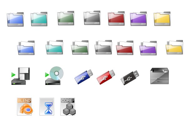
15Mar 06: Beta Preview 18Mar 06: Extended Preview, added device icons. 13April 06: Contrast fixes and new action icons. 16May 06 all svg edition. 18 Mar 2008: Moved download source to redhyena.net to allow larger file size.
You have a great Icon set and I Love the fact it's SVG. However I think the action Icons need to be worked on maybe rounded or something ofr me they seem to look out of place. Of course I'm just one person with one opinion so you don't have to listen to me, but it is a great set!
I like your direction, my personal request would be a lighter shade option for the drive icons. I personally have always liked the off white and greys for these. Like everyone else has mentioned the folder Icons are great.
Im keeping KDE Pro s squared and rigid as possible because there is a lack of nice crystal-modern square themes. Thats what I want KDE Pro to be. However I an working on "Softer" version that will be released as an alternate version of KDE Pro.
very nice, excelent colors and love the folder icons especially, with that slick transparent look.
Is it possible to show them slightly in profile?, because they seem a little to square.
Very nice, I will be looking forward to how this turns out, but one thought I had was to maby make the corners on the icons a little rounder? Personally the look a little square. Just some ideas....
yes, logixoul has right.
the sharp corner's look really good and
so fresh. there's too much stuff with
rounded corner's in the last time.
keep up going...


Ratings & Comments
35 Comments
I really like these icons. Keep up the good work!
I like it very much, hope for more of these great icons soon ;) . Thanks very much !!!
This is really good work, which tools did you use to make the icons?
Created with inkscape.
Could you send me a small tutorial, if you have one, or some advice because I would like to try it myself
Great icons, i like the crispy thing!. Also, they are quite minimalistic. Great work!
I prefer this one to the 3D one. And I reinterate the other comments: Please finish the set! I'm very much looking forward to it.
You have a great Icon set and I Love the fact it's SVG. However I think the action Icons need to be worked on maybe rounded or something ofr me they seem to look out of place. Of course I'm just one person with one opinion so you don't have to listen to me, but it is a great set!
Damn right, this looks very nice! Do users the favour and finish it... I voted this good.
It's a nice blend of Crystal and Amaranth styles, looking forward to a complete set! Keep it up
I like your direction, my personal request would be a lighter shade option for the drive icons. I personally have always liked the off white and greys for these. Like everyone else has mentioned the folder Icons are great.
Not much else to say. Definite potential one of the best icon sets around. And a much better look than crystal itself.
Definitely keep up the good work! I'm looking forward to the final version.
Im keeping KDE Pro s squared and rigid as possible because there is a lack of nice crystal-modern square themes. Thats what I want KDE Pro to be. However I an working on "Softer" version that will be released as an alternate version of KDE Pro.
very nice, excelent colors and love the folder icons especially, with that slick transparent look. Is it possible to show them slightly in profile?, because they seem a little to square.
Very nice, I will be looking forward to how this turns out, but one thought I had was to maby make the corners on the icons a little rounder? Personally the look a little square. Just some ideas....
3floppy lacks contrast
Keep up the good work
yes, logixoul has right. the sharp corner's look really good and so fresh. there's too much stuff with rounded corner's in the last time. keep up going...
Please release the icons in SVG.
Very nice ;)
I'm totally in love with these icons. Especially the decision to keep the corners sharp... please don't follow Nuvola!
Looking forward for the complete set!!
I love the look you're achieving here. I look forward to gracing my computer with your hard work.
very well put - I second that...