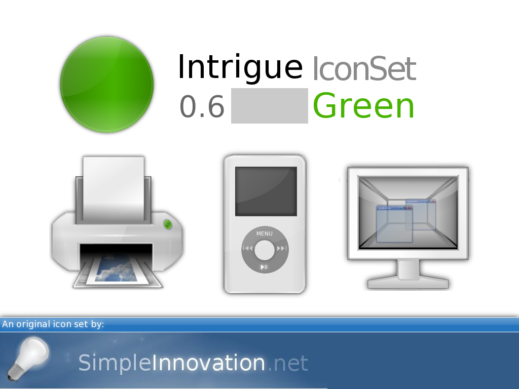
Description: A simple and beautiful icon set for the Kde desktop. Comments and suggestions are very appreciated .
*NEW: Help improve the Intrigue Icon Set by signing up for an account with Simple Innovation at: http://simpleinnovation.net/index.php?page=8&source=1 *NEW: You can now search through, view, download, & critique individual icons at: http://www.simpleinnovation.net/index.php?page=19&id=2&source=1/22|ANDid=2 *NEW: You can now see a visual overview of the changes made in the latest release at: http://www.simpleinnovation.net/index.php?page=21&source=6&id=4Last changelog:
##### Intrigue Icon Set 0.6.1 & 0.6.2 [green] #####
Thanks to the kde-look user Pquarles, I was able to fix some bugs, I hadn't known existed . - Fixed the mismatch of Konqueror's bookmark buttons - Fixed Icon Mismatch in KMail - New Kopete Icons - New Konversation Icons
The rest of the change-log has gotten too long to fit here comfortably -- you can still find it at: http://www.simpleinnovation.net/index.php?page=23&source=1/22|ANDid=2&id=2
Hi Regendra,
It means alot to get encouragement from someone who has contributed several pieces of great art to KDE, as you have :).
Thank you,
Timothy Crosley
I love this icon set, for the most part, and will probably continue to use it for some time after doing some fixes. Three major complaints.
1) The "next unread" and "previous unread" buttons in Kmail are mismatched, with the latter apparently using whatever the system default is set to.
2 and 3) Like virtually *every* KDE icon set, this one doesn't include anything for Kopete or Konversation. These are two major KDE applications (aren't they?), and yet almost no one wants to include them in new icon themes.
Apart from items that aren't included in the theme, though, I think this is excellent work. :)
Hi Pquarles,
It is very rare to get such a kind, and helpful comment :). I will try to release an update that addresses all of the issues you presented withing the next 3 days.
Thank you,
Timothy Edmund Crosley
Many thanks for the update! The icon for Konversation is really nice, and nothing like what I was expecting.
One other small thing I have noticed since using this: in Konqueror, the bookmarks menu uses the CrystalClear (or whatever the default is) icons for bookmark folders. This icon is a shiny blue gradient with a yellow star, so doesn't really match your theme.
Hi Dorious,
I appreciate the time you took to comment; but am sorry you did not like my icons. I'm sure you realize though, that I can not please everyone :). When I started to post my icons over A year ago, I saw -- like you said -- only 2 major Icon designs. So I decided to create something different -- an icon-set that was simple enough not to distract the user, and cause too much noise -- but with enough detail to allow the user to instantly recognize the object the icon represents. I did not want to make an icon set to fit into a pre-defined mold. And so far the wonderful users of KDE have encouraged me to finish this icon set -- through high ratings, and a large # of downloads -- as long as this is the case I will do so.
~Timothy Edmund Crosley
Thank you for your comment :).
If you right click on a folder->go to properties-> and then click on the current folder icon: you will see several variation of the folder icon(different colors and such).
~Timothy
Hi,
I tried the download on 2 seperate connections and it worked on both. The download is hosted by sourceforge(which may have been down when you tried to download it, though this doesn't happen often).
Thank you for your concern :),
Timothy
very nice to see they way good icons are getting, though i thought "aqua" was cool in 2002, now it just seems obnoxious. i love these in kde- but i think the simplicity and understated beauty of this set would look great on my ubuntu box too. any thought to a gnome release?
Thank you :).
If you enjoy making icons just keep working at it, and you will get better. When I started out my icons were laughable:
http://i4.photobucket.com/albums/y117/timothy_crosley/lsearchtool.jpg
(and thats just the oldest pic I can find, they used to be even worse!).
Heres a few things that have helped me:
1.Before I draw a difficult icon I sketch it twice. The first time very rough, and then more detailed. It gives me a feel for how the icon should look.
2.I draw my icons really large (300x300). That way if theres small mistakes - they wont show up when I scale the image down.
3.I Look at real world objects for inspiration. If im drawing a Peice of paper, I have a piece of paper right on my desk - and I look at it constantly as a point of refrence.
4.If I make a mess of an icon I dont sweat it. I just leave and come back to it latter.
I am not near the best icon designer. Far from it. But hopefully these tips will help :).
Have a nice day
~Timothy
Thanks :),
You are right the trash-bin looks very odd without a third-person perspective. This is probally becuase this is the perspective you see it from in real-life.
This was a style decision I made early on.I had noticed that most icon sets have icons in varying perspectives and decided to experiment making an icon-set in which all icons were in the same perspecive. I did this becuase I thought it would make the icon set look more clean.However I may have been wrong O:-).
I will however - finish this IconSet with this same style -- After which I may start a new one (with a normal looking trashcan perspective ;)).
Thank you for your adice :),
~Timothy
not at all, i see the bin icon to be just fine. it looks more like a pouch, and very clean. it's perfect, don't change anything.
rather, you could do a bin (alternative) for those who don't like the original. but don't get rid of it.
great work!


 .
. 


Ratings & Comments
55 Comments
fresh idea and nice icon.. thx for your contribution
Hi Regendra, It means alot to get encouragement from someone who has contributed several pieces of great art to KDE, as you have :). Thank you, Timothy Crosley
I love this icon set, for the most part, and will probably continue to use it for some time after doing some fixes. Three major complaints. 1) The "next unread" and "previous unread" buttons in Kmail are mismatched, with the latter apparently using whatever the system default is set to. 2 and 3) Like virtually *every* KDE icon set, this one doesn't include anything for Kopete or Konversation. These are two major KDE applications (aren't they?), and yet almost no one wants to include them in new icon themes. Apart from items that aren't included in the theme, though, I think this is excellent work. :)
Hi Pquarles, It is very rare to get such a kind, and helpful comment :). I will try to release an update that addresses all of the issues you presented withing the next 3 days. Thank you, Timothy Edmund Crosley
Excellent. I look forward to seeing what you come up with. :)
Many thanks for the update! The icon for Konversation is really nice, and nothing like what I was expecting. One other small thing I have noticed since using this: in Konqueror, the bookmarks menu uses the CrystalClear (or whatever the default is) icons for bookmark folders. This icon is a shiny blue gradient with a yellow star, so doesn't really match your theme.
Fixed. And thanks again for your help :).
I just don't like such simple icons, there is only 2 ways simplicity or minuteness, your work is middle of those.
Hi Dorious, I appreciate the time you took to comment; but am sorry you did not like my icons. I'm sure you realize though, that I can not please everyone :). When I started to post my icons over A year ago, I saw -- like you said -- only 2 major Icon designs. So I decided to create something different -- an icon-set that was simple enough not to distract the user, and cause too much noise -- but with enough detail to allow the user to instantly recognize the object the icon represents. I did not want to make an icon set to fit into a pre-defined mold. And so far the wonderful users of KDE have encouraged me to finish this icon set -- through high ratings, and a large # of downloads -- as long as this is the case I will do so. ~Timothy Edmund Crosley
I'm really blown away your icons. I'm using them now and they probably stay long time on my Linux ;)
Thank you for your kind feedback :). ~Timothy
I am just a normal user of KDE. I find the folder icon boring. May be its just the yellow color. Otherwise the icon set is great
Thank you for your comment :). If you right click on a folder->go to properties-> and then click on the current folder icon: you will see several variation of the folder icon(different colors and such). ~Timothy
Hi. The download link is not working.
Hi, Thank you for alerting me to the problem, The link is fixed ;). ~Timothy
the link seems to be broken again apparently
Hi, I tried the download on 2 seperate connections and it worked on both. The download is hosted by sourceforge(which may have been down when you tried to download it, though this doesn't happen often). Thank you for your concern :), Timothy
very nice to see they way good icons are getting, though i thought "aqua" was cool in 2002, now it just seems obnoxious. i love these in kde- but i think the simplicity and understated beauty of this set would look great on my ubuntu box too. any thought to a gnome release?
Hi, Thank you for your comment, I am working on a gnome version for my 0.5 release :). ~Timothy
How do you make icons this good? I've tried to make icons and I've ended up with something that doesn't make sense.
Thank you :). If you enjoy making icons just keep working at it, and you will get better. When I started out my icons were laughable: http://i4.photobucket.com/albums/y117/timothy_crosley/lsearchtool.jpg (and thats just the oldest pic I can find, they used to be even worse!). Heres a few things that have helped me: 1.Before I draw a difficult icon I sketch it twice. The first time very rough, and then more detailed. It gives me a feel for how the icon should look. 2.I draw my icons really large (300x300). That way if theres small mistakes - they wont show up when I scale the image down. 3.I Look at real world objects for inspiration. If im drawing a Peice of paper, I have a piece of paper right on my desk - and I look at it constantly as a point of refrence. 4.If I make a mess of an icon I dont sweat it. I just leave and come back to it latter. I am not near the best icon designer. Far from it. But hopefully these tips will help :). Have a nice day ~Timothy
Nice start, but try adding perspective to your icons. The bin looks especially weird without perspective.
Thanks :), You are right the trash-bin looks very odd without a third-person perspective. This is probally becuase this is the perspective you see it from in real-life. This was a style decision I made early on.I had noticed that most icon sets have icons in varying perspectives and decided to experiment making an icon-set in which all icons were in the same perspecive. I did this becuase I thought it would make the icon set look more clean.However I may have been wrong O:-). I will however - finish this IconSet with this same style -- After which I may start a new one (with a normal looking trashcan perspective ;)). Thank you for your adice :), ~Timothy
not at all, i see the bin icon to be just fine. it looks more like a pouch, and very clean. it's perfect, don't change anything. rather, you could do a bin (alternative) for those who don't like the original. but don't get rid of it. great work!
Thanks! I am glad to here somone shares my personal prefrences :).~Timothy