Description: This is a preview version of an Icon theme I'm in the process of making. So far, it's less than half completed, but I thought I'd put it up here to give... well, preview. I originally started it to get some practice using inkscape and svg, and never actually expected it to become anything. Any feedback would be appreciated. And the name, Mewls is temporary, because I'm really really bad at coming up with names for things.
------------------ I added another file, "Buildable" which contains a buildscript for the iconset, so it only needs to contain the 128x128 folder, which shrinks the file size considerably. To build it, just run 'sh buildset' from the directory, and install the newly created archive with KDE Control Center. The script depends on, tar and imagemagick (I think).Last changelog:
0.6-------- Again, added quite a few more actions, and redid the Database icon.
0.5-------- Added a lot more Actions.
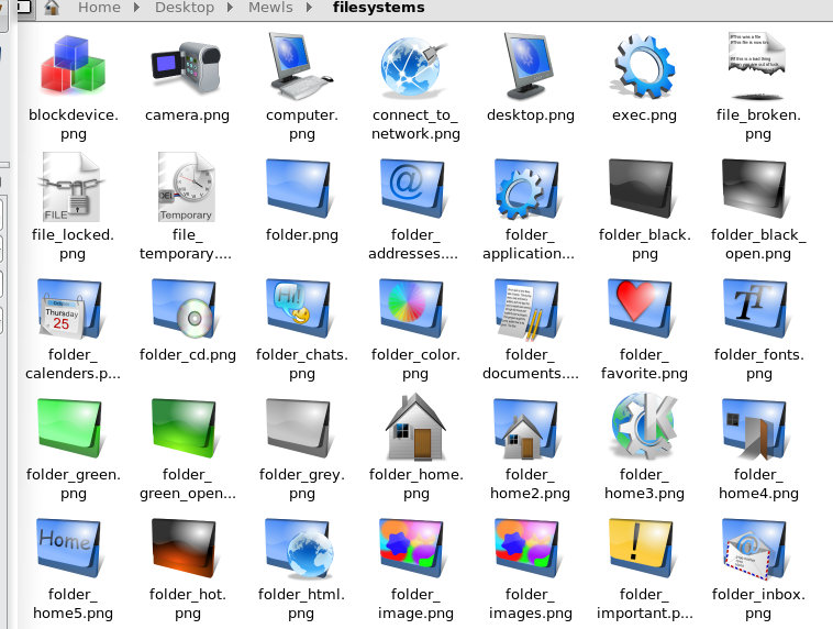
0.4-------- The Mimetypes, Filesystems and devices and now all pretty much completed.
0.3a------- Added more apps, actions, and mimetypes, and some random "home'ish" Icons.
This seems to be a good piece of work, however if I may make a suggstion, the lighting is rather... primitave. For your highlights, it would be better to make your radial gradient bigger, blurier, and a little more transparent. Right now the icons look almost fake because of this. Try not to use flat white for lighting, try using a brighter, more saturated color for the object where it needs to be brighter, and a less saturated brighter version of the objects color for highlights. Overall on the right track, just needs some minor improvements. Hint: try looking at the crystal project, this is an excellent example of proper lighting techniques for photo realistic icons.
Can you make an yellow version of your folder icon
Against blue backgrounds, blue icons are not very good from usability point of view. Otherwise, this icon set is one among the best i have used. Nice work.
As far as I know, there is already a yellow folder icon in there... to change the default blue to yellow (or any other colour thats in there) you just need to go to Control Center >> KDE Component > >File associations >> inode and change the directory icon and look under filesystems. Or it should work at least. (unless you mean something different)
Woaw that are really nice icons ,i just like to add a small comment on it why ain't you using the glassy shadow for your icons like on the first preview here that you show on kde-look.org that can give it a final edge on it??
But i must say i give you good credit on it and they are on my desktop now, just maybe consider it to give it more that sharp edge on it with the glassy shadow.
GREETINGS FROM A LININSPIRED FREAK :-)
Just letting you know that what you are drawing looks very nice.
If you manage to create a complete icon-theme that would be very great.
I really like the style. Images Folder icon is really nice :)


Ratings & Comments
11 Comments
This seems to be a good piece of work, however if I may make a suggstion, the lighting is rather... primitave. For your highlights, it would be better to make your radial gradient bigger, blurier, and a little more transparent. Right now the icons look almost fake because of this. Try not to use flat white for lighting, try using a brighter, more saturated color for the object where it needs to be brighter, and a less saturated brighter version of the objects color for highlights. Overall on the right track, just needs some minor improvements. Hint: try looking at the crystal project, this is an excellent example of proper lighting techniques for photo realistic icons.
Can you make an yellow version of your folder icon Against blue backgrounds, blue icons are not very good from usability point of view. Otherwise, this icon set is one among the best i have used. Nice work.
As far as I know, there is already a yellow folder icon in there... to change the default blue to yellow (or any other colour thats in there) you just need to go to Control Center >> KDE Component > >File associations >> inode and change the directory icon and look under filesystems. Or it should work at least. (unless you mean something different)
Woaw that are really nice icons ,i just like to add a small comment on it why ain't you using the glassy shadow for your icons like on the first preview here that you show on kde-look.org that can give it a final edge on it?? But i must say i give you good credit on it and they are on my desktop now, just maybe consider it to give it more that sharp edge on it with the glassy shadow. GREETINGS FROM A LININSPIRED FREAK :-)
Just letting you know that what you are drawing looks very nice. If you manage to create a complete icon-theme that would be very great. I really like the style. Images Folder icon is really nice :)
Thanks, and I'm still working on it, so eventually it should be a complete icon theme. :)
folder icons are nice!
Thanks for all the votes. And I'll try and come up with an alternative home icon of some kind :P
coool!!! ...but can anyone come up with a "home" icon that doesn't look like a little house??!!?? - they all look crap! ;-)
very cool man, keep doing, nice work. thanks
i like them. keep dooing shit like that man, i will keep voting for good !