


Fone2Talk
mikenicholson


Source (link to git-repo or to original if based on someone elses unmodified work):
2008.06.22 (v0.5)
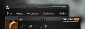
-Packed a version that looks like the Metacity theme (see third preview).
-Minor unoticeable tweak here and there.
-New screenshots for Emerald/Beryl theme manager and gnome-look.org.
2008.06.19 (v0.4)
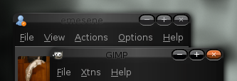
-Repacked, now contains both the Pill Buttons and Combine Buttons look. You ask, you get.
2008.06.18 (v0.4)
-New buttons, now all rounded with a pill feel.
-Removed unwanted pixels from buttons that was only viewable when hoovered.
-Removed unwanted pixels from buttons that was only viewable under Emerald/Beryl theme manager.
-Removed unwanted pixels from buttons that was only viewable when opening the image file under an image editor.
-Centered the X from the maximise and restore buttons by moving it of 1 pixel to the left.
-Added two (2) white (#ffffff) pixels to the left of the minimise button so it now looks centered and more consistent with "+" (same width).
-No more rounded left and right bottom corners.
-New screenshots for Emerald/Beryl theme manager and gnome-look.org.
2008.06.17 (v0.3)
-Name changed from "MaybeLUX" to "It might be LUX".
-Since left, right and bottom borders are using only one hex color, scaling is unecessary, speed increased by 2% on my computer (gtkperf + fresh boot).
-New screenshot for Emerald/Beryl theme manager, the 0.2 one was stretched.
-New screenshot for gnome-look.org.
2008.06.16 (v0.2)
-Moved to pixmap with revamped images for left & right borders.
-Completely redone images for the bottom and the four (4) corners for more consistency.
-New screenshot for Emerald/Beryl theme manager and gnome-look.org.
2008.06.13: (v0.1)
-Initial release.


Other Beryl/Emerald Themes:


Ratings & Comments
10 Comments
Hi Dude, Look around here: http://www.1001freefonts.com
This is just wonderful !!! I really LOVE it!!!
I liked the theme and was watching it updated untill I saw this separation of buttons. The combined buttons was one of the things that made this theme look different to the others. In fact that was the feature that attracted me in this windeco (mystelf I've been using CylonMinimal for ages now). It's just my 5 cents, but if it's not to difficult to maintain both styles, I think people might appreciate this (remember it got rating 76% while it had the old style!) Thanks for great work:)
what gtk theme are you using? you managed to have the title bar blend with the rest of your wndow, how would i achieve this in xfce?
I don't know anything about XFCE, but like I mentionned in my description, this is considered to be best used with LUX gtk theme, wich currently at version 0.9.2! ;) Cygoku
very good
I like it, simply and linux, well done. Voted good :) Puli
...But it should not say "Ubuntu download". This theme will work with any distor of Linux that has emerald installed, so I'd suggest removing the branding.
Sorry for the double-post
...But it should not say "Ubuntu download". This theme will work with any distor of Linux that has emerald installed, so I'd suggest removing the branding.