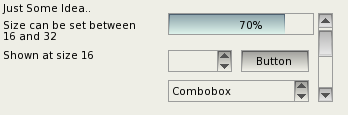
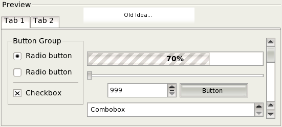
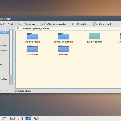
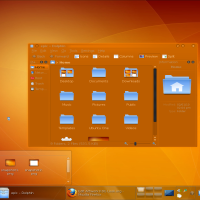
Description: I was just thinking about what I want in a theme for KDE4, I like the like transparent themes but im tired of seeing the "bubble" look of things like liquid, plastik, karimik, etc. So I made this mockup. I hope it might ispire people to consider a more flat and boxy look. If you would like to make a theme like this go ahead, I think people will like it.
As of my new update, I have added a more "Cut glass" look. Hmm... I cant make up my mind. Do I like the new style or my old style... Maybe ill make both.. Maybe ill make none... I Dunno yet.Last changelog:
- Oct 5 2005: First Mockup - Oct 6 2005: Added another style
As others have mentioned there is some fine tuning to do.
Nevertheless, the project is in it early stages.
I for one welcome the prospect of another theme with a less colour saturated and 'plastic' look than the majority of KDE themes.
While there is a QT/KDE port of Industrial, it is only one theme. A wider range of choice for people of varying aesthetic preferences can only be a good thing.
Cheers.
As all the styles around, scrolbars are too big, tabs enourmous, ...
Nice work but why not have sizes from 10 for those who do not want to look at the widget but see the applications.
In which way is this flatter than plastik??? It is certainly flatter than keramik, but not flatter than plastik. Still, too bubble-ish. For me "flat"=industrial, and the closer that I managed to get with kde is a customized qtcurve or reinhardt theme. Search for those in this web to see what is a plain clean theme (and ultrafast also).
It's amazing, it is one of the best style (for me) i have ever seen.
http://www.kde-look.org/CONTENT/content-m2/m29824-2.png
http://www.kde-look.org/CONTENT/content-m2/m29824-2.png
I can't find on my Kubuntu 7.10 or 7.04 files accountable for how styles look like
(you know, files from for fgzample baghira/QtCurve/Lipstick where I can change buttons, scrolbars, progressbar .. e.t.c )
If I have those files I would do that
I'm sorry everyone for my terrible english


Ratings & Comments
7 Comments
As others have mentioned there is some fine tuning to do. Nevertheless, the project is in it early stages. I for one welcome the prospect of another theme with a less colour saturated and 'plastic' look than the majority of KDE themes. While there is a QT/KDE port of Industrial, it is only one theme. A wider range of choice for people of varying aesthetic preferences can only be a good thing. Cheers.
As all the styles around, scrolbars are too big, tabs enourmous, ... Nice work but why not have sizes from 10 for those who do not want to look at the widget but see the applications.
I think it ROCKS!! Keep up the good work!
In which way is this flatter than plastik??? It is certainly flatter than keramik, but not flatter than plastik. Still, too bubble-ish. For me "flat"=industrial, and the closer that I managed to get with kde is a customized qtcurve or reinhardt theme. Search for those in this web to see what is a plain clean theme (and ultrafast also).
There is a Qt/KDE version of Industrial.
I know, but it is too buggy, and it is unmaintained at all since so many time ago.
It's amazing, it is one of the best style (for me) i have ever seen. http://www.kde-look.org/CONTENT/content-m2/m29824-2.png http://www.kde-look.org/CONTENT/content-m2/m29824-2.png I can't find on my Kubuntu 7.10 or 7.04 files accountable for how styles look like (you know, files from for fgzample baghira/QtCurve/Lipstick where I can change buttons, scrolbars, progressbar .. e.t.c ) If I have those files I would do that I'm sorry everyone for my terrible english