


OSX theme package
TheBlackKnigth


Source (link to git-repo or to original if based on someone elses unmodified work):
0.8 - Ported to Qt 4.
0.7 - Add menu button indicator
- Fixed drawing of list headers and some buttons (98894, 99174)
- Fixed tabbars and splitters
0.6 - Fixed toolbuttons with pixmap backgrounds
- Fixed widgets on search bars
- Scaling several GUI elements according to font size
0.5 - Imported to kdeartwork
- Fixed expander arrows
0.4 - Fixed rendering bugs for desktop menu and tab close buttons
0.3 - Improved menubar, tabbar, splitter
- Minor code fixes
0.2 - Improved highlighting and focus of checkbox, radiobutton
- Visual improvements to progressbar, headers, kicker buttons
- Fixed drawing non-movable dockwindows (KJobViewer)
0.1 - Initial public release


Other QtCurve:

Ratings & Comments
34 Comments
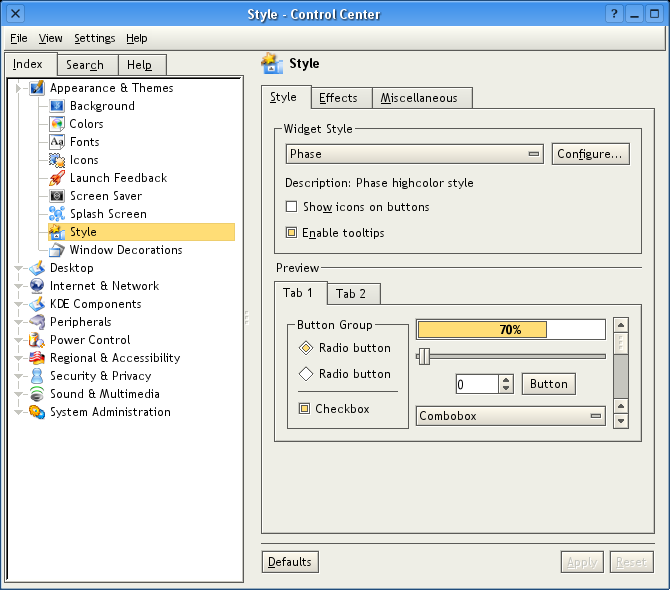
Phase is being maintained in the KDE repository (in kdeartwork). The crash mentioned above have been fixed. I'll try spin off a new kde-look release soon.
I installed your style, everything went fine. But when i select it in qtconfig, it crashes with a segmentation fault. Starting Qt4-apps with option -style Phase or editing the Trolltech.conf by hand everything works fine. I don't know what's the problem, but probably you :) Thx Franz
I can't reproduce this on Qt 4.2.3. If you have more than one Qt installed, make sure you're using the right qtconfig. Otherwise, I have no idea. Sorry.
Oh, could it be i'm using the current qt-4.3.0_beta1? As i don't want to compile the whole qt-4.2.3 again, i think this solution (editing the Trolltech.conf) is the best way ATM. Of cource i have different Qt-versions installed: Qt-3.3.8 and Qt4. But these are installed in different locations, and i know that i start the correct qtconfig. ;) BTW: I like the style :) thx!
Nope, not seg fault constant with Qt 4.3.3
The backtrace from: https://bugzilla.redhat.com/show_bug.cgi?id=456614 That's this line: PhaseStyle::pixelMetric(QStyle::PixelMetric, QStyleOption const*, QWidget const*) const (phasestyle.cpp:2387) And this code: case PM_TitleBarHeight: return qMax(option->fontMetrics.lineSpacing(), 20); To the author: You have to check if fontMetrics is not NULL. The documentation for pixelMetric explicitly says "Note that the option may be zero even for PixelMetrics that can make use of it."
Sorry, I mean "You have to check if option is not NULL."
Actually, as the author says below, this is already fixed in the current version in kdeartwork 4.1: http://websvn.kde.org/branches/KDE/4.1/kdeartwork/styles/phase/phasestyle.cpp?r1=784282&r2=808184
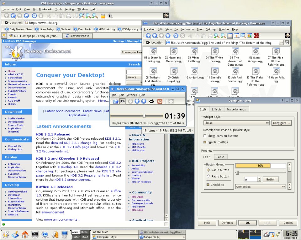
A puristic, useable, light and fast widget. No stupid gimmicks and limited to the really needful things. Similar to the «Plastik» widget but more angular. Thx!
This is a very nice widget style, I can't wait until 1.0!
There won't be a "1.0" per se. This style is now being maintained within KDE (kdeartwork). If you keep your KDE up to date, you'll always have an up to date Phase!
Nice, but it has a few things I dislike: - The slider nub is a bit chunky. Perhaps if you replaced the vertical black line with a rotated rectangle (like the ones on comboboxes). Or if it looked like the scrollbar control, with the three squares and reverse gradient. Or something. - While I don't care for the checkboxes, I really dislike the diamond-shaped radio buttons. I'm not sure what would be better, though. A circle seems somewhat out of place, since that style is so angular, but that's the only place there are 45' angles, so the diamonds don't fit in much better, either. - The zero in the spinbox is only 1px away from the left inner edge. The other styles have a bit more space, and look better, imo.
1) The black line in the slider control is purposeful, as it's used to indicate the center point. Most sliders will have tickmarks, and this line indicates which tick the handle lines up with. It corresponds to the arrow in Plastik. An example of form following function. 2) The radio buttons are not the only angular bit in Phase. Consider the arrows. Also the use of diamond radio buttons is common in Unix thanks to Motif. I needed them to be as small as checkboxes, in roughly the same style, but be very distinct from them visually. Diamonds do this very well. 3) You're right. But the other standard styles have the same problem, and it's not just the spinbox, it's all edit controls. (ignore my screenshot, at it's probably not using the same fonts as you). I'll mark this down as something to think about. I appreciate your comments, so don't let my apparent dismissal of them keep you away from further constructive criticism.
Good job as always. :) The nice gradients are very pleasing to the eye. GNUStep has not been down any better.
With these 2 fixes this theme got just great, not that is wasn't before of course. ^_^ Join it your Grover windec and Keramic color scheme and you just got yourself a great looking desktop that at the same time looks good and is not intrusive, not a thing we see every day! Very good job, my congratulations!
It still has some annoyning bugs. The first is with tabs, open up konqueror and open a new page (Ctrl + Shift + N), in that tab there is a close button, when you place the mouse cursor over it the close icon goes a bit to right. The second is with MacOSX style menubar, the menu look very bad, looks like the menu isn't clean, so every characters stay then becoming a big mess. Fix these 2 bugs and you have a great theme!!
I never use the close buttons on tabs, or the desktop menubar, so I never noticed these problems. They definitely need to be fixed. Thank you for bringing it to my attentions. I'll start working on this right away.
It's nice, but it's interesting to see how the style trends work. Sometime ago, big and bubbly (keramik) was the way to go, but now the majority of KDE users are going for more simple tastes (including me)... sorry for babbling, hehe.
I really like this style a lot, but it seems kate gets a extra frame around its view manager (the area with the editor component[s]). Is that right?
Looking at the screenshot you sent me, this is an illusion caused by the dark kate schema. It appears with a few other styles as well.
Make the scrollbars more flat when inactive, and keep them as they are when active, so you have the "pushed down" look.
the style is nearly perfect (i use it with groover windec:)). i really love the squared feel :) just the active windows button on taskbar have no gradient, i think it must have a reversed gradient like in active button. may be some gradient in pressed button to but not necessary ;-)
I really like this style and I was wondering ... There is a long-standing complaint of kde style saying that the menu entry spacing is too close. I'm not sure if your style can override that but one should conscious of this for usabilty reasons. I was thinking that the colored-inside-diamond's border of the radiobox/checkbox could be of an even more contrasting color which would stand out for colorblind and noncolorblind people alike
I just ran over and looked at a friends Windows system, and I couldn't see any readily apparent difference in menu spacing. This is something I could override, but I don't want to if there is not a problem. Maybe the people complaining are using too small of a menu font size? If you could send me some comparison screenshots (offline) of this problem, I would appreciate it.
I believe he means the spacing of items in the menubar. See PM_MenuBarItemSpacing in the QStyle docs. Its only available in Qt 3.3, though.