
Gentleman
Source (link to git-repo or to original if based on someone elses unmodified work):
Description:
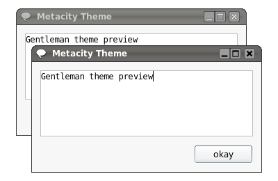
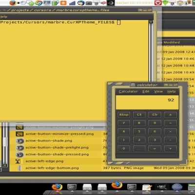
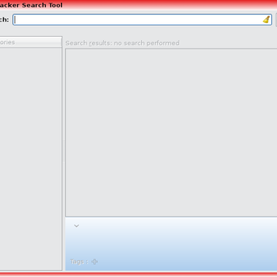
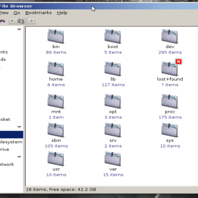
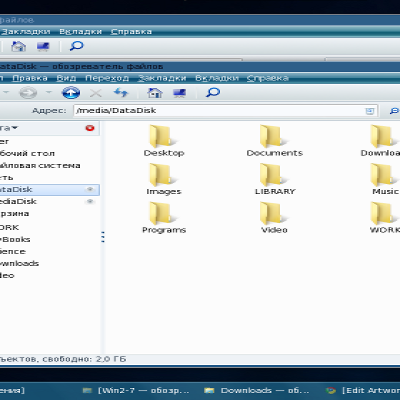
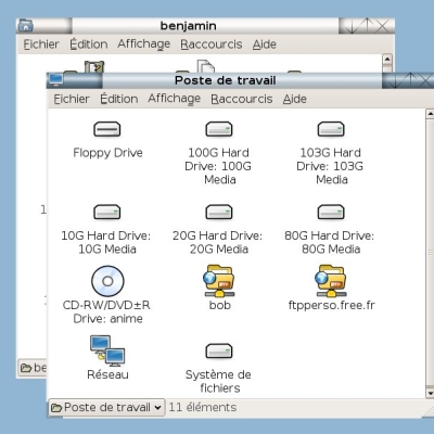
This Metacity theme is modelled after the GNOME mockup "A cleaner gnome mockup" by Gentleman. I like it a lot and tried to create the window theme using his graphics. It's my first Metacity theme so don't expect too much...
Here's the mockup:
http://gnome-look.org/content/show.php?content=31128
Due to popular demand I uploaded a version with 3px wide frames.
There's also a XFWM4 port of the theme available, thanks to AnXa.
http://www.xfce-look.org/content/show.php?content=32353
Known problems:
If you use a version of Metacity prior to 2.12 please use the theme version with the 3px thick frame, otherwise the rounded corners will appear white. Metacity 2.12 and above displays both theme versions correctly. Last changelog:
Here's the mockup:
http://gnome-look.org/content/show.php?content=31128
Due to popular demand I uploaded a version with 3px wide frames.
There's also a XFWM4 port of the theme available, thanks to AnXa.
http://www.xfce-look.org/content/show.php?content=32353
Known problems:
If you use a version of Metacity prior to 2.12 please use the theme version with the 3px thick frame, otherwise the rounded corners will appear white. Metacity 2.12 and above displays both theme versions correctly.
0.1:
- initial version
0.2:
- changed button layout to be closer to the original
0.3:
- new graphics (from first mockup screenshot)
- transparency bug fixed
0.4:
- added shaded titlebar images for inactive windows
0.4.1:
- fixed wrong color for inactive frame
- alternative version with 3px wide frame added






Ratings & Comments
54 Comments
I started making out XFCE4 port. :) When I get it ready would you like to include it to your package?
http://www.xfce-look.org/content/show.php?content=32353 I published XFWM4 version.
Good job! I added the link to your XFWM4 version in the description above. :)
Hi! i like it so much! Why don't u do a whitish one too?
Haven't found the time yet, but it's on my TODO list.
I like this theme a lot. I think maybe you could do an alternative version with a red close button and a different graphic for maximise and minimise. I will also try and work on this, but I am not good with inkscape.
I meant that the maximise and minimise buttons should be different so that you know when a window is maximised or minimised.
I'm not good with Inkscape either, but different buttons for maximized windows seems like a good idea, I'll probably do this soon. As for the red button I'd rather do another theme altogether, since the Gentleman theme was intended solely to resemble the mockup.
Seems like I haven't inspected the new screenshot from the mockup closely enough... the new one has a red button. Guess it's time for Gentleman v2. ;)
I have to take back my comment above, I have looked at the screenshot and it looks great with a lighter shade of red than I had used.
I tried the red button and it spoils the theme, so I won't proceeed with it. Its just not visually appealing.
The borders really should match the colour of the title bar.
They do actually. The titlebar has a very thin border in the same color as the frame.
I think binarymelon is referring to your 3px version.
The 3px frame has the same color as the 1px frame. I'm not sure what you mean.
I guess you didn't see the link I posted earlier? http://kwh.kernow-gb.com/~bvc/theme/devel/Gentleman_3px.tar.gz This is a 3px border where the 1px is dark and the other 2 are taken from the gtk theme bg[NORMAL]. So it has the sleek appearance of 1px but the usability of 3px. Looks cheesy on trans terminal windows but well worth the usabilty factor.
I saw the link you provided but didn't download and try it. I assumed it was the same 3px version that I uploaded. Guess I didn't read your posting carefully enough. ;) Anyhow, what does this have to do with the question of binarymelon? He refers to the titlebar color, not the background color.
http://kwh.kernow-gb.com/~bvc/theme/devel/border-3px.png I thought he was referring to a border that jumps out at you. Look at the top window. Does the border flow into the titlebar like the bottom window? Does the top window match the titlebar like the bottom window?
I know the theme does not look that good with a wider border, because of which I didn't release that version from the very beginning. If you magnify your image you'll see that the color actually is correct, although it seems to "jump out at you". http://img353.imageshack.us/img353/9858/border3pxmag4bj.png
I understand all that but both of these windows have a 3px border. http://kwh.kernow-gb.com/~bvc/theme/devel/border-3px.png Which looks better and which is inline with the titlebar? I simple made the changes for you to show you how to get a 3px border that has the sleek appearance of a 1px border. That's all. If you do not want to use it, then don't.
I think we are talking at cross-purposes here. As I understand it binarymelon's question has nothing to do with this. He just asked about the color, not about thinner or thicker borders and such. And I do appreciate that you showed me the trick with two colors to get a pseudo-1px border, wasn't aware of it. I'm thinking about adding a third download with your version of the 3px border.
yes, he asked about color that is obviously a match, so naturally I'd say the issue is that all 3 pixels are dark. You could also make a 3px 3D (dark/light/dark) border like the titlebar and stop the bottom line of the titlebar 3px from the end, which is actually what I think he was wanting to say. Anyway, don't stop!!!
The 3px border seems to get rid of the corners problem. I'd make the borders the same color as the gtk theme.
Indeed, a width of 3px or more is needed to display the corners correctly. Really strange... :/ Thanks for mentioning!
like this http://kwh.kernow-gb.com/~bvc/theme/devel/Gentleman_3px.tar.gz