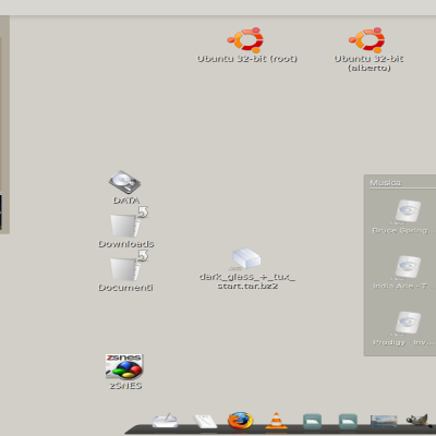
Description: This is the win7 menu button for gnomenu. I think that it's necessary to have a win7 theme, because the principal objective of the project in the beginning (VistaMenu) was to emulate the windows vista menu and make more simple the transicion for windows users. So, if the default package have the xp and vista theme, i think it's necessary also the windows 7 theme.
Because that, i'm working now in a win7 theme, menu, button and icons. We must be original in themes design, but we can't forget the first objective of this project.
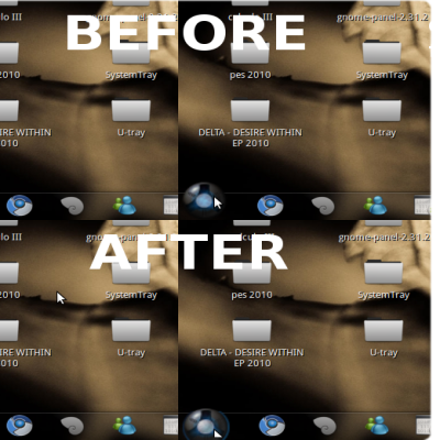
It is nothing too difficult to take care of, but when the button is depressed, it skips up one pixel. Edit your depressed button and bring it down one pixel and that should fix it. Thanks!
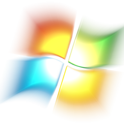
Make the seven orb it's really difficult, i think it's a good first step. The original seven orb has light over the panel... i must remake this if I want to add this. If i have time, i will.
First, you will need to download GnoMenu from here:
https://launchpad.net/gnomenu/trunk/1.6
Download the GnoMenu-1.6.tar.bz2 (md5) file.
Right click on the tar ball and click "Extract here"
Open Shell (or Terminal)
type sudo su
enter your password
then type the following:
cd /home/(your user name)/Desktop/GnoMenu
press enter
type:
make install
press enter again
Then, right click on your panel and click "Add to panel"
scroll down to select GnoMenu
Then download this file
right click on the gnome foot (the start button by default)
Select Preferences
Click on Panel Button on the left
Click on the install Icon (Looks like a plus "+" sign)
(you will have to enter your password again)
When it says theme installed, you know you're done! :D
Click the okay or cancel button, it will say that the menu needs to be restarted, and click yes (you may even get a notice that it quick unexpectedly and needs to be reloaded, so click reload now)
then right click, select preferences again, click on the panel button option on the left, and chose your new button.
May take a little work, but it does work and I hope that that helps you and doesn't confuse you too much.
Also you can install Gnomenu from *.deb packages.
Download from here:
http://gtk-apps.org/content/show.php/GnoMenu+-+consolidated+menu+for+gnome?content=93056
" the principal objective of the project in the beginning (VistaMenu) was to emulate the windows vista menu"
This is not emulation. This is copying. It's fine to create something that will ease the transition. But a carbon-copy will likely make the transition harder in the long-term. If it looks exactly like Windows then you're setting up the expectation that it works exactly like Windows. But if you create something that is similar, yet slightly different then you aren't setting up those same expectations.
The idea of the blue-orb for the button is good. But stick a Gnome footprint in it, or a penguin, or something that it's the (copyrighted) Windows logo.
The big, obvious blue-orb button with a logo in it is already associated with the main menu. You don't need this extreme degree of hand-holding to help people transition from Windows.
my arguement is this... yes indeed winblows is winblows.. linux is linux.
but this my friends... is desktop customization.. what we are proving here is that the linux desktop can look like anything we want it to look like...and here are some resources to make it look like that. It's all about choice, afterall...you see many linux shots and windows shots trying to desperately copy mac osx's look.. why dont we say...i dunno..macs are macs linux is linux in that case? well duh it is.. but customization allows us to get whatever we like. and as a matter of fact this is one step closer to getting a win7 like set up. the fact that the gnome desktop can do something like this itself is something to be proud of. gnome is very customizable indeed.
maybe is better to tell people that LINUX is NOT WINDOWS. Teaching some basics will make the transicion easier than with imitations.
And... do u really think that people will get confused with a linux distro logo instead of the windows one?
Why not any other logo? Why does it have to be a Winblows logo? I mean the idea is cool, but people aren't using Winblows, so why a Winblows logo? I'd love to see a Ubuntu/Suse/Arch/whatever logo instead of the Windows flag in that aqua bubble :-P
Yes I have, but it still is GNU/Linux, not Windows, I just find it kinda odd to see a Windows logo when I'm obviously using GNU/Linux, that's all. The idea of letting it look familiar is good after all.
I see nothing wrong with this, though GnoMenu is directing away from using Windows like layouts as a default it can still use them. There will be those whom will want this though few compared to those which are looking for Linux and or distribution specific buttons.


Ratings & Comments
18 Comments
It is nothing too difficult to take care of, but when the button is depressed, it skips up one pixel. Edit your depressed button and bring it down one pixel and that should fix it. Thanks!
Make the seven orb it's really difficult, i think it's a good first step. The original seven orb has light over the panel... i must remake this if I want to add this. If i have time, i will.
Your seven orb is better than the one I made. Nice work! Thanks!
thanks!!
How to use in ubuntu? I am a new user of ubuntu.
First, you will need to download GnoMenu from here: https://launchpad.net/gnomenu/trunk/1.6 Download the GnoMenu-1.6.tar.bz2 (md5) file. Right click on the tar ball and click "Extract here" Open Shell (or Terminal) type sudo su enter your password then type the following: cd /home/(your user name)/Desktop/GnoMenu press enter type: make install press enter again Then, right click on your panel and click "Add to panel" scroll down to select GnoMenu Then download this file right click on the gnome foot (the start button by default) Select Preferences Click on Panel Button on the left Click on the install Icon (Looks like a plus "+" sign) (you will have to enter your password again) When it says theme installed, you know you're done! :D Click the okay or cancel button, it will say that the menu needs to be restarted, and click yes (you may even get a notice that it quick unexpectedly and needs to be reloaded, so click reload now) then right click, select preferences again, click on the panel button option on the left, and chose your new button. May take a little work, but it does work and I hope that that helps you and doesn't confuse you too much.
Also you can install Gnomenu from *.deb packages. Download from here: http://gtk-apps.org/content/show.php/GnoMenu+-+consolidated+menu+for+gnome?content=93056
Due to, probably, user error, I've had problems with the *.deb packages that is why I suggested the source package.
" the principal objective of the project in the beginning (VistaMenu) was to emulate the windows vista menu" This is not emulation. This is copying. It's fine to create something that will ease the transition. But a carbon-copy will likely make the transition harder in the long-term. If it looks exactly like Windows then you're setting up the expectation that it works exactly like Windows. But if you create something that is similar, yet slightly different then you aren't setting up those same expectations. The idea of the blue-orb for the button is good. But stick a Gnome footprint in it, or a penguin, or something that it's the (copyrighted) Windows logo. The big, obvious blue-orb button with a logo in it is already associated with the main menu. You don't need this extreme degree of hand-holding to help people transition from Windows.
my arguement is this... yes indeed winblows is winblows.. linux is linux. but this my friends... is desktop customization.. what we are proving here is that the linux desktop can look like anything we want it to look like...and here are some resources to make it look like that. It's all about choice, afterall...you see many linux shots and windows shots trying to desperately copy mac osx's look.. why dont we say...i dunno..macs are macs linux is linux in that case? well duh it is.. but customization allows us to get whatever we like. and as a matter of fact this is one step closer to getting a win7 like set up. the fact that the gnome desktop can do something like this itself is something to be proud of. gnome is very customizable indeed.
why so many windows stuff its linux not windows if you want your computer to look like windows then use windows
maybe is better to tell people that LINUX is NOT WINDOWS. Teaching some basics will make the transicion easier than with imitations. And... do u really think that people will get confused with a linux distro logo instead of the windows one?
Why not any other logo? Why does it have to be a Winblows logo? I mean the idea is cool, but people aren't using Winblows, so why a Winblows logo? I'd love to see a Ubuntu/Suse/Arch/whatever logo instead of the Windows flag in that aqua bubble :-P
you have read the description?? i will not use this logo, but some people will.
Yes I have, but it still is GNU/Linux, not Windows, I just find it kinda odd to see a Windows logo when I'm obviously using GNU/Linux, that's all. The idea of letting it look familiar is good after all.
Maybe a Win7 theme with a *buntu, LM, SuSE, or Arch logo would be in order...
For *buntu, yes. The way they keep pumping out updates for the *buntu's. you would thing Shuttleworth and Gates are one in the same.
I see nothing wrong with this, though GnoMenu is directing away from using Windows like layouts as a default it can still use them. There will be those whom will want this though few compared to those which are looking for Linux and or distribution specific buttons.