

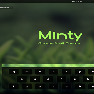
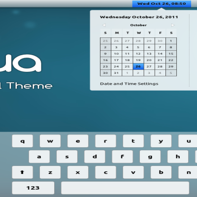
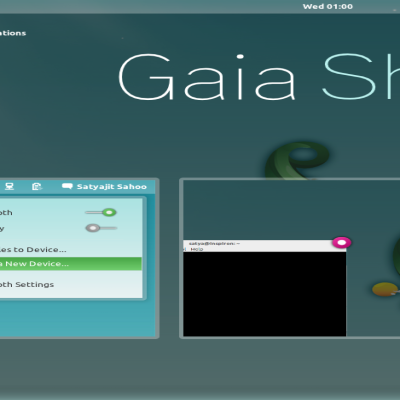
Gnome Theme and Icon Pack
seniDEac


Source (link to git-repo or to original if based on someone elses unmodified work):
v 1.1 Fixed some transparency. Thought it was too much and fixed the active workspace bug (blank as seen in the image).
Please donate! 50c goes a long way!
Paypal : anododai@gmail.com


Other Gnome Shell Themes:
Ratings & Comments
6 Comments
Awesome theme. i use for my fedora :D Thanks for sharing :]
Feel free to mod this theme as desired...It's open of course...
I kind of like it that way. I personnally think bold fonts tend to make themes seem less techy. Also the transparency seems good for the menus etc on my laptop. It might seem like it's too much but I really like the layering effect...
Really my favorite theme so far! If you want some feedback I have jsut a teeny tiny comment. Too much transparency in the panel drop down menus hurts a bit the eye., i.e., it is a bit hard to read especially with a light theme. I changed the transparency from 0.4 to 0.7 in my own setup and now is just perfect! (not sure if I did this consistently with all widgets though...) Perhaps you take this into consideration for future updates. Other than that great theme! and thanks for sharing! Cheers
Hi, A really very nice theme! But i think that font style in gnome-shell.css.old is more pleasant. Thanks!
(updating) Applications -> Categories font.