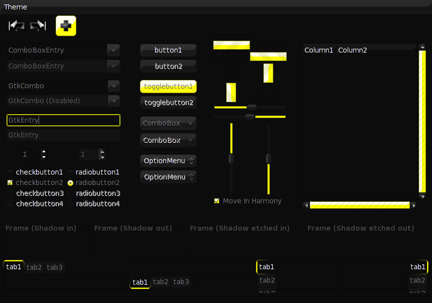
This theme is similar to something I had setup for KDE. I like dark themes. A few issues I have noticed:
1). XFCE menu section dividers are black, maybe they should be something that is aligned with the theme (yellow or gray?)
2). Inactive menu items are too low contrast, I have to lean up to the screen or tilt it to read what they are.
3). When using applications such as thunar or mousepad, the in-window text is very low contrast. This makes it hard to read. The text should be a lighter shade of gray, or slightly off white (it shouldn't be the same color as the application menus, though, to help differentiate between the two.)
4). XFCE Task List & Settings Manager mouseover/highlight. Currently, when an item is highlighted in the settings manager, the text changes to light gray. This should be consistent with the rest of the theme (see mouseover in XFCE menu, text is black).
5). XFCE Pager. It should be possible to see where virtual desktop borders begin/end. Currently they are the same color as the panel.
6). Multiple highlighted items. See XFCE Settings Manager ~> Window Manager ~> Title Font. Currently, if there are multiple list-type selection fields, it is impossible to see which one is active.
7). Active window title colors. IMO, title/widgets should be a little bit higher contrast, perhaps black?
If these issues are addressed, this should be one of the better dark themes for XFCE/gtk apps.
Thank you so much for your suggestions. I just wanted to let you know that I'm working on it, although I don't know how to change all of that especially because I don't have XFCE.
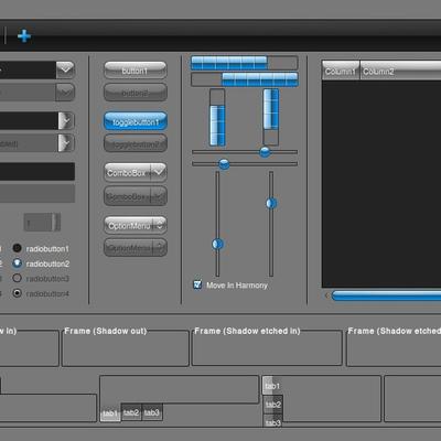
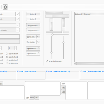
in my opinion, the yellow shines out way too brightly and the contrast is a little too high. maybe you should try to get some more matching colors together


Ratings & Comments
3 Comments
This theme is similar to something I had setup for KDE. I like dark themes. A few issues I have noticed: 1). XFCE menu section dividers are black, maybe they should be something that is aligned with the theme (yellow or gray?) 2). Inactive menu items are too low contrast, I have to lean up to the screen or tilt it to read what they are. 3). When using applications such as thunar or mousepad, the in-window text is very low contrast. This makes it hard to read. The text should be a lighter shade of gray, or slightly off white (it shouldn't be the same color as the application menus, though, to help differentiate between the two.) 4). XFCE Task List & Settings Manager mouseover/highlight. Currently, when an item is highlighted in the settings manager, the text changes to light gray. This should be consistent with the rest of the theme (see mouseover in XFCE menu, text is black). 5). XFCE Pager. It should be possible to see where virtual desktop borders begin/end. Currently they are the same color as the panel. 6). Multiple highlighted items. See XFCE Settings Manager ~> Window Manager ~> Title Font. Currently, if there are multiple list-type selection fields, it is impossible to see which one is active. 7). Active window title colors. IMO, title/widgets should be a little bit higher contrast, perhaps black? If these issues are addressed, this should be one of the better dark themes for XFCE/gtk apps.
Thank you so much for your suggestions. I just wanted to let you know that I'm working on it, although I don't know how to change all of that especially because I don't have XFCE.
in my opinion, the yellow shines out way too brightly and the contrast is a little too high. maybe you should try to get some more matching colors together