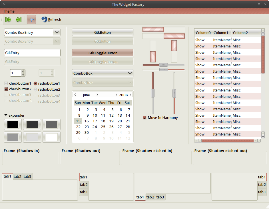
I was a little blunt last time, so this time I'll try actually telling what I don't like - sometimes being productive can be good. :)
Generally, it looks overpolished and overdone, with too many different elements each grabbing too much attention instead of working together.
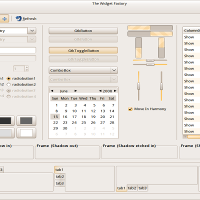
First, the progress bars are what strikes me the most. Both massive borders and a massive 3d-effekt - I would say tone one of them down. It was what I didn't like in your previous theme, where you used them as scroll bars instead.
Second, the scroll bars here are actually really, really nice. Much more subtle while still showing off the interesting progression of murrine. The double-arrows at both ends are too much though. I'd either remove one at the top and keep two at the bottom, keep just one double-arrow at the bottom, or just use a single arrow in each end.
I like the buttons here as well. I think they will look better if some other parts of the theme is changed.
The reddish top bar doesn't fit very well, I think.. Or perhaps it's the window decoration. I think it would look best if it matched the window in all cases.
Giving a bit of a lighter hue to the check- and radio buttons would be nice as well, I think. It's a bit too dark.
Hope that's a bit more helpful.


Ratings & Comments
4 Comments
I was a little blunt last time, so this time I'll try actually telling what I don't like - sometimes being productive can be good. :) Generally, it looks overpolished and overdone, with too many different elements each grabbing too much attention instead of working together. First, the progress bars are what strikes me the most. Both massive borders and a massive 3d-effekt - I would say tone one of them down. It was what I didn't like in your previous theme, where you used them as scroll bars instead. Second, the scroll bars here are actually really, really nice. Much more subtle while still showing off the interesting progression of murrine. The double-arrows at both ends are too much though. I'd either remove one at the top and keep two at the bottom, keep just one double-arrow at the bottom, or just use a single arrow in each end. I like the buttons here as well. I think they will look better if some other parts of the theme is changed. The reddish top bar doesn't fit very well, I think.. Or perhaps it's the window decoration. I think it would look best if it matched the window in all cases. Giving a bit of a lighter hue to the check- and radio buttons would be nice as well, I think. It's a bit too dark. Hope that's a bit more helpful.
I will see what I can do for you.
luks pretty nice Paul! rating it up mate!
Thanks. Doesn't look like everyone agrees though.