

Industrial-Sahara
Six


Source (link to git-repo or to original if based on someone elses unmodified work):
*** Initial release ***
Based on the Mist-Engine
I'm fine with it, are you?
*** Second release ***
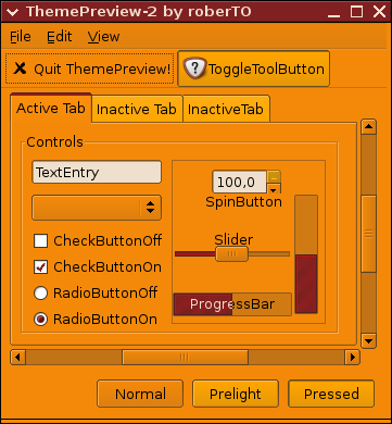
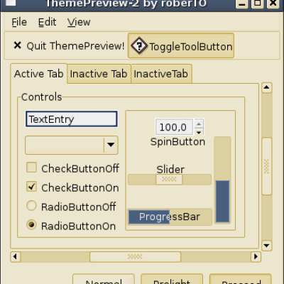
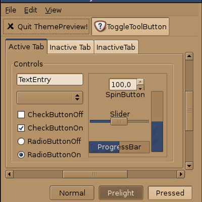
Changed to Clearlooks engine and tuned the colors a little - no more blue but a fine corroded iron red now. It even works in Open Office and Firefoxnow. Well, sort of...
*** 2.1 ***
Well, i'm dumb. Removed some control-contrast colors and tweaked a little more. Screenshots 2 and 3 are now outdated. I will replace them soon.
*** 2.2 ***
More color tweaking. New screenshots.
*** 2.3 ***
More color tweaking, especially menu prelighting, including Firefox. See screenshot 3 for details. I also fixed the tooltips, you can read them now ;-)
*** 2.4 ***
Fixed the statusbar colors. You will not see it in the screenshots, they are still 2.3
*** 2.5 ***
Changed prelighting colors in the menus and the sunken menu is back due to popular demand ;-) Focus is now working in Firefox. Updated the screenshots. Finally, i removed a lot of clutter in the gtkrc-file.


More GTK2 Themes from Six:
Other GTK2 Themes:


Ratings & Comments
18 Comments
I think it looks cool.
Just a suggestion, I think if set the "sunkenmenubar" to 1, it would look better. At least I prefer this way. I think is an interesting theme, and I find it quite usable. Keep up the good work.
Thank you! The superactiontheme had the sunken menubar up to version 2.2 but it is really not working out so fine with OOo. OTOH, OOo is a bitch anyway and it is completely beyond me how i can influence the color of the selected text in OOo with Clearlooks settings. This and the combobox appearance are the two things i'm currently trying to figure out. Too bad that Clearlooks is so badly documented.
You can always ask on the mailinglist. :) I'm afraid that not much can be done about OO.o though, that's mostly a case of OO.o having to improve it's native theme support.
Hi, even if i like "crazy themes", this is too much. My suggestion (well nothing concrete:), I like lots of colors, contrast, and - is it possible to make a different color strip for incons in menus? (I mean like vertical bar with a different color then the "text" area of menu) - and so on. Btw - I liked the idea, that root's app would have Robotorch theme to make them more contrast than the "users" ones. Keep on good work! Thx
Well, i like to keep my themes clean, simple and, even if it sounds funny considering the superactiontheme, easy on the eyes. And to be completely frank, i really never understood what the vertical icon background thingy should do and found it boring and distracting at the same time. I therefore fear that you will not see it in my superactiontheme Robotorch. Besides, i don't know how to code the vertical bar in Clearlooks and i'm too lazy to scrutinize the source to find out. Regards
Call me George Foreman! I can't help myself, i love this theme. So much, in fact, that i'm posting to myself :-)
This is... very Orange. Not bad, but not my favourite colour.
Very perceptive ;-) Thank you anyway and look out for my new Sugarshack theme, coming soon. It will be brown. Have fun.
I actually LOVE this! Thank you.
No, thank you!
I have a sudden craving for carrots ;)
LOL, where's da wabbit?
but it's gnome, isn't it? So no "good" vote from me here, you might put it on gnome-look.org. Keep up the good work.
sorry, i'm stupid - i just realized the cross site section ;-P.
For a moment you had me worried. All is well, all is good.
Now, who do I send my eye doctor bills to? That hurt... ;) Cool idea about having something as obvious for root-run'd apps, but who in the heck would allow other users to run root-pwd processes? :)
Obviously this is not for the faint of heart. You need super-cow-powers to employ it and some old-school-hardware you like to tinker with ;-)