Description: I liked the Firey Dark metacity theme by Themer but I coudln't find a GTK theme that I liked to go with it. I decided to create my own.
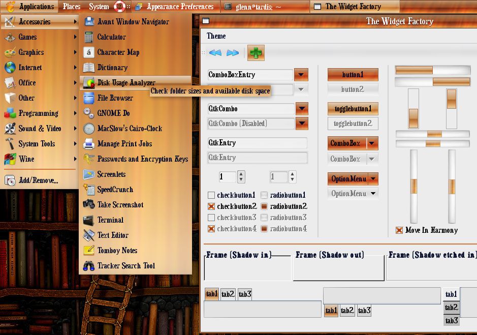
I used the Water Vapor GTK Theme as my starting point, and drew some of the graphics from the Firey 1.0 and Firey Dark metacity themes. Other graphics are my own creation. As the screenshot shows, they go together quite well.
Since this is my first effort at creating a GTK theme, I'll be tweaking it as problems are spotted.
The font used in the screenshot is Duality.
Firey Dark Metacity Theme: http://www.gnome-look.org/content/show.php/Firey+(normal+and+dark!)?content=64584
I think you have a really good theme here. I love the glossy look of the menus. I agree that the font might be the reason for the bad voting, but that can be easily fixed by the user.
I was wondering if the theme would look more harmonic if you changed the colors of the windows to a warmer one that matches the panels and the border better. Beige, perhaps? Definitely not gray.
I hadn't noticed this one! :p I think your getting voted down because of the fonts you chose. Personally, I think the theme would do a lot better with some less huge, bold, messy ones


Ratings & Comments
2 Comments
I think you have a really good theme here. I love the glossy look of the menus. I agree that the font might be the reason for the bad voting, but that can be easily fixed by the user. I was wondering if the theme would look more harmonic if you changed the colors of the windows to a warmer one that matches the panels and the border better. Beige, perhaps? Definitely not gray.
I hadn't noticed this one! :p I think your getting voted down because of the fonts you chose. Personally, I think the theme would do a lot better with some less huge, bold, messy ones