This theme's never going to make it if you use the Aurora engine. It's rated one of the worst out there. It looks good, but it's slow and doesn't allow some features that others do.
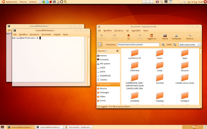
I love the orange Elementary icons (and by DanRabbit's reaction I think they might become the norm for Elementary :P), but I don't like the peach-coloured GTK style. I'd probably prefer a similar blue one.
I'd like it if there were many color schemes to this theme.
The overall feel of the widgets is nice, good use of Aurora.
Mainly, I think having too much saturation is hard on the eyes in the window. I tried looking at that for a long time and it felt like I was staring at the sun.
I think white, grey, black, and blue variants would be really cool.
I'm with SaikoBee -- even though orange is my favorite color, I'd cut the saturation down quite a bit on the peach-colored widgets, too. The orange highlight color is fine, though, which I think would be a refreshing change for Ubuntu's default colors instead of the yellow and copper.
Just lay off the saturation a bit on the widgets and I think you'll have yourself a winner. :-)
Hey there,
I do like the colors you picked: it's a smooth blend, easy for the eyes.
It's following a trend we've seen before: we're moving away from glossy, aqua themes to softer, flatter inspirations.
I couldn't help but noticed that the buttons you used on the title bar are a little like Vista's. Is it intentional?


Ratings & Comments
8 Comments
This theme's never going to make it if you use the Aurora engine. It's rated one of the worst out there. It looks good, but it's slow and doesn't allow some features that others do.
Very nice !
I love the orange Elementary icons (and by DanRabbit's reaction I think they might become the norm for Elementary :P), but I don't like the peach-coloured GTK style. I'd probably prefer a similar blue one.
I'd like it if there were many color schemes to this theme. The overall feel of the widgets is nice, good use of Aurora. Mainly, I think having too much saturation is hard on the eyes in the window. I tried looking at that for a long time and it felt like I was staring at the sun. I think white, grey, black, and blue variants would be really cool.
I'm with SaikoBee -- even though orange is my favorite color, I'd cut the saturation down quite a bit on the peach-colored widgets, too. The orange highlight color is fine, though, which I think would be a refreshing change for Ubuntu's default colors instead of the yellow and copper. Just lay off the saturation a bit on the widgets and I think you'll have yourself a winner. :-)
where did you get the orange elementary icons??
Hey there, I do like the colors you picked: it's a smooth blend, easy for the eyes. It's following a trend we've seen before: we're moving away from glossy, aqua themes to softer, flatter inspirations. I couldn't help but noticed that the buttons you used on the title bar are a little like Vista's. Is it intentional?
Maybe some screen shots of the menu and some common apps? Looks nice, though.