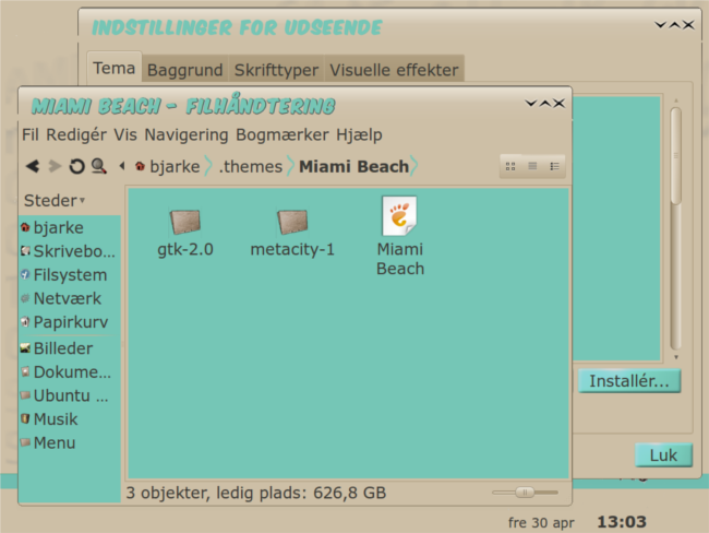
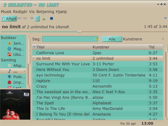
I think this would look better with the standard white text background and using the teal as a highlight color. The menus I could live with as they are now, but I'd prefer tan for the background and teal for the moused-over menu items.
I think you've got a good basic idea going here, but it could stand a little bit of fine-tuning, at least to my eyes.


Ratings & Comments
3 Comments
I think this would look better with the standard white text background and using the teal as a highlight color. The menus I could live with as they are now, but I'd prefer tan for the background and teal for the moused-over menu items. I think you've got a good basic idea going here, but it could stand a little bit of fine-tuning, at least to my eyes.
Thank you for your input.. I might consider your idea for the menu. But white text on a light background... I'm not too sure about that.
Now I have to swap out my hoody, for a nice palm print short sleeve shirt. And maybe add a couple of gold chains. ha ha Looks cool.