


Ambiance-Humanlooks
scarrs


Source (link to git-repo or to original if based on someone elses unmodified work):
v 0.9
-Changed gtk theme and mist-human to ubuntu gutsy/feisty colors
v 0.8
-Use of Mist engine removed
-New metacity theme
-Text entry highlight, scrollbar coloured, notebook borders coloured, etc.
v 0.7
-Menu highlight and progress bar redesigned again (old menu highlight renamed to menulight-old.png)
-Added gradient color to metacity theme
-Metacity bug reported by denisesballs (thanks) solved.
v 0.6
-New tabs design
-New progress bar
-New menu highlight
-Removed stock icons
v 0.5.1
-Corrected a "Overlay image options specified without filename" bug
v 0.5
-Changed Warty human colors to Hoary&Breezy human colors.
-Changed metacity theme with white icons.
v 0.4.1
-Corrected scrollbar borders.
v 0.4
-Changed default color. Now the desktop is more clear and the unfocused buttons are a bit more visible.
-New scrollbar with brown borders highlight.
v 0.3.1
-Corrected a few bugs when window is unfocused (restore button and a window black line).
v 0.3
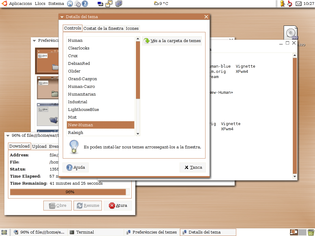
-Changed theme name to New-Human.
-New metacity theme based in Pilgrim with Human colors.
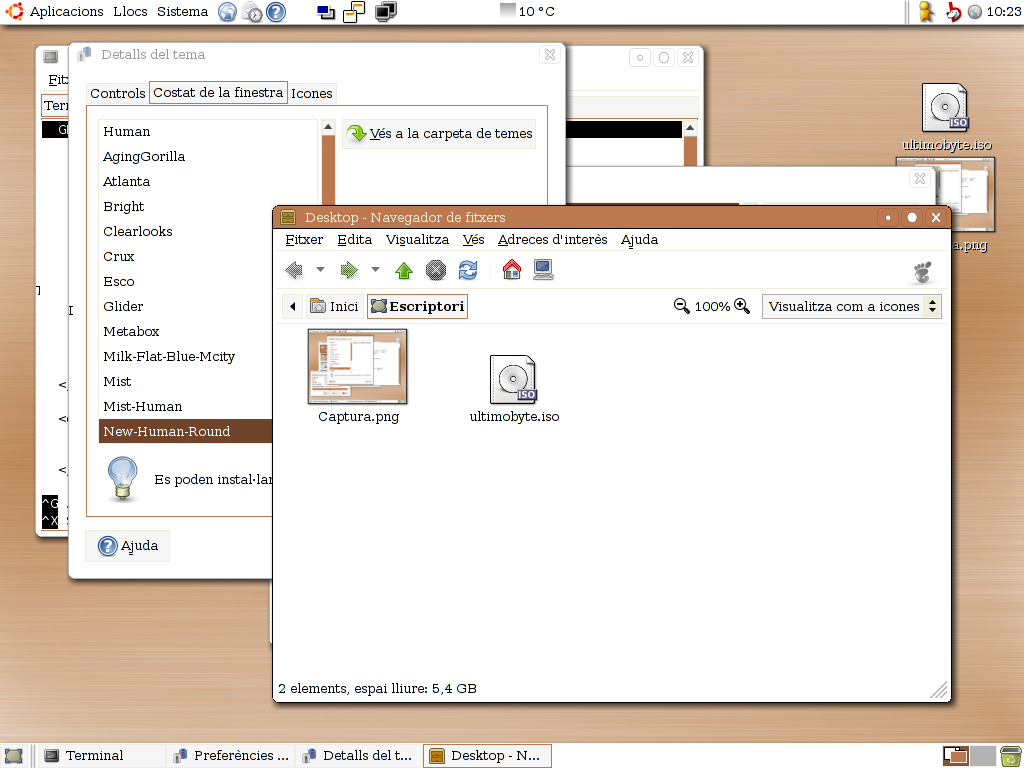
-Old mist+systemg metacity theme is named as Mist-Human
v 0.2
-Added a index.theme file.
-Added Suede stock icons (http://www.gnome-look.org/content/show.php?content=13430).
-By default, Human icons theme are used. If you are using another Linux distro, you can use another icons (I recommend Suede).
-New metacity theme. I changed Mist window icons (close, maximize, minimize) with others similar to SystemG (http://www.gnome-look.org/content/show.php?content=19800).


Other GTK2 Themes:


Ratings & Comments
21 Comments
.
I miss the old rounded metacity with the distinct but simple border and big, easy to find buttons in the top right! Just my feelings about it. Maybe it was a speed v. design fight that speed won?
Here: ftp://ftp.oronetes.net/pub/temes/New-Human-Round.tgz
No offense, but I find the title of this theme rather misleading - since Gnome's new default engine is Clearlooks, and this goes in an entirely different direction than Clearlooks & Clearlooks-Cairo.. That having been said; nice job.
It's the metacity that has the weird bug i posted above ^^ cuz it does it with other gtk themes.
Yes, it's a metacity bug, I'm working to solve it:) Thanks.
I have to say, I miss the clean and crisp look of the 0.5 version's menu highlight and progress bar. The menu highlight just looks unpolished to me and I really miss the 0.5 version. Great theme, I use it as my default (with humility icon set) and I really hope you reconsider these last design changes.
You can try with renaming ~/.themes/New-Human/gtk-2.0/progressbar-old.png to progressbar.png to use a more cleanest progressbar.
K, so there's something wrong here. I'm not sure if it's the gtk theme or the metacity, but the unactive window shows some random character on the left border of the window. I've taken a screenshot here: http://jessejoe.com/images/theme.png
K, so there's something wrong here. I'm not sure if it's the gtk theme or the metacity, but the unactive window shows some random character on the left border of the window. I've taken a screenshot here: http://jessejoe.com/images/theme.png
Excellent !!!
This is actually really cool! Us Ubuntu users who actually like the Human theme, doesn't mean we have to be plain. Not so with this theme! Thanks a lot.
wow brown.
Hello, please upload your work also to http://art.ubuntu.com/ Thank you!
It's my default :)
Hmm, after using it for a few days i think it would be really nice if buttons had a border that was a bit more visible (Same for list column headers, like in evolution). Maybe the same border that notebooks have?
Thanks for your suggestion, you are right, the unselected buttons are a bit difficult to see, I'll modify it. Thanks again:)
This is so nice, i couldn't event resist posting a screenshot! http://gnome-look.org/content/files/20016-mist-human-chiro.png - Rob
I have been trying to tweak Human with Ubuntu color. This one is a pure gem. The only thing I find wrong is that the brown highlight for icons besides a menu item, also appears when there are no icons, causing it to overlap on text. I don't think there will be a workaround for that but cool anyways.
in debian, human style rocks! :D How did you get the shadows? it's xorg? Thanks, for your theme ;)
Yes, the shadow is with xorg. I installed it with ubuntu hoary repositories in ubuntu warty. Thanks for your comment, I'm glad you like the theme:)