

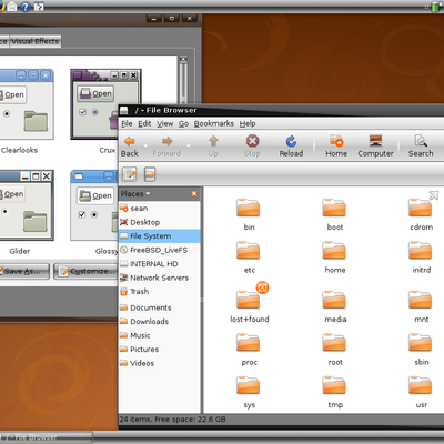
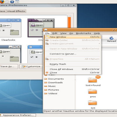
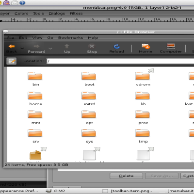
Simply Blue
Smlymn707


Source (link to git-repo or to original if based on someone elses unmodified work):
--1.8.5--
*New Panel
*Improved range png's
--1.8.2--
*Tabs blend better now
*Radio buttons upgraded
*scrollbars changed (tell me which u like more these or the old glassy ones)
--1.8--
*an all around improvement to the theme. (Still working on radio buttons)
--1.7--
*new menuitem; tell me if u like
*improved scrolltrough
*slight change in menus
*new horiz lines
--1.6.4--
*changed active panel and window button pixmaps. Panel button idea inspired by windows 7.(it does not have a pressed in look.)
--1.6.3--
*went back to old scrollbars
*improved check and radio buttons
--1.6.2--
Sorry it took so long lots of new stuff
*tell me if u like the scrollbars!!!
--1.6--
*new panel (inspired by xp)
*rounded scrollbars
*larger menubar item
*improved tabs
*new arrow prelights
*cool menu/menubar effect
*new range buttons(need improvement)
*improved check-radio
*Added button effect
--1.5.3--
* new new normal and prelight buttons
* improved checkbuttons (will be working on radiobuttons now)
* narrower scrollbar trough
* new panel buttons
--Think I may have fixed the bugs everyone is talking about. Tell me if it worked. Thanks!
--1.5--
*new name
*new panel menubar
*improved buttons
--1.4.2--
*Menubaritem has a blue glow/shadow
*Rounded improved menu item.
--1.4.1--
*New active prelight button
*Improved Scrollbuttons
*new Menubaritem (actually the original)
--1.4--
*Improved buttons; Prelights sort of glow
*Same Toolbar but inverted
--1.3.4--
*lighter menubar (not very noticeable)
*new menubar item (comment please)
*white prelight text
--1.3.3--
*darkened button outlines
*improved toolbuttons
*new active panel item
*new button(pressed)
--1.3.2--
*better Panel items
*more even panel
*NEW menubar item
--1.3--
*new scrollbar buttons
*improved menubar item and menu items
*much better tabs
*new list headers
*new radio buttons
--1.2--
*new toolbar
*improved menubar and new menubar items
--1.1.5--
-minor changes-
*new check buttons
*new Combo buttons(blends better)
--1.1--
*New Panel Bg (Tell me if you like.)
*New Panel Effects too.
--1.0.1--
*New Menu Bg
*New Menu Item
--1.0--
*New Buttons (Tell me what you think, please.)
*Great New Progress Bar
*Much needed new tabs!
--0.6--
*Nothing all that great just new _menuitems
-- 0.5 --
* New Menubar-Item
* Modified Buttons
-- 0.4 --
*Much improved scrollbar
*New Menu (same color as menubar)
-- 0.3 --
* New scale
* New Toolbuttons
* New Checkbutton
-- 0.2 --
* New menubar and toolbar


More GTK2 Themes from Smlymn707:
Other GTK2 Themes:


Ratings & Comments
59 Comments
If I were thee, I would have made the text color on the light blue highlights black (or possibly dark blue) instead of white. The white doesn't seem to contrast very well with that shade of blue, at least not on my monitor, anyways. Other than that, nice work! :-)
I love it :) Keep up the good work.
Truly beautiful, but personally I prefer the old panel background :). Anyway - definitely GOOD!
hi i like your gtk theme =) can you tell me want metacity theme you use in the screenshots ???
Its just human.
And don't matter the ratings - the light themes seems to be not high rated here. I know that, and I want to say that we wait for the next release - again the rating means nothing. I know that. Many people here thing, that the rating system on the site needs improvement. And sorry for my not so good English - I hope you understand what I wrote :)
Hi, I just want to say, that it's very good theme, but it needs some improvements. As the post above says - there are a lot of missing pixmaps. You can improve the theme by adding them, or editing the code. Anyway, it's a very good theme and it has potential to be a great theme. If you don't have much experience with GTK programming - use one of my themes to get the code (the last one was inspired from this theme , and the code is very complete - just took it , and replace my pixmaps with yours - here is my theme - http://www.gnome-look.org/content/show.php?content=97886 ). Otherwise there are bugs in the main menu and the FUS applet (just get my theme and replace the pixmaps ). I voted good, since there are good idea in this stuff , and I'll wait your next release, because I like it very much. Cheers and greetings :)
The latest version 1.6.1 looks great! You're really improving this theme by leaps and bounds. I would like to see a solid check-mark in all check-boxes globally across the theme; instead of a filled box to denote that it is checked as is the case in some cases. Also, some progress bars are gray instead of blue. In 'Transmission' (the bit-torrent) client for example, download progress bars are dark gray. On a gray background, it's hard to make out the progress with a quick glance. Other than these couple niggles, this theme is looking really great!
Fantastic theme, but I'm getting a strange error - "This theme will not look as intended because the required GTK+ theme engine " is not installed." That's not a typo btw, that what the error says. I'm seeing it quite a bit these days actually. If I've done something wrong please let me know. The theme seems to be working regardless anyway.
I have heard that once before, and i dont kno what is wrong, the theme only uses pixmap...
# This prevents Sodipodi from crashing while opening the # Object-Style dialog. style "unstyle" { engine "" { } } I guess these lines cause the "not as intended" warning. But other than that, it complains about a lot of missing pixmaps, try launching gcalctool on terminal and better watch these file paths.
removing this causes a lot of pixmaps not to work
Just change in your gtkrc all: engine "" in engine "pixmap" (or pixmaps) ;)
Thanks for the help!
No problem mate ;)
It is not Aero at all. I must admit the name itself withheld me initially to go and see, but it looks pretty nice. Voted good. Could you make the menu bar items, without a black line around them, so unselected programs kind of integrate with the application bar? The selected menu option in the openSUSE Slab Menu looks too dark and isn't as nicely shaped as the other buttons. Perhaps you could work on that?
As an addition to the above: If you hover the mouse over an application the selection becomes square. I like that, and that is what I tried to express in the above comment, hope that this makes it more clear. :-)
I should call it IceLinux ;) good work, I voted up.
I think its getting voted down just because of the name and its Vista connotation. Maybe some folks don't realize this looks nothing like the Vista Aero interface(I actually think it looks prettier). Good job.
I second that comment. Good looking theme, don't be discouraged by the haters.
i think it is a good work here. one can see how it is growing, hard work and timee of yours... cool.. now i would try to remove the white shadows on insensitive objects/text/icons.. instead they could be greyed out.... the rest will find its way with the creators muse.. bye
Sorry i tried getting rid of the shadow but had no success.
Never thought I would use an aero-theme again but you prove me wrong :) It really is beautiful. Keep up the good work
What's with all these windows derivated themes...this is Linux...make something original and leave the shitty windows behind.
Well I would like to see a comment that is original. It would not matter what my theme looked like, as long as it is a name that is associated with Windows I get people like you commenting like crazy. Obviously I do not support Windows or I would not be on "GNOME"-look.org. And if you look at the theme it does not resemble Windows whatsoever.