


I'm a little tired from rounded themes, so I made this stuff.
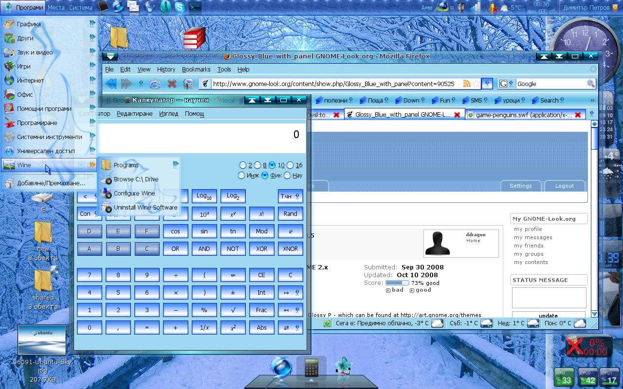
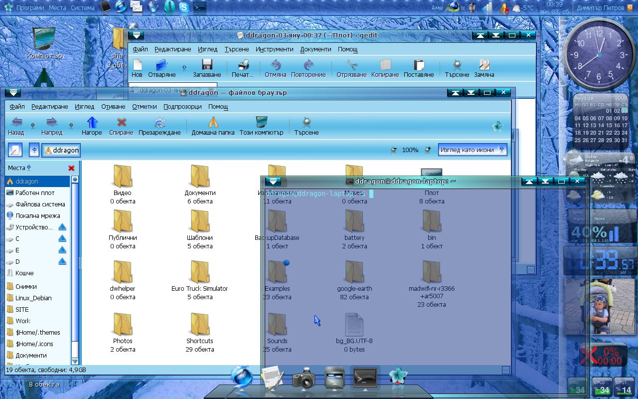
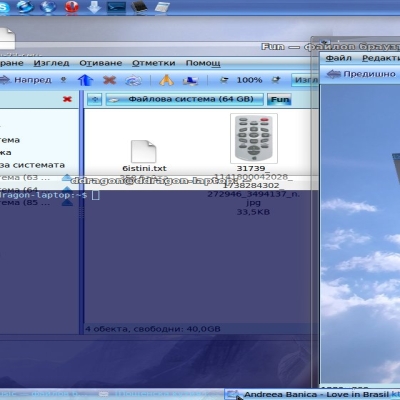
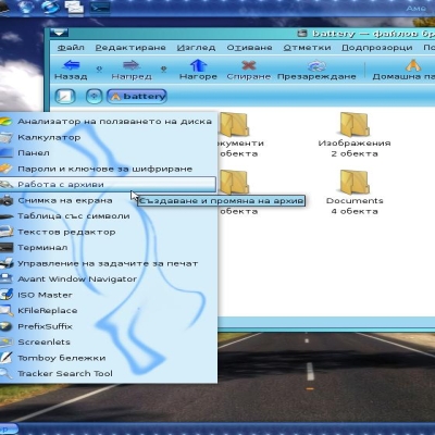
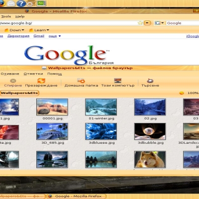
Look at the screenshots - if you like it - download

NOTE : By default, the theme include decoration of the panels.
If you don't like in, just run the script that's in the ZIP file, (make it executable if it don't start), and it will remove the panel decoration!!!
If you want the panel back - run it again .
INSTALL :
extract the ZIP that you download, and choose System->Preferences->Background, then choose Theme tab, then click the Install button, and navigate to the TAR.GZ file( ddragon's GTK Blue-rounded.tar.gz) OR just extract ddragon's GTK Blue-rounded.tar.gz in your /HOME/YOUR_NAME/.themes directory (it is hidden - to see it, press Ctrl+H) .
Hope you like it
Best regards .
***********************************
This archive is not the theme itslef - you need to extract it first, and then to install ddragon's GTK blue - squared.tar.gz theme
***********************************


Ratings & Comments
9 Comments
"It looks dated, amateurish and it is too blue. " ??? Dated?? Sorry, but I think it looks just fine! Amateurish??? Well, nope, it's a really good work. The icons are big enough and fit smoothly in. The Text is the right size and color to be easily read. The background graphic is nice and smooth, without being to flashy. So sorry to disappoint, but it looks like the good work it is! Too blue?? Ok, this one leaved me a little dumbstruck, hey,where are your glasses?? I like it, it's a great theme!! Thank you for sharing!!
:) Thank you man, the people like you are the only reason, to continue upload here , and I'm glad to see one of them in your face. Btw the theme is updated 3 times since I post it here, but because of the low rating, I did not think to update here. If you want it, just send me a message with e-mail :) Thank you again.
because It looks dated, amateurish and because is too blue. I am designer - so I think I have my right to affirm those things. Also the author has it's on his right to make it so. The real point is - someone think to do something different. Also - for a negative vote - we need some "professional" explanations - "it looks dated" is not an explanation - many artists like to do art in "classic old style". "amateurish", well we all are amateurs, from top to down on this earth - believe-me, else why intelligent peoples kill peoples, why our planet are in crisis ? or why in our days we still need gas for cars ? - because of professionals for sure. At least I found a "super-hyper-mega-profi" reason to vote up - because I can.
Thank you very much :) Every time I see thinking people like you makes my day shine even more :) Thanks again for the comment :) Cheers.
The theme is nice, I like it ^_^
Thank you very much :) I'm glad to share it with you and people like you :) Enjoy, and if you have questions or suggestions - just tell me :) Cheers .
It looks dated, amateurish and it is too blue.
First of all thanks for your comment. I think, everybody has own preference about what is good, so ... Secondly - you may think that it's amateurish, but I'll answer - Your opinion is amateurish ;) And I think you don't know what is gtk and how to write the code - 100% :) About the theme - I don't thing there are bugs - it's very complete theme. About the colour and style - you are right to yourself, don't think the others are like you :) I created his theme ( and use it more than 2 months for me) , because there are only BLACK and GREY themes for gnome. If somebody ants something different .... guess what? There isn't so much choice. So ... I posted detailed screen shots - if you don't like it - just don't DOWNLOAD it.No one force you :)
And that was the point - TO BE BLUE - LOOK AT THE TITLE :)