


Ambiance-Humanlooks
scarrs


Source (link to git-repo or to original if based on someone elses unmodified work):
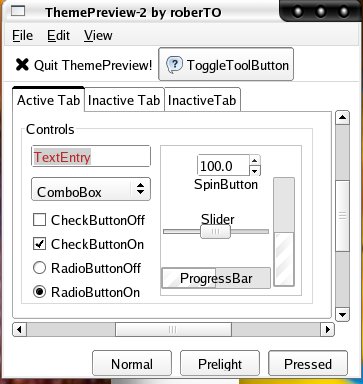
May 12 2005:
-uploaded new screenshot
May 11 2005:
-made highlighted text easier to see -made strip on tab of selected window easier to see
-fixed an error that many gtk apps were giving related to clearlooks-frame-title
TODO (as of May 11):
-make the checkboxes under the sounds menu in gaim (and any other program with a similar problem) the same color as normal checkboxes.
-figure out why gimp doens't work so I can upload a screenshot
Last edit:
Made checkboxes and radiobuttons easier to see.
Made prelight settings a light gray so it's easier to see what you have highlighted in menus.
todo: need to figure out how to set the color of the strip on top of tabs in multi-tab applications. If anyone knows, tell me!


Other GTK2 Themes:


Ratings & Comments
9 Comments
what was the error that many gtk apps were giving related to clearlooks-frame-title and what's the fix? Remove style "clearlooks-frame-title" from the gtkrc???
Yeah, I just removed the class setting. It was just some random error, I had no idea what it meant.
if I remove/comment out frame-title from the gtkrc in Clearlooks-Edge http://www.kernow-webhosting.com/~bvc/theme/gtk/clearlooks/other/Clearlooks-Edge.tar.gz then the checkradiobutton doesn't work. I haven't tried others and haven't had time to look into why.
I set checkradiobutton myself, so I didn't notice a change at all.
yes, but you do not have all my additions and one or more is conflicting, I guess....I just don't know which one.
Very nice theme, but I actually liked the "old" version better. The light-gray menu highlighting in the new one is nice, but the new color for highlighted text is almost invisible on a lot of webpages, particularly phpBB forums - you can't tell the difference between highlighted and unhighlighted text.
That's one thing I'm having a problem with. I'm just starting to learn about how to specify colors for, say, the progress bar and have another color for everything else and I'm failing miserably :P.
You might want to take a look at one of my themes using the Clearlooks engine, e. g. Robotorch, i documented them as good as i could, especially which setting influences what color in which location. Other than that: oh yeah, another bright theme, yay.
I like it.