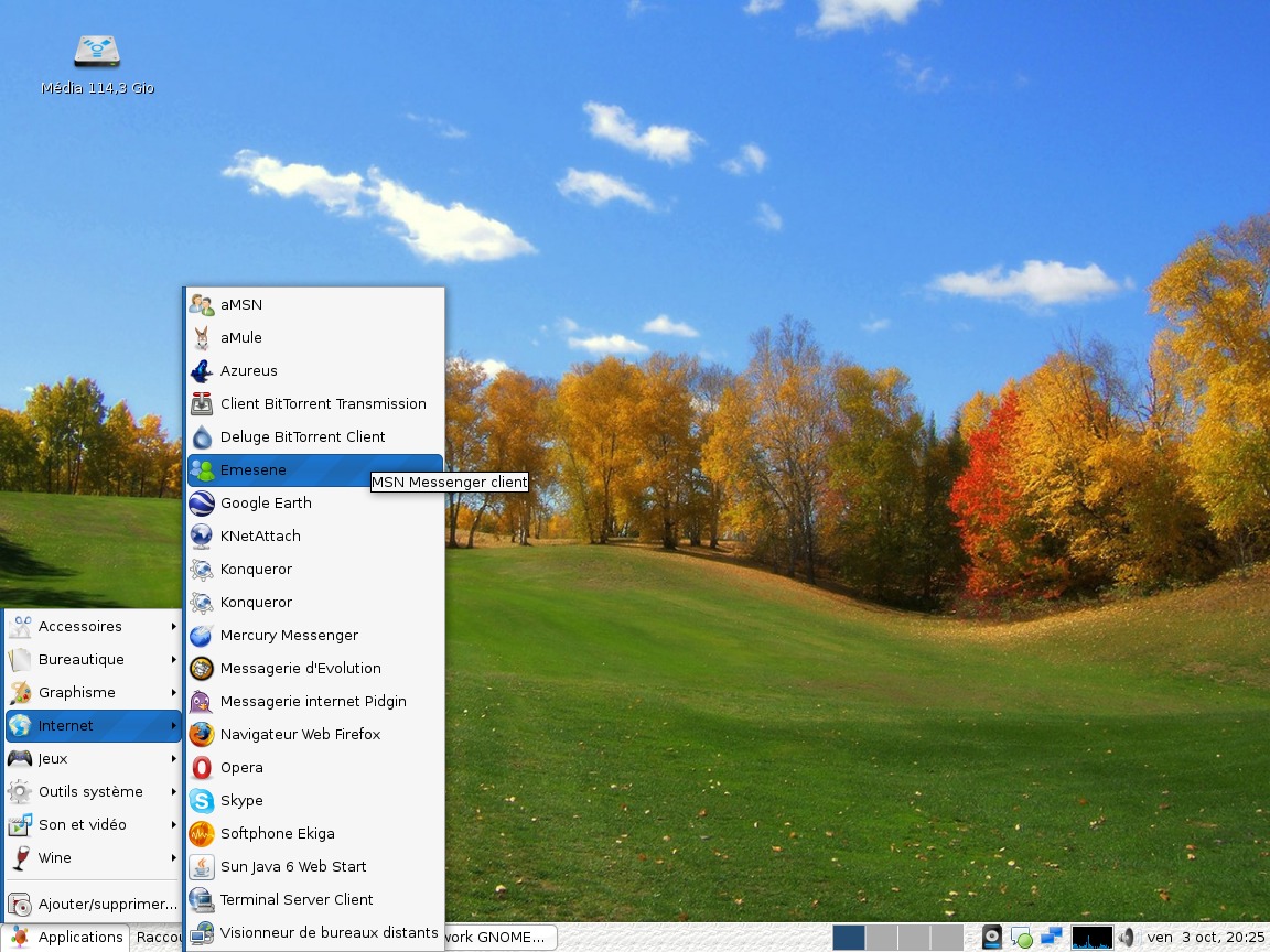
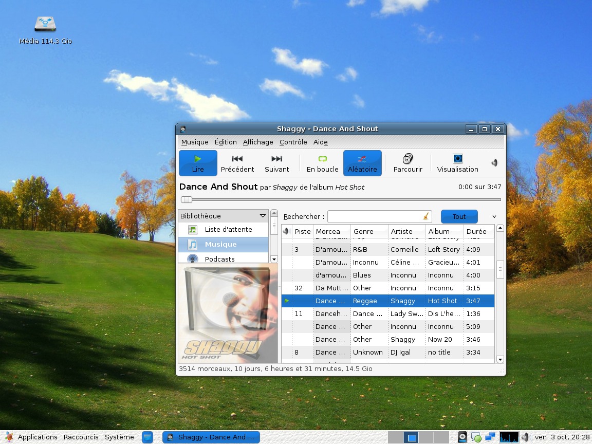
On your selected and moused-over items, I think this theme could use a little more contrast. In your first screenshot, where you have the blue background in your menus, I think the text on it should be white, not black, and of course, ditto for the buttons shown in blue in Rhythmbox in the second screenshot.
Other than that, great theme!


Ratings & Comments
2 Comments
I agree with fredbird67. White on blue is better for the sake of visibility. Overall, it's a pretty good simplistic theme.
On your selected and moused-over items, I think this theme could use a little more contrast. In your first screenshot, where you have the blue background in your menus, I think the text on it should be white, not black, and of course, ditto for the buttons shown in blue in Rhythmbox in the second screenshot. Other than that, great theme!