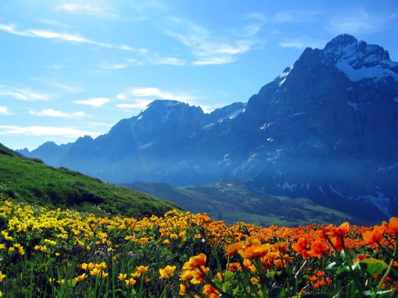
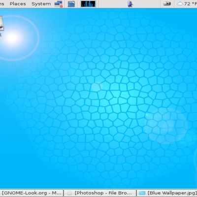
Description: a GIMPed version of tardigrade's wetterhorn background. its not very natural or realistic i guess, but i thought it looked pretty good. slightly improved from 1024x768 version and 800x600 preview, other than just being bigger.
thanks to tardigrade for the beautiful original, hope this is an improvement.
Perhaps not "realistic" but I definately prefer the modification. I never downloaded the original Wetterhorn, mainly because it felt skewed in balance. Giving the flowers a gradiant has altered the balance to the center.
And I know that the above sounds like B.S. so I'll rephrase slightly - yellow has a higher weight to the brain than red. The colour balance is now shifted to the left, but the spatial balance is still shifted on the right, making the photo overall balanced.
Ah, that still sounds like B.S. Oh well, my point is this:
Nicely done, I like.


Ratings & Comments
5 Comments
I like this. It is a good change in colors.
Perhaps not "realistic" but I definately prefer the modification. I never downloaded the original Wetterhorn, mainly because it felt skewed in balance. Giving the flowers a gradiant has altered the balance to the center. And I know that the above sounds like B.S. so I'll rephrase slightly - yellow has a higher weight to the brain than red. The colour balance is now shifted to the left, but the spatial balance is still shifted on the right, making the photo overall balanced. Ah, that still sounds like B.S. Oh well, my point is this: Nicely done, I like.
Very nice work. Very nice indeed. ORBiTrus it is time to return to the collective.
Heh. Wait [... a long time] and see ;) So I'm always late. What of it?
thank you very much! im glad you like it