


Ambiance-Humanlooks
scarrs


Source (link to git-repo or to original if based on someone elses unmodified work):
1.2.1 knocked out a few little issues that were bothering me, added the Emerald.
1.2 Slightly lighter again, crunched down the whole thing, de-striped the progress bars, etc.
1.1 Unified and compact menus, sharper corners, darker overall, lighter buttons, goofy stripes gone in most areas.
1.0 first release


Other GTK2 Themes:


Ratings & Comments
8 Comments
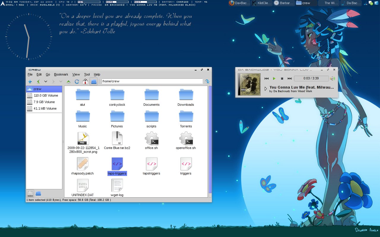
Nice blue, and diggin the Tolle quote, man! Read his books? BTW, I gotta say, I love your avatar pic! It's Satan, from The Adventures Of Mark Twain :-D
Thanks! That quote actually is part of my conky, it's a script that pulls quotes from tinybuddha.com and then plops them on the desk. I'm not too familiar with Tolle, sadly.
Nice, clean, compact theme. Simply beautiful
Thanks! There are a few more things I'd like to do, but I'm not positive they can be done solely with the Murrine engine. Plus I probably need to learn how to make a metacity theme so the GNOME folk aren't left high and dry.
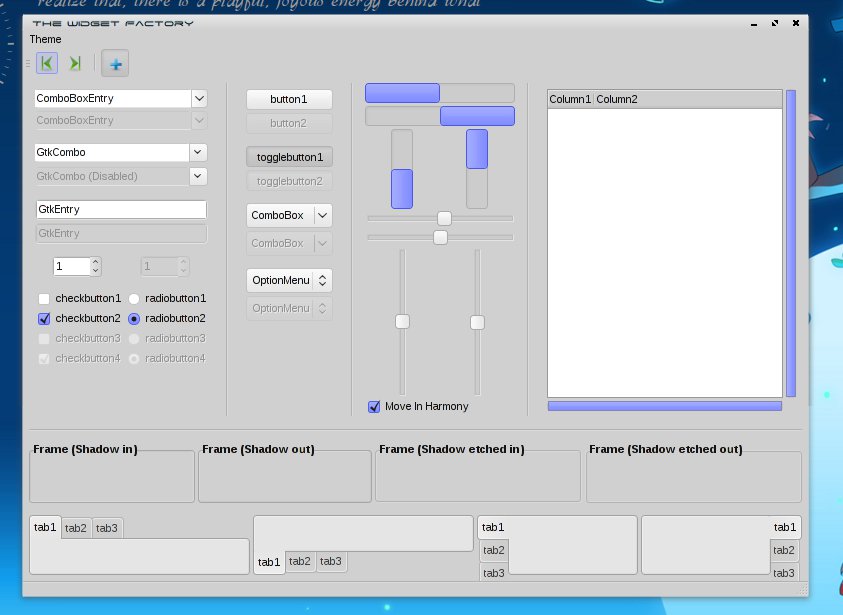
to be honest, at first glance, it doesn't seem too amazing... but then I noticed the slim scroll bars which really look good and give this theme a bit of uniqueness. good job, and keep it up!
Yeah the widget-factory screen doesn't do it justice, especially in thumbnail form. It's just a simple theme that doesn't do anything fancy. Stays out of your way and looks smooth. Thanks for the feedback!
Team Ramrod ftw! Nice one man. Rated good Daisuke
Thanks! I'm no GTK expert so I'm not sure how much I can mess with the geometry, but if there's any way to improve it let me know.