


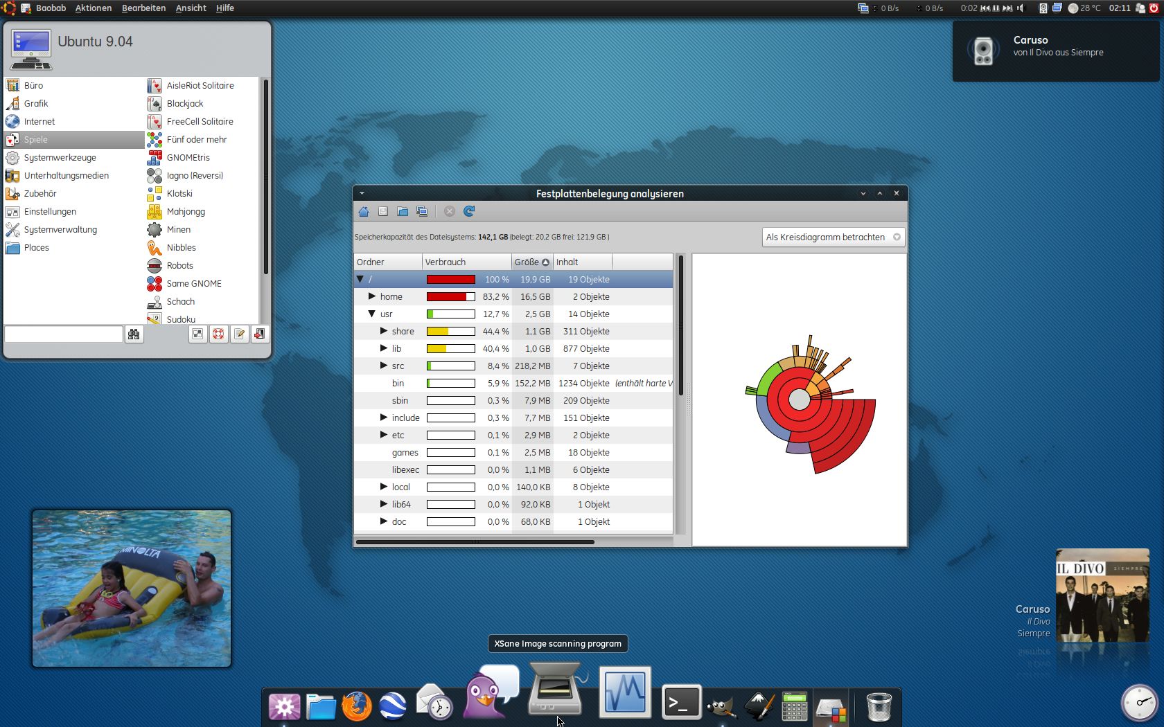

For Ubuntu-Users I can recommend Humanoid-blue what fits well with this theme:
http://schollidesign.deviantart.com/art/Humanoid-nearly-Human-123984041


Source (link to git-repo or to original if based on someone elses unmodified work):


More GTK2 Themes from schollidesign:
Other GTK2 Themes:


Ratings & Comments
10 Comments
nice !!!
Hey, thanks for this neat theme. I am familiar with lassekongo's impressive work, and I think this mod is a great step up. There's a lot of wonderful attention to detail, like the check buttons that fade, and the rounded corners. some feedback--- I prefer a panel whose background color/image I can change/see. As it is, the buttons are not transparent. ...I hope this is making sense, I'm not sure of the terms here. I would do this myself but I just don't know how. thank you.
oh, hey, I guess I figured this out. I just deleted the panel and button backgrounds (I'll restore them and back them up). so it's really just the way I like it now. I'm glad I finally learned this, there are other themes I wanted to do this for.
What's that menu called? Is that a gnomenu theme? I like it :-)
No it isn't. I installed the "screenlets" for put the clock on my desk and I found the pretty MainMenu in it what is linkable to the panel, too. Take a try ... ;)
cool, thanks :-)
The skin is beautiful, but something strikes me even more attention is called How you use this source? Greetings
The font I am using calls GE Inspira. I don't know if it works well with the emerald-theme if you haven't it installed. If not you can choose another one u like in the emerald-theme-manager. GE Inspira is a non-free font, so I can't include it in the package. If you want this font you must look by yourself for it. Sorry
Ok, muchas gracias la buscaré por mi cuenta, parece mas bonita que Verdana (la que uso para la interfaz).
No. No parce solo asi sino es mas bonito - merece la pena, en. :)