


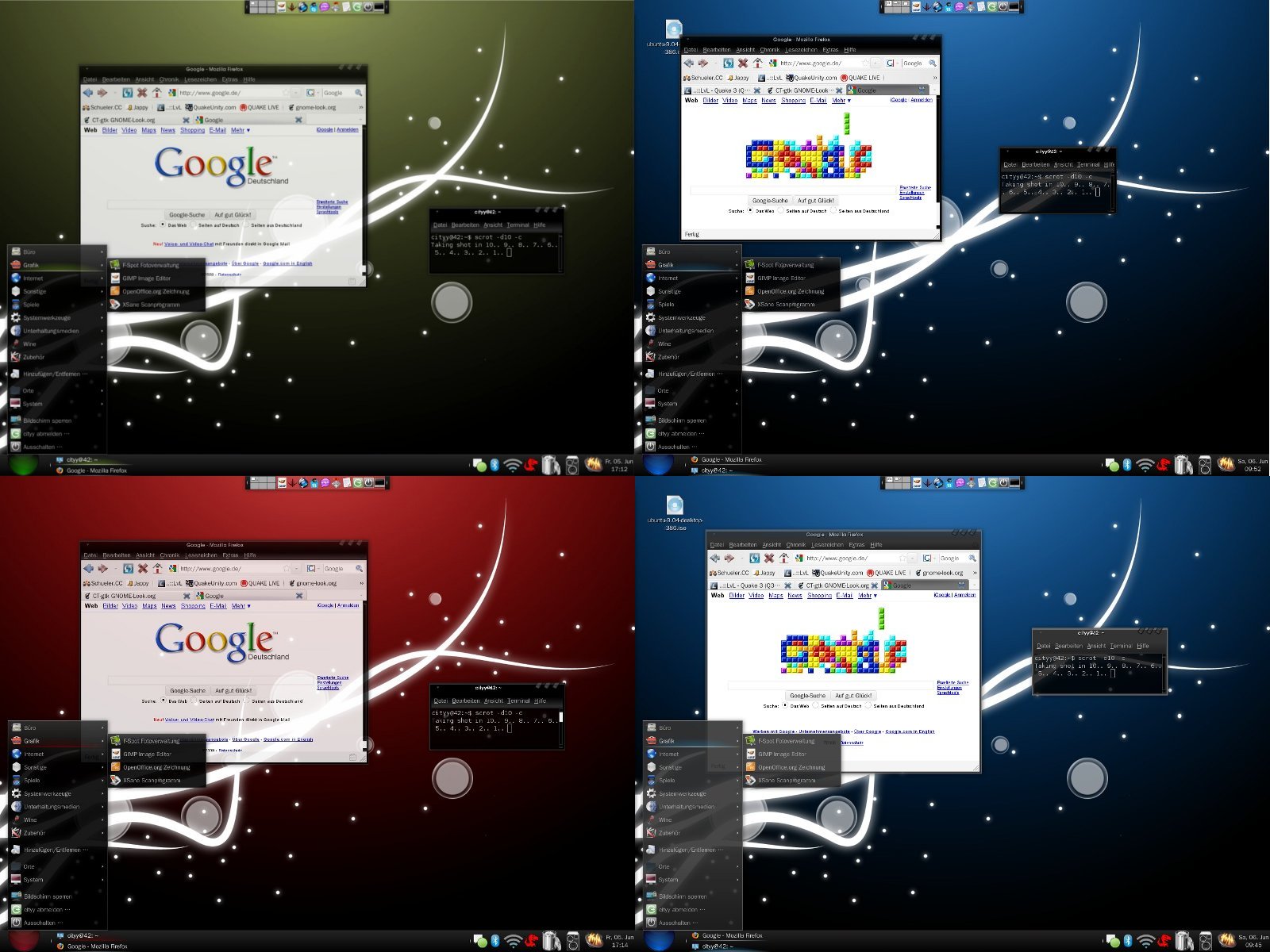
Ct-gtk is a gtk 2.x theme which shall give you a complete new feeling using gnome. It comes with 4 different versions: a blue one, a red one, a green one and a grey one. There are also 3 different panel backgrounds included - two different black ones and a transparent one. This guarants that everyone will find the style he or she prefers. If you decide to download - please leave feedback if you like or if you don't like. For now I'll stop working on this one as main project but be sure that there will be an update if you want to have one.

PS: Sorry for my english.
**NOTE**
You have to unpack "CT-gtk.tar.bz2" before you install.
=======================================
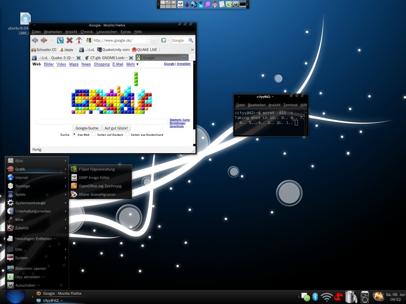
Panel background:
If you want to change the panel bg go to "~/.themes/CT-gtk/gtk-2.0/" and open "panel.rc". In the first few lines are the panel background settings.
**Panel backgrounds can be found in "~/.themes/CT-gtk/gtk-2.0/Panel"**
Wallpaper:
http://gnome-look.org/content/show.php/Creation?content=102511 - 'Creation' by Lemonade
=======================================
Credits:
- LeninRussianKing for giving feedback and creating a green version
http://gnome-look.org/content/show.php/Dark+Ice?content=69886 - Dark Ice (gtk)
http://gnome-look.org/content/show.php/VistaUltimate?content=79665- VistaUltimate (Metacity)


Ratings & Comments
57 Comments
Can I get permission to us theme during youtube videos i make??
Ofc, you can use it for your videos. What kind of videos are you creating?
The light version looks great! Its definitely not too dark. I think maybe the window border could be a little darker, but I'll leave that up to you. Thanks again for working on this!
Hm I think I'll leave it the way it is - it's a light version, not a second dark version :) No problem.
I think this theme is awesome, and has a lot of potential. I particularly like the metacity minimize, maximize, and exit button design. Most of these issues may only be related to my laptop LCD screen (on a Dell Inspiron 1420), nonetheless here they are: -It is hard to distinguish the active tab in Firefox from the others. -I think there needs to be more separation (maybe color or contrast-wise) between the metacity and the panel. -Related to the above, the dark black of the Metacity makes it so that I cannot see the gradient except from a sharp angle on my screen. I would suggest lightening it up a little. Some darker themes that seem to handle this well are Shiki-colors and New Wave. Maybe you could make a lighter version for testing?
Okay, first of all, thanks for your feedback. > "-It is hard to distinguish the active tab in Firefox from the others." >> I also have a problem with the tabs - I already reworked them but it seems like I have to do it again. > "-I think there needs to be more separation (maybe color or contrast-wise) between the metacity and the panel." >> Sorry but why do you care about separation of panel and metacity? :P > "-Related to the above, the dark black of the Metacity makes it so that I cannot see the gradient except from a sharp angle on my screen. I would suggest lightening it up a little. Some darker themes that seem to handle this well are Shiki-colors and New Wave. Maybe you could make a lighter version for testing?" >> Interesting thing - maybe there will be a lighter version, maybe a complete new metacity theme or maybe both - I've to think about. But what ever it will be, it will be lighter. So here's my todo list: - rework active Tabs - spend some time with metacity themes :) - seperation of metacity and panel? Maybe not - I'm waiting for good arguments/suggestions from your side :P
I think having separation would improve usability. It seems that I can't tell at a glance what is panel and what is window: I found myself grabbing the panel a couple of times when trying to move a window that was up against it. This might not be a problem with a lighter metacity. I think the darker themes I mentioned have solved the problem by putting a 1 pixel lighter colored line along the top of window border. It might be just me though, so you probably want to get input from other people as well :)
Okay - I understand what you mean. I've added a lighter version - you can use this as start and maybe make it darker/lighter yourself if you want to - I also just used GIMP and changed brightness and saturation of the metacity theme and the menu(bar).
Thanks for making the lighter version :) It certainly solves the problems I was having with it! I think could use some more tweaking though, but not quite sure what... I think since you have a darker panel (which I like a lot) than themes like Shiki-colors, that the metacity doesn't have to be as quite as light as you made it (Although it could be made to look nice as is). If you want to keep the current shade I think the menu font needs to be lighter, but I'm not sure you could accomplish this in Firefox without the Firefox CSS "hack" unless you changed the main menu background to white - you probably know more about this limitation than me. You might not want to go that route because of that issue. Also, the gradient for the menu bar background strikes me as odd - I think maybe it should be more subtle or gradual...but I'm not really sure. I suppose I should whip out Gimp myself and experiment... :) I might get time later. Also, I really like the new active tabs! Sometimes I feel like its too much gray though.... Maybe for the blue theme, for instance, they should have a blue shade (just an idea)!
No problem. > "I think since you have a darker panel (which I like a lot) than themes like Shiki-colors, that the metacity doesn't have to be as quite as light as you made it (Although it could be made to look nice as is)." >> No, it's not done to look nice as is. :D I'd call the lighter version a kind of beta - I think it was 1:00AM here in germany when I made it - this morning I took a look and thought 'wtf!? - this is too light' :D > "If you want to keep the current shade I think the menu font needs to be lighter, but I'm not sure you could accomplish this in Firefox without the Firefox CSS "hack" unless you changed the main menu background to white - you probably know more about this limitation than me. You might not want to go that route because of that issue." >> Hm, yes, how I said, don't want to keep current shade. > "Also, the gradient for the menu bar background strikes me as odd - I think maybe it should be more subtle or gradual...but I'm not really sure. I suppose I should whip out Gimp myself and experiment... :) I might get time later." >> I already thought about the gradient - maybe I'll change the color to black and do some small changes. You'll see in the next version. Feel free to do it :) So here my new todo list: - make light version a bit darker - change menubar gradient
Oh I forgott to talk about tabs. Hm I like them the way they are but I'll make a try and see how it looks like.
I didn't change the background of the active tabs - I really like them the way they are. Any other suggestions? I hope the light version isn't to dark now!? Your opinion?
All looks very nice but after the installation the following message appears in the preferences window: "This theme will not look as intended because the required GTK+ theme engine is not installed". Which kind of GTK+ package is required exactly? Thanks and compliments ;)
-> engine "pixmap" This is what the config told me.
If you use ubuntu try this: apt-cache search gtk2-engines - don't exactly know in which package the engine is in - I'll ask google..
Installing 'gtk2-engines-pixbuf' should fix it. http://ubuntuforums.org/showthread.php?t=1081154
This package is already installed on my system (Mint7)... in the appearance preferences dialog-box the problem seem linked to the color scheme which is not supported... for instance my main menu or terminal window are still with original colors (white)
Hm, strange. I've no idea.. I'll search for a solution - maybe also someone who reads this has an idea?!
Open the gtkrc file and go to the line #This prevents Sodipodi from crashing while opening the # Object-Style dialog. style "unstyle" { engine "" you can leave like this or change to engine "pixmap"
What would I do without you.. :S Thx :)
All looks very nice but after the installation the following message appears in the preferences window: "This theme will not look as intended because the required GTK+ theme engine is not installed". Which kind of GTK+ package is required exactly? Thanks and compliments ;)
like that
To hear words like this is better than getting money for my work 8)
Hi.. thanks for you gtk. my desktop looks good now :) Anyway, can you make the top panel color not too black and transparant too. that will look your gtk more sophisticated ! keep nice work.... thanks...
Changed the top color and added a new transparent panel bg :) You could also make the panel transparent with compiz. Thanks for feedback - thats what I need :)