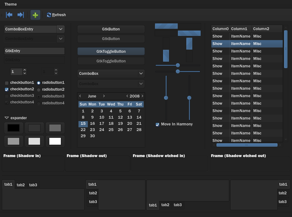
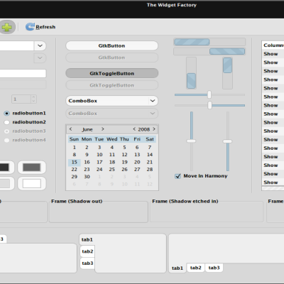
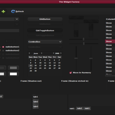
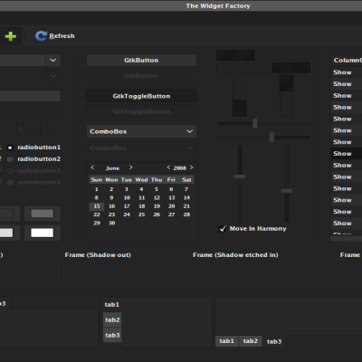
Description: Shinobi is a dark theme. My girlfriend coined the name.
I am very sorry I removed the color schemes from my theme. I was being lazy and forgot to add them back in when I updated it. I have fixed this. They are not pictured, but I added two more colors for a total of: Blue, Green, Orange, Red, Purple and Pink! I hope this makes up for my laziness.
This theme needs Murrine SVN and Aurora.
My font is ITCFranklinGothic Medium size 10 slight hinting.
It uses many dark shades of grey to differentiate widgets, and has muted accents. This theme strives to keep all the beauty of a dark theme without sacrificing the usability of a lighter theme.
If there is anything you dislike about this theme, let me know before you vote down. I might fix it.
I will not make emerald or metacity themes. If you like my theme, make them yourself. If you make one, please send it to me and I will credit you and incorporate it into the suite.Last changelog:
2.1: - Color schemes added
2.0: - Many changes, including menus, scrollbars, and overall colors
1.2: - Lightened textarea - Changed calendar to match textarea
1.1: - Changed menu padding from 8 to 4 - Decreased xfwm lightborder brightness
It's one of the best dark themes I have used so far. I see you cleaned up the source quit a bit. Very good color choices btw!
All together its inspiring. Here have some brownies I made for Easter!
Yeah maybe a grey theme would do it. I like everything about this theme except I don't like having the actual window itself dark, i like dark title bars, even toolbars and menus, but not the window itself.
Thank you for your response!
Lucky you, I'm already working on two themes that fit what you requested. I'll try and remember to comment you back when I post them. The names will likely be Broken Oreo and Macchiato Double Shot if you'd just rather keep a lookout on the main page for when they are released.
Hello !
Just wanted to say that I like your theme. I would just maybe like having some kind of blue halo for preselection (before mouse clicking) like you could find in aurora midnight theme.
Good work,
Sirsurthur
I take it you took out the color variants.... I won't even tell you how long it took me to figure that out. Anyways I found the old version on your dA account. I use different colors for different user accounts. Makes my desktop a bit more alive. So I guess my question is are you going to be releasing other versions of Shinobi?
Are you using GNOME? If so, all you need to do is change the selected colors for the theme to change.
If not, message me back and I'll put the multiple colors back into the theme. Sorry, I was being lazy when I updated it.
What distribution are you using?
If you have the newest Ubuntu, it comes with the right version of Murrine. You also need to install the Aurora engine. You can search for them with synaptic.
Hi - love your theme. There's only a few dark themes that make text readable, yours is one. One question though - my panel looks rubbish compared to your screenshot - have I missed something there? Enabling transparency on the panel just leaves the window-list and the notification area opaque...
Thanks for your hard work.
If you dislike the font sizes, look throughout the files Shinobi/gtk-2.0/base.gtkrc and Shinobi/gtk-2.0/panel.rc
You should find lines that say "font_name =" in them. Change the numbers in them to change the font sizes. For example
Quote:
font_name = "Bold 7"
could become
Quote:
font_name = "Bold 9"
or it could become
Quote:
font_name = "8"
If that's not what you were saying or you need more help, just say so.
What is the value to change to eliminate the padding around menu items (from a dropdown list, such as "File" or something)? This is a wonderful theme, and thus far, the padding or spacing is my only complaint.
Open the file ~/.themes/Shinobi/gtk-2.0/base.gtkrc (or /usr/share/themes/Shinobi/gtk-2.0/base.gtkrc if you installed this system-wide)
(Yes, it's this file even if you use a different color variant than blue)
Look for the section:
style "murrine-menu" = "murrine-wider"
In that section there are two lines:
xthickness = 8
ythickness = 8
Those numbers are the padding values, so just change them to whatever you want. Now that you mention it, I seem to prefer the values of each set to 4. I've also edited the windeco to have a slightly less noticeable light border. Thanks for your interest in my theme. I will now be uploading the new version.
Ah, I thought that was it. Thanks! Now, what about what designates the size in the main menu drop down (Applications, Internet, System...). I guess I like smaller icons/heights.
Sadly, I don't know. That's a GNOME-related thing. If you can find me another theme that incorporates the smaller icon sizes in the GNOME menu that you like, link me to it. I'll investigate it and fold the changes into my theme.


Ratings & Comments
29 Comments
It's one of the best dark themes I have used so far. I see you cleaned up the source quit a bit. Very good color choices btw! All together its inspiring. Here have some brownies I made for Easter!
Glad you like it! Brownies are the best things ever *nom*.
Very nice theme, I like the rounded controls. A little too dark for me though. Do you think you could make a little lighter theme?
This is already pretty light for a dark theme. Maybe you'd prefer a grey theme?
Yeah maybe a grey theme would do it. I like everything about this theme except I don't like having the actual window itself dark, i like dark title bars, even toolbars and menus, but not the window itself. Thank you for your response!
Lucky you, I'm already working on two themes that fit what you requested. I'll try and remember to comment you back when I post them. The names will likely be Broken Oreo and Macchiato Double Shot if you'd just rather keep a lookout on the main page for when they are released.
Hello ! Just wanted to say that I like your theme. I would just maybe like having some kind of blue halo for preselection (before mouse clicking) like you could find in aurora midnight theme. Good work, Sirsurthur
Not unless the Murrine engine supports a feature like this. I'm not switching to Aurora. Sorry.
I take it you took out the color variants.... I won't even tell you how long it took me to figure that out. Anyways I found the old version on your dA account. I use different colors for different user accounts. Makes my desktop a bit more alive. So I guess my question is are you going to be releasing other versions of Shinobi?
Are you using GNOME? If so, all you need to do is change the selected colors for the theme to change. If not, message me back and I'll put the multiple colors back into the theme. Sorry, I was being lazy when I updated it.
no actually i'm using xfce.
Check the new description, I added several colors! Now you can have six different users for your setup :)
Has anyone found an emerald theme that fits this theme?
I'm pretty new to linux. How do I make it work once I've downloaded it? Thanks,
What distribution are you using? If you have the newest Ubuntu, it comes with the right version of Murrine. You also need to install the Aurora engine. You can search for them with synaptic.
Hi - love your theme. There's only a few dark themes that make text readable, yours is one. One question though - my panel looks rubbish compared to your screenshot - have I missed something there? Enabling transparency on the panel just leaves the window-list and the notification area opaque... Thanks for your hard work.
Glad you like my theme! Are you using xfce? The screenshot is of an xfce desktop, so if you use GNOME it will sadly look different! D:
Grr. Yeah, Gnome here. Thanks for the reply!
Nice theme :) I just have some very small font-size in the panels (main menu, current window etc). Thanks for the theme.
If you dislike the font sizes, look throughout the files Shinobi/gtk-2.0/base.gtkrc and Shinobi/gtk-2.0/panel.rc You should find lines that say "font_name =" in them. Change the numbers in them to change the font sizes. For example Quote:font_name = "Bold 7"
could become
Quote:font_name = "Bold 9"
or it could become
Quote:font_name = "8"
If that's not what you were saying or you need more help, just say so.
What is the value to change to eliminate the padding around menu items (from a dropdown list, such as "File" or something)? This is a wonderful theme, and thus far, the padding or spacing is my only complaint.
Open the file ~/.themes/Shinobi/gtk-2.0/base.gtkrc (or /usr/share/themes/Shinobi/gtk-2.0/base.gtkrc if you installed this system-wide) (Yes, it's this file even if you use a different color variant than blue) Look for the section: style "murrine-menu" = "murrine-wider" In that section there are two lines: xthickness = 8 ythickness = 8 Those numbers are the padding values, so just change them to whatever you want. Now that you mention it, I seem to prefer the values of each set to 4. I've also edited the windeco to have a slightly less noticeable light border. Thanks for your interest in my theme. I will now be uploading the new version.
Ah, I thought that was it. Thanks! Now, what about what designates the size in the main menu drop down (Applications, Internet, System...). I guess I like smaller icons/heights.
Sadly, I don't know. That's a GNOME-related thing. If you can find me another theme that incorporates the smaller icon sizes in the GNOME menu that you like, link me to it. I'll investigate it and fold the changes into my theme.
Emerald, or atleast a Metacity theme would be appreciated ... a lot ! Cygoku