


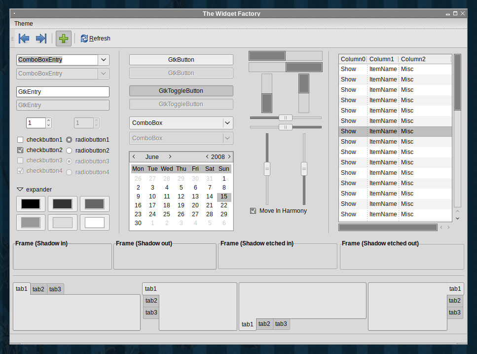

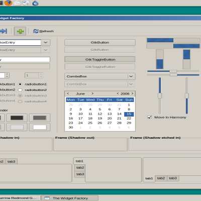
Dreadful is: Flat. Retro. Gray. Its feelings are not hurt if ignored.
To make the theme more compact uncomment lines 16 and 59.
There's a fluxbox style, as well.
----------------------------------------
This theme started as a quick hack to strip the Murrina Humanity code base from the dark bug fixes and workarounds. To bug test it I threw something together loosely inspired by GNUstep and associated UIs. I was so pleased with the result, I thought I'd share. (I don't think it's bug free, yet. Tell me if you find anything.)
----------------------------------------
GTK+ based on and inspired by: DarkRoom by Kenneth Wimer & Conn O'Griofa, Shiki-Colors by perfectska04, and the GNUstep UI.
Fluxbox style based on carp by tenner.


Ratings & Comments
6 Comments
Where's the Fluxbox style?
I like this a lot. I love grey, flat, sexy themes like this one. ;D
Looks nice (apart from the toolbar handle), but the download link is taking me to a screenshot rather than the theme.
You're right! Sorry about this, link is fixed now.
Excellent work on gray shades ! Very clean , easy on eyes. A more compact version would be great too ( many gtk themes have huge buttons )
You can make the toolbar buttons smaller by commenting line 6. More compactness can be achieved by adding "GtkWidget::focus-padding = 0" in line 52 or thereabouts (it doesn't really matter as long as you're within the "theme-default" block). Anything more substantial than this will considerably decrease the aesthetic appeal of the theme. But if you're feeling particularly brave you can remove all the "= theme-wide" and "= theme-wider", which will decrease widget padding. There are a few more tricks, but I haven't experimented a lot with compactness to be able to help further. Hope this helps.