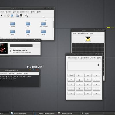
Description: the theme is highly inspired by lassekongos nooto, it also includes his metacity with a small fix. but it mostly uses the (newest) murrine engine and you need the aurora engine, too. so it works 100% with evolution and the openoffice widgets look nicer
good taste for global colors (wall and windows), the only thing I could say is that the sliders should be in the same color that the progress bar or scrollbar...
very good theme
thx, i´m really glad u like it.
i tried the scrollbars with the other color, but it was not my style...i think i will made a second version including this, so users can choose
nice mod of a really nice theme.
btw, if i might give you a hint for one place that is seldomly polished in xfce-themes: the app-switcher (alt+tab).
you can try it with the following code:
style "tabwin" = "default"
{
bg[NORMAL] = "#222222"
bg_pixmap[NORMAL] = "app_switcher.png"
fg[NORMAL] = "#FFFFFF"
bg[SELECTED] = "#6C8085"
fg[SELECTED] = "#ffffff"
# bg[INSENSITIVE] = "#ff0000"
# fg[INSENSITIVE] = "#0000ff"
}
widget "xfwm4-tabwin*" style "tabwin"
btw, for my eyes some of the contrasts are too harsh (like the blue on black when marking a file in thunar) and the menu is also not as color-balanced as in nooto.
thx for givin feedback :)
and many thx for your help...i´m usin gnome and i don´t tested the theme on xfce, but i will include your code in next release
with the color of highlighted text and menu items, i think, you are right...i choosed this one in cause of the used wallpaper, so it fitted well together...but in a standalone theme it´s better to use a smoother one


Ratings & Comments
11 Comments
good taste for global colors (wall and windows), the only thing I could say is that the sliders should be in the same color that the progress bar or scrollbar... very good theme
thx, i´m really glad u like it. i tried the scrollbars with the other color, but it was not my style...i think i will made a second version including this, so users can choose
hi what metacity theme are you useing ???
metacity is from lasskongos nooto, but a little bug is fixed i included it in the theme
thumbs up :-). Explain me please what aurora-engine is ... I didn't found it in the repos. Cheers.
If I remember correctly, you should be able to search for the Aurora engine right here on GNOME-Look.
yeah, he is right :)
nice mod of a really nice theme. btw, if i might give you a hint for one place that is seldomly polished in xfce-themes: the app-switcher (alt+tab). you can try it with the following code: style "tabwin" = "default" { bg[NORMAL] = "#222222" bg_pixmap[NORMAL] = "app_switcher.png" fg[NORMAL] = "#FFFFFF" bg[SELECTED] = "#6C8085" fg[SELECTED] = "#ffffff" # bg[INSENSITIVE] = "#ff0000" # fg[INSENSITIVE] = "#0000ff" } widget "xfwm4-tabwin*" style "tabwin" btw, for my eyes some of the contrasts are too harsh (like the blue on black when marking a file in thunar) and the menu is also not as color-balanced as in nooto.
thx for givin feedback :) and many thx for your help...i´m usin gnome and i don´t tested the theme on xfce, but i will include your code in next release with the color of highlighted text and menu items, i think, you are right...i choosed this one in cause of the used wallpaper, so it fitted well together...but in a standalone theme it´s better to use a smoother one
nice work Kind Regards MikeDK
thx a lot, glad u like it :)