

This theme, as some might notice, is based on a variety of themes, enhanced by own artwork. Most credits go to roberTO, whose artwork was a great inspiration for me and one of the most important sources.
Enjoy.


Source (link to git-repo or to original if based on someone elses unmodified work):


Other GTK2 Themes:


Ratings & Comments
15 Comments
This is great :) makes me actually enjoy my terminal with borders :-D great job!
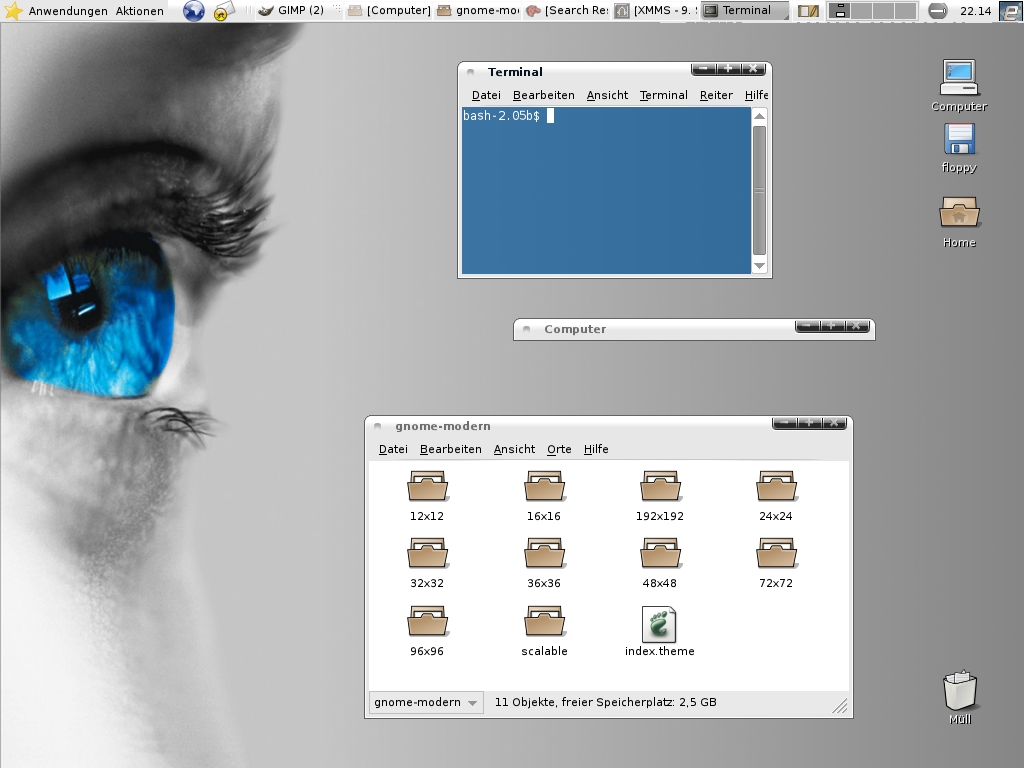
... hue just fall in love with the wallpaper showing this deep blue eye... Please, please, please, point me to somewhere i will be able to find it !
i found it at customize.org and modified it a bit (added a soft gradient)
thank u very much i just found it. I forgot to say it, but very nice theme, it don't woth the actual score! keep up the good work.
It seems that I like themes with integrated title bar. GREAT THEME! I reccomend using it with GNANT Icon theme from this page. Can't wait to see updates. Do you plan to make new scrollbars and selection buttons? Present ones are simple & clear, but It would be interesting to provide also more eye-cathing version. So hurry up ;) The rate is too low, you deserve ~80%
http://gnome-look.org/content/show.php?content=16258
I had seen this theme earlier as longhorn inspirat or something. This theme also has the same problem with inspirat. When switching to the evolution calendar view, evolution just crashes. I guess that is the only thing which prevents me from using this theme. I am using Fedora Core 3
see my post for fix http://gnomesupport.org/forums/viewtopic.php?t=7487&start=15
hmm.. i read the fix but the lines you mentioned are not included my gtkrc-file. :P or am i blind?
You have the newer code. It doesn't crash here on evo 2.1.4. So the question is what version, what distro, and what errors do you get when evolution is run rom a terminal?
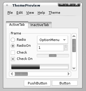
well, the gtk theme looks good. but i still (i commented about this on gooeylinux.org) have a problem with the metacity theme. the black behind the buttons is part of the titlebar graphic instead of being part of the button graphic. whenever you have windows without all three buttons, you're left with blank "buttons". i only use max and close buttons (right side), so i'm always left with a blank button. it's even worse if you have your buttons on the left side... you get nothing behind the buttons, and still have those black peices on the right side. this is not only a matter of aesthetics, but of usability as well. it is very confusing to people who don't realize there are only on or two buttons, when it always looks like three. this is nice looking theme, and i would use it if not for this one issue.
ouch... i must admit that i have not thought of this problem. maybe i can find a way to fix that, but as it is my first major theme for gnome, i cannot assure you that i can add all that you would like to see included. i will give it a try nonetheless. : )
i started poking around at the metacity theme, and i noticed something i hadn't considered before. the bottom corners of the black area are rounded and there are 1px black spacers between each "button". so even if the black parts were incorporated into the button graphics, it wouldn't look right without all three buttons. in my case, i'd end up with maximize button having a squared corner and that 1px black spacer left over. i could just hack it up so there were just two black peices with rounded corners for my maximize\close setup, but when those special widnows with only close buttons came along.. i would still be left with an empty black button... i guess there is really no feasible way to have only the buttons i want showing and have them look right at the same time without the theme being aware of how many buttons metacity is configured for (+\- special windows). and i don't see that happening anytime soon. =(
i have thought about this problem the whole day and yes, the rounded versus sharp edge of the buttons will cause trouble. I have tried with including the background image into the button but the spacing needed new adjusting then and furthermore, i didn't really get the same effect. the only solution would be to replace the rounded corners with sharp 90° corners or does anyone have a phenomenal idea how this little problem could be solved? maybe i am thinking too complex on an easy thing... : (
the problem with what you're asking is that they are meant to be in a specific order. the two outside buttons are curved on the outside edges, the inside one straight on both. re-ordering them would likely make it look funky anyways, so you're sort of bound to using a specific order of things anyways.