


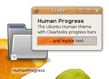
 what is this theme all about? Actually it's just Ubuntu's Human theme (the caramel-orange one) using the ubuntulooks engine, slightly modified.
I was sick of the poor usability of the progress bars, so I took the theme and replaced them by Cairo Clearlook's progressbars. I changed the text to black (better contrast), and made the desktop icon's text black on transparent white, which helps a LOT if you have bright background images. If you do not want to use the transparent icon text background, just edit gtk-2.0/gtkrc and comment the two lines "NautilusIconContainer" near the top.
Since this is the open source world, why not share the theme I personally use?
THIS THEME IS SIMPLY "HUMAN" WITH CLEARLOOKS PROGRESS BARS!


Ratings & Comments
6 Comments
nice modification, looks better than the original progress bars. but: "This trick (NautilusIconContainer) is brought to you by me. I think I'm the first theme to use it" i don't think so :D
^_^ give me a proof of prior art and I shall remove that statement nyahah :)
http://www.gnome-look.org/content/show.php?content=49798 take alook into the gtkrc and the desktop-icon-labels.rc, it is not enabled by default but it is still there ;)
damn, beaten only by a few days! :) I should have done this sooner ;)
hehe...was just a hint :)
Looks much more professional than the original. Nice work! Any hope of a blue variant??