Description: UPDATED AGAIN! AND AGAIN... (2004.09.20)
2004.09.20_2: 2004.09.20_2: Include stock buttons! Created by me, see the ReadME.txt!!!!!! (If you dont need these icons, see the ReadME also!)
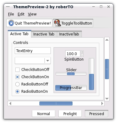
2004.09.20_1: I modify the scrollbars, and slidrers. (rounded) and add inactive state the metacity decor, and new toolbar-buttons, some small changes...... Please re-download!
I working a squared version this theme, (also metacity)
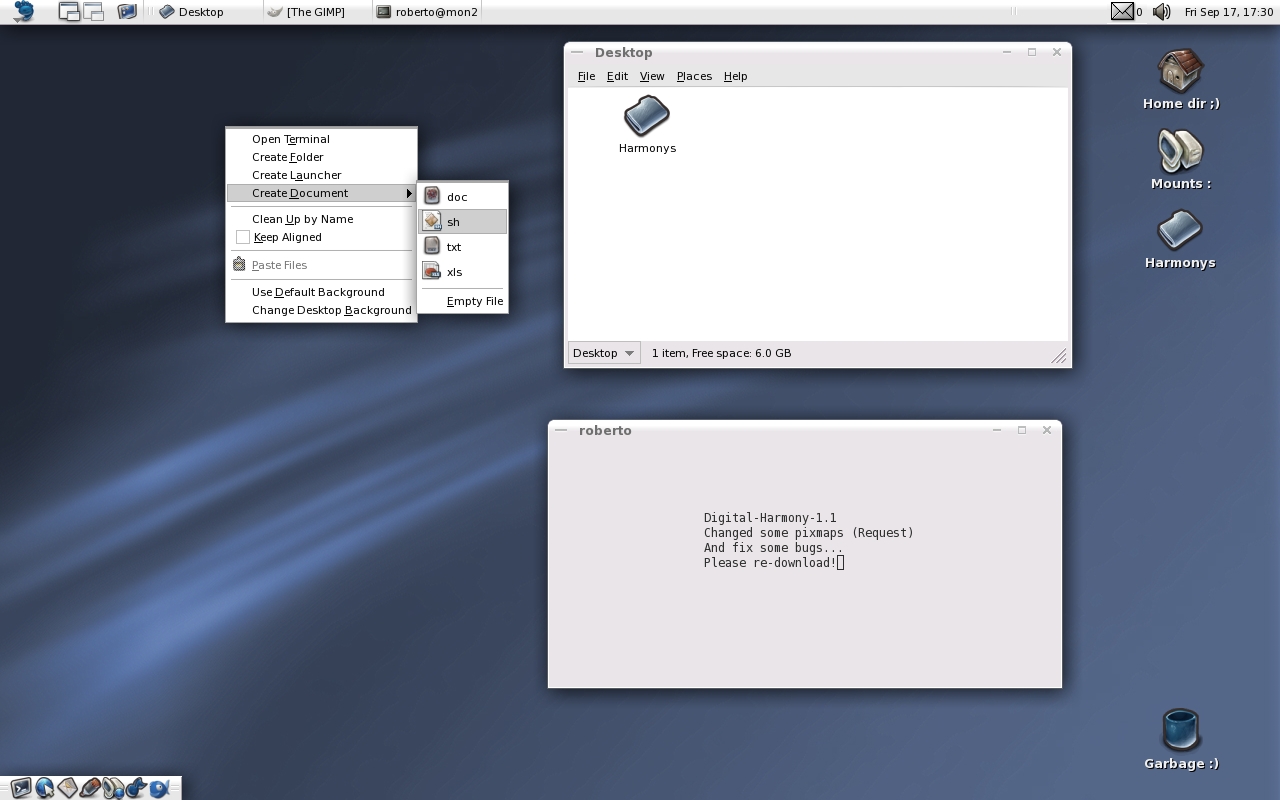
I create a new theme called Digital-Harmony. (Not Port) Skinned Panel-backgrounds and buttons, Skinned toolbar and menubar and toolbuttons, Metacity theme, All not color pixmap converted to Grayscale (speed up theme) Structured theme directory, (See in theme dir...)
Hi.First this is a great theme but secondly one thing i notice (though i may be wrong) is that when i use the tab key to cycle through the buttons of an open window i don't see the focus on which button i am(i hope i describe it well)Any idea on this?
I too must point out that this theme crashes Evolution while accessing the Calendar.
I absolutely love this theme and would love to see it work flawlessly. Any chance an evolution-safe version is in the works?
Great Theme!
I like the clean Design of Digital Harmony very much!
The very soft seperation lines and blends creates a harmonic union.
The blue sliders, lines and buttons are just perfect too.
All these elements come together to create a very modern look.
Nothing is to fancy, everything is very ergonomic.
That upgraded version look much better and it increses usability (scroll bars are easier to track).
Thanks for another great theme.
SnOp
PD: I still doesn't like that white/grey duality in this theme (I'll prefer all panels to be white) but I guess that's just a matter of taste.
Is this a bug or just the way gnome handles multiple png's?
Take a look at the screenshot, this doesn't happen with other themes. Look at the icon, it's supposed to be transparent.
http://users.ossm.org.mk/~tome/wp-uploads/digital.png
sure, fugure out what color attribute is doing it, and change it to match. I installed the applet just to see if it was a bug. Anyone can change a color. Yes, it is a bug but it's not with the theme. The color the applet shows should be the forground color, but instead it's showing the background color. Whether or not a theme looks good depends on the colors set. There's no right or wrong here. It is the applets code that needs fixed.
Why is it that a lot of nice themes are pixmap based? This makes them a lot slower than native themes like industrial and bluecurve.
Is programming a GTK engine such a hell?
Hi Roberto,
First of all I must say that your gtk themes are among the best ones (if not the best!).
There are just 2 things I don't like on most of them: there's no clear way to know what component (specialy buttons) is select (so, I don't know what's gonna happen if I press "enter").
Metacity themes are also good looking but it can be quit difficult to know what's the top window (I must look at font color).
For digital-harmony I'll prefer to see only one color (I don't like this white-gray duality).
I'm just trying to give you some feedback 'cos maybe some people feel similar things when using your themes which, as I said, are already great.
So, the only thing I want with this post encourage you to keep improving your themes. And, please, go on with your wonderfull work.
SnOp


Ratings & Comments
23 Comments
Please, the link is dead T_T
Help x 2 = 2xLink THE FRIKIN Link DIED, HELP!!!
Help ! The download link is broken.
Hi.First this is a great theme but secondly one thing i notice (though i may be wrong) is that when i use the tab key to cycle through the buttons of an open window i don't see the focus on which button i am(i hope i describe it well)Any idea on this?
The contrast between list items in Nautilus is too much. Other than that, this seems to be a nice theme.
I too must point out that this theme crashes Evolution while accessing the Calendar. I absolutely love this theme and would love to see it work flawlessly. Any chance an evolution-safe version is in the works?
Great Theme! I like the clean Design of Digital Harmony very much! The very soft seperation lines and blends creates a harmonic union. The blue sliders, lines and buttons are just perfect too. All these elements come together to create a very modern look. Nothing is to fancy, everything is very ergonomic.
I use it a lot, together with gnant icons which are great too. Unfortunately it crashes evolution when in calendar mode. :(
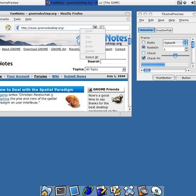
Very nice! Though tabs in Firefox need some attention.
then the gnome browsers (at least epiphany) would need attention, lol
Nice :-)
That upgraded version look much better and it increses usability (scroll bars are easier to track). Thanks for another great theme. SnOp PD: I still doesn't like that white/grey duality in this theme (I'll prefer all panels to be white) but I guess that's just a matter of taste.
Is this a bug or just the way gnome handles multiple png's? Take a look at the screenshot, this doesn't happen with other themes. Look at the icon, it's supposed to be transparent. http://users.ossm.org.mk/~tome/wp-uploads/digital.png
it's just how the colors are set in the gtkrc
Can it be fixed? I'm not into gtk theming...
sure, fugure out what color attribute is doing it, and change it to match. I installed the applet just to see if it was a bug. Anyone can change a color. Yes, it is a bug but it's not with the theme. The color the applet shows should be the forground color, but instead it's showing the background color. Whether or not a theme looks good depends on the colors set. There's no right or wrong here. It is the applets code that needs fixed.
This is NetworkMonitor applet bug! I use some pixmap theme and always bad looking this icon... :(
Perfect, as always!
Why is it that a lot of nice themes are pixmap based? This makes them a lot slower than native themes like industrial and bluecurve. Is programming a GTK engine such a hell?
I designer and IT man.... Not programmer.. :(
Hi! I update theme some request.... Please re-download! And working on Metacity "active - inactive windows"
Hi Roberto, First of all I must say that your gtk themes are among the best ones (if not the best!). There are just 2 things I don't like on most of them: there's no clear way to know what component (specialy buttons) is select (so, I don't know what's gonna happen if I press "enter"). Metacity themes are also good looking but it can be quit difficult to know what's the top window (I must look at font color). For digital-harmony I'll prefer to see only one color (I don't like this white-gray duality). I'm just trying to give you some feedback 'cos maybe some people feel similar things when using your themes which, as I said, are already great. So, the only thing I want with this post encourage you to keep improving your themes. And, please, go on with your wonderfull work. SnOp
very original & nice...