


Fibrous Themes
kerrle


Source (link to git-repo or to original if based on someone elses unmodified work):
0.9.5
-----
-Bugfix:
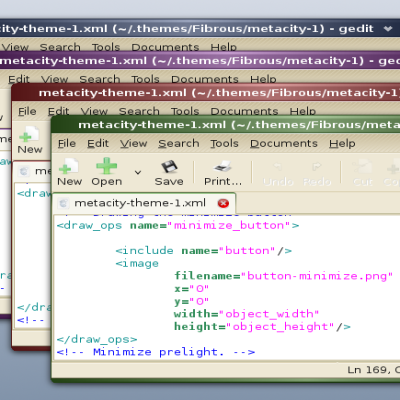
-Corrects inactive, shaded titles in metacity
-Corrects prelight color problem found by bvc.
A new metacity theme with different min, max, and close buttons will be released in the next day or so.
0.9
---
-Metacity theme added
-Various small tweaks to the GTK theme.
0.4
---
-Left, right, and bottom tabs now work properly (tested in Bluefish).
-Various color tweaks for fonts
-Prelights for most items, though they are suble and will probably be made more obvious.
0.3
---
First version released publicly.


More GTK2 Themes from kerrle:
Other GTK2 Themes:


Ratings & Comments
61 Comments
Linux Mint said, this theme needs icons "Industrial". Would you like to give link to the right icons?
¿como lo descargo? donde esta el link
I know this theme is pretty old, but it's still my favorite. Any chance of getting it updated to Gtk3? Evolution is butt-ugly.
Very nice theme. The dark blue complements the Black-Red icon theme nicely, and I highly recommend it as an icon set. http://gnome-look.org/content/show.php/Black-Red?content=91098
Slyd also works well as a matching icon theme, and has better coverage of all the icons than Black-Red.
I love it! It is my favorite! Of course some issue with Firefox... (I'm using a custom userContent.css...) And still some Apps show black text on the dark button (Ubuntu Software Center Install and other buttons) I am using the buuf-deuce icons with it... AND I LOVE IT!!! TRIED MANY OTHER DARK THEMES THIS IS THE BEST BABY!!! Thanks a lot to the author!
I use the UbuntuStudio Icon theme with it
Have you looked into the Azenis icon set? I think it would work well. just give credit where credit is due obviously
Its only very small but when you have a inactive maximised window it gets a small white line in the top left corner of its metacity theme
I love this theme... here is a fix for it... on metacity file: metacity-theme-1.xml original: <draw_ops name="draw_title_tile_inactive_normal_maximized"> <image filename="max-inactive.png" x="0" y="0" width="object_width" height="height" /> <image filename="title-inactive.png" fill_type="tile" x="9" y="0" width="width " height="height"/> <image filename="max-inactive.png" x="width - object_width" y="0" width="object_width" height="height"/> </draw_ops> change: <draw_ops name="draw_title_tile_inactive_normal_maximized"> <image filename="title-inactive.png" fill_type="tile" x="0" y="0" width="width " height="height"/> </draw_ops>
Hi thankyou for a very nice, professional new theme. By way of suggestion if you ever feel like remixing it i would love to see a shade of orange substituted for the blue to give it a ubuntu feel.Thanks again
nice theme - too bad it's basically unusable because it turns browser text boxes black with dark text so you can't read anything. nice try, though.
Great theme.
My Favorite Black Theme :)
if u know what background this is/how to get it please reply
The creator i saw wrote: - I'm still looking for a good icon set if anyone has suggestions. What you all could do is what i did, simply get the HumanAzul2 icon theme. With the Smoked Glass theme up and running you go: Smoked Glass >> Adjust >>> Icons and select the HumazAzu2 iconset. And final,you save the whole edited Smoked Glass theme with the icons and all. This is what i did and it worked. Here is the link for the icons: http://www.gnome-look.org/content/show.php?content=37099
On this theme, most of my text boxes are black with a dark colored font...same with dialog boxes. Can you change the font color to a lighter shade so I can actually read them?
I love this theme... but what I don't love is how it shades some form backgrounds black on webpages (like gmail) in firefox, and on gaim as well.
There are only a couple of points that i will make. First, could you please make/find better icons that suit the theme. It is beautiful, but i think that the icons let it down slightly and i am unable to find one that suits it perfectly. Last: on a couple of website (www.vodafone.ie is the only one i can think of at the moment) the text box appears in black and so does the text. For anything to be seen, it has to be highlighted. I will put up with that as this is such a good theme but i would appreciate it if you could look into that. Thanks again for a great theme.
I've found the glass icons icon theme set REALLY looks good with this one.
fair enough, but i would prefer if they had a bit of a dark blue tint to them. They seem a bit stark against the dark background for me.
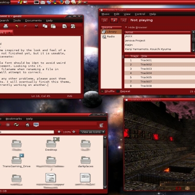
i just get a solid dark-blue colour for toolbars, buttons, widgets, and controls, unlike the blue gradient in the screenshot. i am using gnome theme-manager in ubuntu edgy. the rest of it works, like the window borders, colours, panel background, etc.
me too! ubuntu edgy
Hey i notices in that screen shot you had a cpu temp monitor how did you ge it ? plz heklp me ihave been looking for one for a while
really great theme. I use is ever since I installed gnome... good work and keep it up! cheers!