


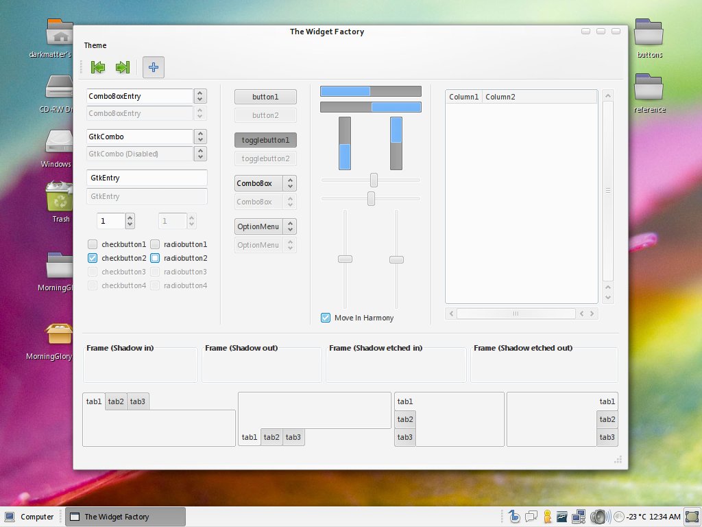
At the moment, its just the gtk+ theme, and not all the colors nor widgets have been completely finalized, and its using standard buttons for the panel at the moment, but it is 'complete' as far as being functional.
Expect an update in a while, including a rebuild of the gtk+, a metacity and an emerald theme (not the one pictured... I just though it fit the preview
 )
)Comments and constructive criticism are always appreciated.
Hope you enjoy this preview release

Regards,
DM
*UPDATE*
Just a minor interim upate while substantial changes are being implemented.


Ratings & Comments
23 Comments
It has a bug in which the button is not of the same size. Try to create a gtk open file window and you will see that the 'open' and 'cancel' buttons got different size. How do I fix this? This is a very nice theme. I'm definitely keeping my eyes on any future update!
This theme is by far the best theme ive ever tried!! cant wait 4 the next release. just one question about the toolars, the ubuntu menu is white and i would like 2 no how to change this plz. any help would be appreciated thx
Alternative styles/colors for menubar is also cool.
Very good. Looking forward for it more complete an with the TextEntry bugs solved.
i love this theme and i'm using it but i hope it will be improved anymore because there are several bugs and missing things. Anyway i'd like to know what font are you using in the preview, thank you :)
Thanks, I just returned from a bit of a net free hiatus, but I'll be working on an update this weekend, and its a rather substantial one as well. As for missing parts and bugs, some of those are fixable, some are flaws in the pixbuf engine, but I'll try to get some of those corrected in the next build. I wont be bothering to fix them all though, as the theme is just a 'live mockup' if you will for an engine. oh, and the font in the screenshots is Segoi UI... you know, the <shudder> VISTA </shudder> font. ;)
oh this is *good*, i'm happy for this :) i'm a bit fanatic in this sense, sometime i waste hours and hours to find a good combination for my gnome-look and since i've tried this theme i can't leave it even if something's missing. it's a fantastic harmony. thanks again, and keep it on ;)
great theme man i just wanted to know what kind of window border are you using, i like it ;) thanks
Thats just some duct-taped beryl thing I did for the screenie... its amora buttons and the deco was just a quick vrunner toss together. I don't actually have that on my system anymore :/
I'd like to know the name of the icon theme you're using. It looks like some flat Tango icons.
It's SuSE's Industrial icons. (basically the reason for Tango) ;)
It will certainly be my theme of choice!! Thank you very much! :)
:) I'll be releasing a small update in a few minutes. It's basically the same but with a few fixes, but will likely be the last release of MorningGlory in its current incarnation. Due to some rather annoying gtk/pixbuf bugs, I'm currently working on an artistic redesign of the theme and an overhaul of the gtkrc... the general feel will be the same, but will have a more "tangoish" palette shift and some changes to widget handling etc. The current (unreleased) dev state looks (thus far) like its fixed a few common app to app consistency issues.. hopefully the "new and improved" MorningGlory will have a beta in a day or two ;) Anyway.. back to getting the preview update packed
If unchecked tabs title were less dark, more legible, they have a surround line lighter and the buttons pressed had a lighter text, it would certainly my theme of choice! But it's a good one, of course.
He is going to edit that in the next releases, this isn't even close to the final version. The tabs and panel images are easy editable.. I made some mods for it, but I'm not sure if I have darkmatter's permition so I won't publish it till I'm sure. Cheers
Actually, as PingunZ mentioned, that is one of the changes being implemented ;)
finalmente un tema come si deve very cool!!!
that looks nice! I've downloaded and tried but it doesn't look that nice here on me desktop as it does in your screeshots : (
As I said in irc : Looking nice already, but still needs some love. I'm not sure about the green and the dark gray Cheers
It's very pretty Darkmatter :-)
i love you darkmatter! :* :* :* :*
That is looking very nice, please keep working on it :)
love it!