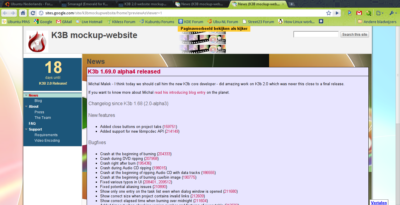
Description: A mockup I'm working on. It's a mockup for the K3B-website. Since 2.0 is around the corner, I thought the website could use a new design. If you click on Download, you'll be redirected to the mockup-site. It's made with Google Sites, but if you need the HTML, you can just look it up with View source.
Note: "Paginavoorbeeld bekijken als kijker" which is at the top middle of the header is only on the screenshot; it's not part of the actual design.Last changelog:
1.95:
Wider lay-out and more slick page background
1.92:
Initial version - Still working on the upper left logo and the sidebar.
but there are certain standards one has
to follow... a typical one is that it
has to be viewable with a 1024 px wide
screen, the way it is now you have to
scroll horizontally with a 1024 screen :)
most webpages follow this :)
The dantes blog thingy the one user pointed
out follows this as well, just a pointer.
//Robert


Ratings & Comments
8 Comments
but there are certain standards one has to follow... a typical one is that it has to be viewable with a 1024 px wide screen, the way it is now you have to scroll horizontally with a 1024 screen :) most webpages follow this :) The dantes blog thingy the one user pointed out follows this as well, just a pointer. //Robert
So you go and check it out k3b.sf.net ;) It's not done yet, but it's official ;)
can't wait to see it finished ;) good screenshot - Limonadovy Joe :D
Nice themes, both. @madsheytan: Why don't you apply your theme to these domains too? http://k3b.org/ http://k3b.plainblack.com/
It will be released as a official one with the new release of K3B. Stay tuned :)
maybe something like this http://dantti.wordpress.com/ because besides background i don't see that big improvement
Please read the description first. Like I said in the description, I'm still working on it.
no worries ;) i didn't vote bad.. i was just giving you some inspiration