


KDE UI Tweaking
PaT


Source (link to git-repo or to original if based on someone elses unmodified work):
##### UPDATE : You can get it if you have KDE 3.3.1, but it is now integrated in the CVS HEAD.
3.0: Ok, its smaller, and I admit it, it looks better, so thanks for harrassing me. Its got 2 pixels padding on each side so it wont look bad. Ive also included new frames for the anchor "checkbox" but its worth nothing... maybe someone will come up with a good idea.
2.0: NOW the background is transparent so there wont be problems with other color-schemes... and its 1 pixel smaller to please some guy...
Thats all!


More Various KDE 1.-4. Improvements from PaT:
Other Various KDE 1.-4. Improvements:


Ratings & Comments
13 Comments
this is in KDE 4.4 at least in the beta and the current CVS
Maybe if you submit your work to the kde-artists mailing list it'll be included in the next release ;-) However, even if you resized it, it still is too big, expecially when compared to the previous led. I don't want my toolbar to waste precious pixels! Just resize it as the current led and it'll be fine... Looking forward to see that in KDE 3.4!
1 pixel smaller? that doesnt please me.
A very nice enhancement. However, I found a problem - the LED background isn't transparent :( My foreground color isn't white - it's light-grey, so active LED has too bright background. I fixed it by making the background transparent using GIMP (I could mail you the modified files if you wish - my email is soundblaster [at] aircom [dot] lv).
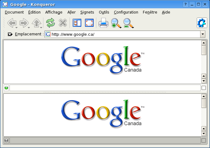
These leds look a lot better, far more lively and modern. They fir in better with icons like Nuvola and Crystal. And what I love most is how clean your Konqueror version is. It's absolutely stunning! This is how I would expect the default to be.
but give them a transparent background. I've done it in less than 1 mn with the Gimp ;)
sorry for the double post :P
but give them a transparent background, done on my computer in less dans 1mn ;)
Ive done that... but it triggers a bug when you split a view... Try it.
can you scale these things down? maybe even by 50%
the kde-artists mailing list (the current one is from kde 3.2-era.. the older one which was even more hideous was kde 2.x)
i want to see this change in kde 3.3.2!
I think it makes sense indeed Fab