


Biggest difference is the sidebar in the style of QtDesigner and recent k3b. No more upside down labels.
Also, there is a corner button for the new tab function. Ive seen this corner button already implemented in kate (great idea by the way).
Finally, the simplified toolbar, with much less icons.
Im currently experimenting in coding all this, but im not a great programmer. Results so far are crashes and other horrible things

Well, maybe some coders somewhere will try this as a challenge, we'll see.
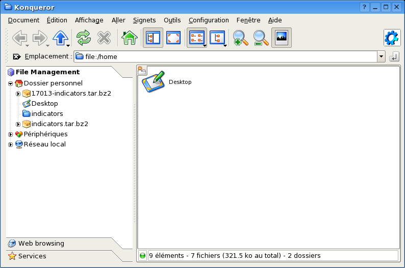
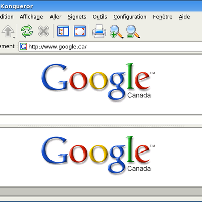
SCREENSHOT #1 : Konqueror, without tabs and with the sidebar.
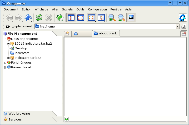
SCREENSHOT #2 : Konqueror, with tabs opened and with the sidebar.
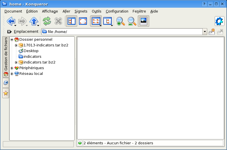
SCREENSHOT #3 : This is what is currently posible...
Have a nice day!


Ratings & Comments
12 Comments
http://www.kde-look.org/content/show.php?content=16962 your idea works great! :-))
I have to say that I still prefer #3 by far for functional reasons.
I know that everyone is going gaga over the side bar tabs but I honestly disdain them. Here is why: -- They substitute horizontal space (which we have plenty of) for vertical space (which we have much less of.) It also takes up a good deal more cubic space than the current universal sidebar. -- They reduce the overall functionality because more mouse clicks are required to access the same functionality. -- It has a definite "Gnome" look to it... it copies the look of nautilus which (by its very nature) is MUCH less functional than Konqueror. All of these functionality loses for a tool used mostly by more advanced users (which is fundamentally the people who most often use the file manager.) Even on web browser mode I wish that firefox's sidebar worked more like konquerors'. I am all in favor of KDE adding the OPTION of using tabbed sidebars for those who wish to do so, but I honestly hope that we never make it the default. That said, this is simply my opinion and everyone is more than welcome to ignore it. And no one is going to keep you from writing the code to implement them. Bobby
I think that the sidebar,while looking good, occupies too much space, the sidebar could be better if has some integration with kparts, for example the one you called file management(similar to what I've done in mine) that appears only with file manager, and a different one (and other related) when the web browser, or image viewer, or pdf viewer is loaded
you're exactly right. a more clever sidebar is really needed.
The more I think about it the more I agree the sidebar elements need this kind of re-work. Not that it's very hard to do, but I'd suggest to go near a KDE developer and see if this can make it into a future KDE release. By now the two things I personally disagree with would be the icon size (already said) and the new tab button. The problem with that is that it would really be in the way in detailed view or multicolumn view with small icons. It's exactly where the first icon - or worse the first "+" from tree view - would be... Now that I checked it again it would not work at all since detailed list view and tree view come with additional information bars above every column - thus the "New tab" button would really look out of place. Having said that I can not come up with a better location for this button and thus tend to say it should be left out. I *think* in file management and webbrowsing alike most situations where you want to open a new tab might happen when you open a link or folder - and that can be done with the context menu. Therefor I think opening the first tab through "File -> New Tab" on the rare(?) occasions where you need a new tab unrelated to your current position is better than to have the button on screen all the time. That's just my opinion and I hope you carry on no matter what others say ;) If it will note make it into KDE you will at least have learned a lot about hacking our favorite project and there will be another developer capable of fixing bugs and adding features :)
I think, too, that the sidebar's look and feel should be improved. That one on screenshot 1 and 2 is nice, but: If you have all bars hided, how would it look then? Doen't it take much more space?
Hmm, I guess the feature to _partially_ hide the sidebar by clicking on the currently active element ("File Management" in the screenshots) would be gone - but this should be pretty much ok, since the sidebar button is there on the toolbar. And this one would (and does today if enabled or triggered via F9) completely remoove / enable the sidebar so that there would no space be wasted. Otherwise I think there could be a little "x" where the configuration-button tool has been in the first version of the mockups. The benefit of this: a new user who doesn't know which toolbar button disabled the sidebar (ok, it's pretty obvious from the icon) could click on the "x" to close the sidebar and then see that the sidebar-button in the toolbar is no longer active... And I think it's a more natural behaviour to search for a way to close something near the element itself first.
the interface you propose looks very similar to nautilus and while might look slightly more appealing, debatebly, it is less functional for the reasons described in the above comment :) cheers
Yes, looks good and Konqueror's defaults could need some cleanup imo. The first thing that I noticed that should really not go from the default set up was the "enter"/go button right to the adress bar. Then I saw that you removed the home-button which I would consider a even more definite no-go... Really I would not want to imagine file browsing without a home button or the confusion of an unexperienced user getting lost in their filesystem and not finding a quick way back. Great work on the sidebar though. Enabling a button to easily enable/disable.. great. And the setup of three easily distinguishable tabs (in a nice place) - very nice, though I suppose most 'power users' will miss the root tab where there are no other services or the likes visible. Oh and I still think it would be better (less bulky but still perfectly usable) to have smaller toolbar icons.
I'd go for a less space-wasting design (only considdering toolbars). like in this (my) screenshot: http://web.inter.nl.net/users/jospoortvliet/pictures/konqueror1.png and what is the "go" button good for???
> and what is the "go" button good for??? For newbies apparently it's not obvious what to do once you've typed what you want into the field. Imagine google without a 'search' button. For me I can copy a URL, paste it and 'go' without having to switch back to the keyboard. Afterall web browsing is mostly mouse driven.