


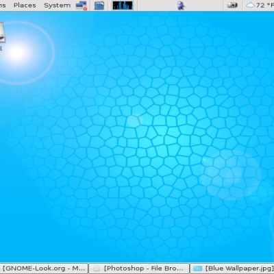
Simply powerful
moty66


Source (link to git-repo or to original if based on someone elses unmodified work):
2-oct-2003: remove the compress and my name.
other sizes are here
http://www.kdelook.org/usermanager/search.php?username=moty66


More Wallpaper Other from moty66:
Other Wallpaper Other:


Ratings & Comments
12 Comments
Well done. At the time I wrote this I'd just finished putting it on my desktop and coordinating a them to go with it.
Wow, i gotta say, props to yah, love the pic. Love the colors and the code (although C++ would look cooler). One question though. Where did you get the graphic up and to the left of the K and the Gear. It's in sort of an L shape and looks like a menu of sorts. Did you draw that?
The L shape is a system monitor, i dont have an idea where to find it, but a friend on mine have sent it to me to insert it on the image ..
It's really kitschy.
thanks alot.
Wonderful piece of work !!! very very nice .. //KenHan
I think your wallpaper is great, but instead of HTML source, how about using another language? From what it looks like, you put the source of the KDE website. How about some C++ source from a KDE application? A markup language (like HTML) doesn't "look" as cool as a real language does. Perhaps you could find a page on KDE's website that loads a lot of JavaScript? That would certainly look better than HTML.
when i designed this one. i was looking for any code and i thought it will be nice with the kde website, but i never thought about c++ code. i will try to do it thanks for the idea
awesome dude, nice job!!!!
The center of the image is a little busy. I'd try removing the KDE at the bottom center and see how that looks.
I really love the K, but the HTML in the top left looks a little blurred. Maybe you could sharpen it up a bit or make it brighter? Keep up the good work :-)
thanks for the comment, but i ment to make it blurred, because i want to show only BRIGHT |