


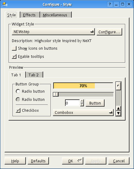
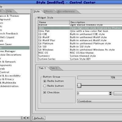
Qinx
Brandybuck


Source (link to git-repo or to original if based on someone elses unmodified work):
0.6 - Disable mouse tracking in menus when in classic mode. Closer to NeXT behavior
0.5 - Bug fix for potential crash on some toolbars (licq)
0.4 - Bug fix to correct drawing of list headers, some buttons.
0.3 - Fixed toolbuttons with pixmap backgrounds (k3b), and widgets in "search" toolbars (kmail, juk, etc)
0.2 - Fixed translucent menus
- Improved toolbar, tabbar, header drawing, progress bar
- Mouseover highlighting for combo, slider, spin widgets
0.1 - Initial release


Other KDE 3.5 Themes:


Ratings & Comments
12 Comments
Thank you once more [this also makes GTK2 more than bearable, using the qt-gtk engine].
Nice look, but I have one question about the feel... I'm a long time WindowMaker user that is now looking into KDE. The one thing I miss the most is a seemingly small feature. In WindowMaker and old classic MacOS, when I select something in a menu the menu item flashes a few times before the menu disappears. I have never used proper NeXTStep, but I imagine that does the same. I couldn't get NewStep or any other KDE theme I have tried to do this. Is it at all possible to do this in Qt?
Try the latest version. It's not identical to what you want, but it's closer to the NeXT/WindwoMaker behavior.
This is perfect for me. My computer is too slow for the "full" KDE, so I use WindowMaker as my WM, but I still use KDE apps. This will provide a more consitant look methinks.
This is awesome! I've always taken a perverse liking to the WINGz widgets and I wished (while I was still using WindowMaker) that I had more programs that looked like it. This is wonderful. I don't use WindowMaker much anymore, but I might use this from time to time, anyway. And ya know, thinking of the WindowMaker config app I wonder... is there a way to make a style that does away with scrollbar buttons altogether? Between using the bar itself and the mousewheel, I never use them any more - except where the space is too small to allow for either. In any case, thanks. If I ever learn how to do these myself, I'll make an OS/2 style and I'll be set.
Thank you!!! I have been waiting for this for a long time. Charles
Now if only it is possible to move the scollbar left- I will be a very happy camper. Charles
Tell me about it! The position of the scrollbars in QScrollView widgets is hardwired in, and I wasn't able to find any way to change it. A theme can only draw where Qt tells it to draw.
And if we could hack Qt/KDE to put the "OK" button always on the right... :)
> Tell me about it! The position of the scrollbars in QScrollView widgets is hardwired in, and I wasn't able to find any way to change it. Too bad. My only problems right now with this theme are: (1) There are some flickering in the scrollbar when scrolling. (2) The NeXT style menus looks terrible in gtk1/2 based apps with using the gtk-qt theme. This most likely is a gtk-qt problem rather then Newstep Thanks again for the theme.
I think it's cool that you are adding more choice to an already wonderful collection of Styles for KDE, but I have always felt that the NeXTStep GUI style is old-fashioned and not very attractive. It's one-step above motif and has not been really "modernized" in the look-n-feel of style. That said, I think you have done a wonderful job of doing just that. This style is *much* better than the default GnuStep style that is normally used with WindowMaker. (My WM of choice for *years*...) To be honest, I doubt this will replace Alloy or Plastik for my personal choice, but still good job.
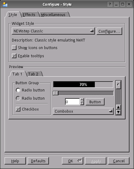
Yes, the NeXT style is old fashioned. But for 8 bit displays, it's hard to beat. Look at any GUI contemporary with NeXT, and nothing comes close. Heck, even some later looks weren't as good. But it is rather plain, I agree. My goal was to recreate an existing look, and not to come up with some new eyecandy.