


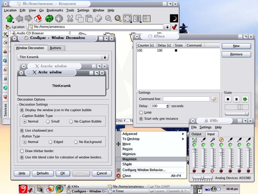
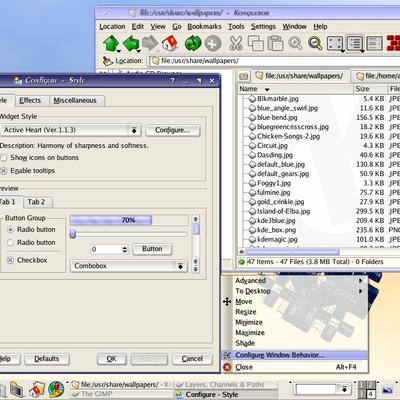
Active Heart
amaterasu


Source (link to git-repo or to original if based on someone elses unmodified work):
Ver 3.2.1
(Backport from activeheart-1.2.1)
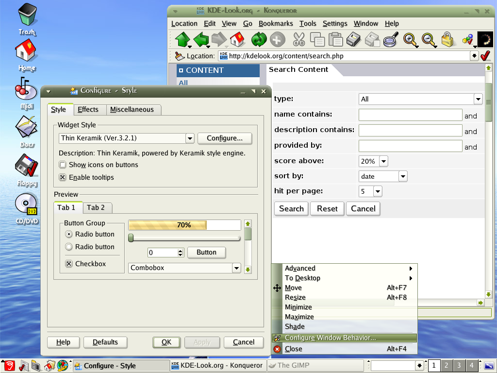
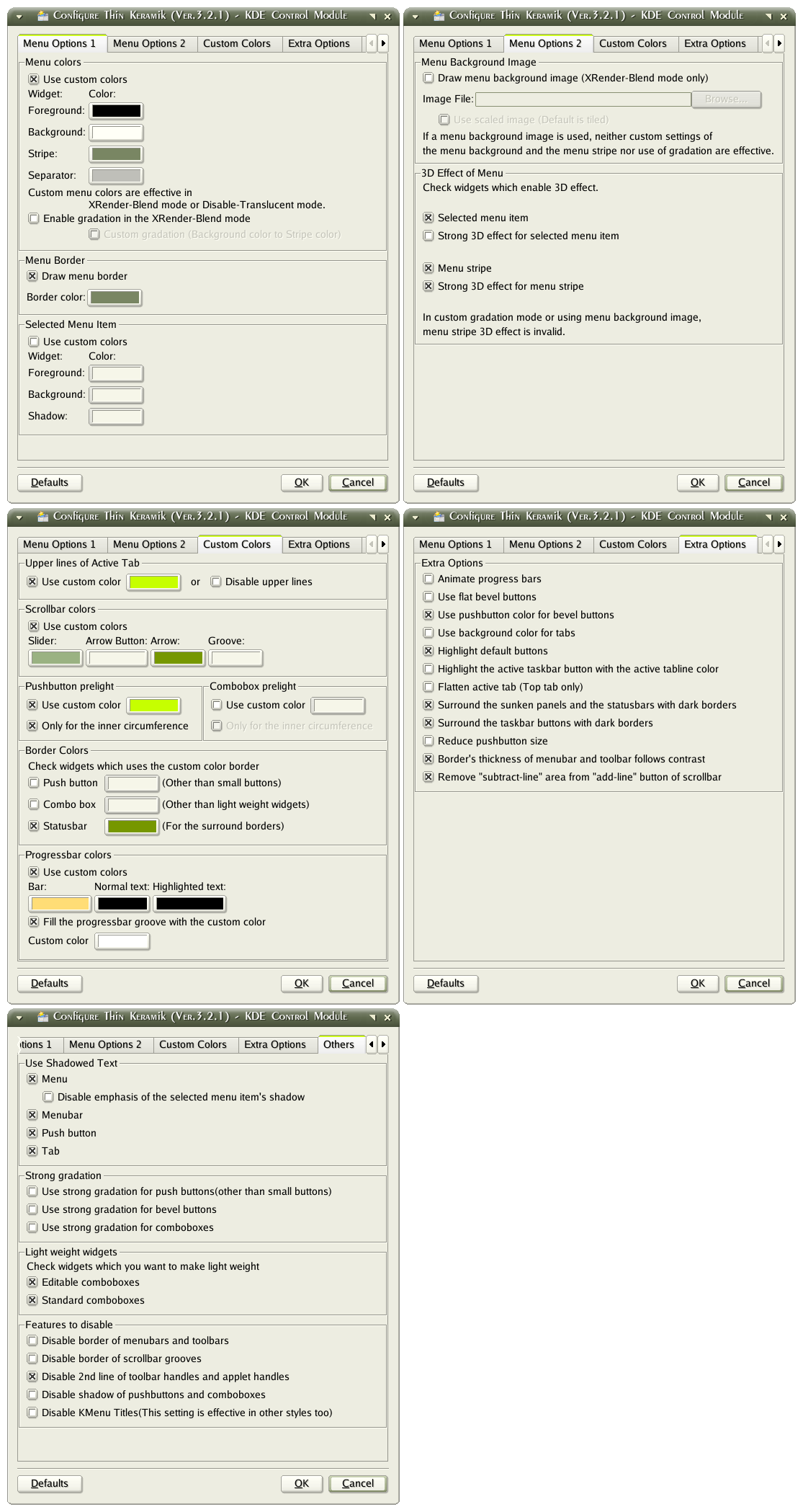
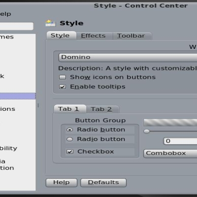
-Style
*"Surround the taskbar buttons with dark borders" option was added to "Extra Options" group.
*"Disable KMenu Titles" option was added to "Features to disable" group.
Ver 3.2
(Backport from activeheart-1.2)
-Style&Kwin
*The version of Keramik used as a basis was changed to what is contained in KDE-3.2.2.
-Style
*"Remove 'subtract-line' area from 'add-line' button of scrollbar" option was added to "Extra Options".
*The custom color option for the statusbar borders was added to "Border Colors" group in "Custom Colors" category.
*"Flatten the text edit area" option was abolished.
And the text edit area became the same appearance as ActiveHeart's one.
Ver 3.1.5
(Backport from activeheart-1.1.
-Style
*Scheme manager can read the global scheme files now.
The global scheme file means the scheme files stored in "$KDEDIR/share/apps/kdisplay/styleconfs" directory.
(This feature is mainly based on Piotr Szymanki's work. And I improved it.)
*The custom color option for the menu separators was added to "Menu Colors" group.
*"Border's thickness of menubar and toolbar follows contrast" option was added to "Extra Options"
Ver 3.1.4
(Backport from activeheart-1.1.7)
-Style
*"Reduce pushbutton size" option was added to "Extra options".
Ver 3.1.3
(Backport from activeheart-1.1.6)
-Style
*Changed the light weight combobox's pulldown buttons thinly.
*"Highlight the active taskbar button with the active tabline color" option was added to "Extra options".
Ver 3.1.2 (maintenance release)
-Style
*Fixed the bug that the larger text gets cut off on "light weight" editable combobox.
*Improved "light weight" combobox's pulldown list.
Ver 3.1.1
(Backport from activeheart-1.1.4)
-Style
*Added "Light weight widgets" group to "Others" category.


Other KDE 3.5 Themes:


Ratings & Comments
41 Comments
I Think this style is AVESOME :)
When I run ./configure (with no arguments)it ends in this: checking for KDE... configure: error: in the prefix, you've chosen, are no KDE headers installed. This will fail. So, check this please and use another prefix! Obviously I need to put a prefix on ./configure but what is it?
here is the slackware 10.0 tgz http://www.kde-look.org/content/show.php?content=18494
here is the slackware 10.0 tgz http://www.kde-look.org/content/show.php?content=18494
Can we expect a version for KDE 3.3? heath holcomb
This one already works with 3.3 :)
is there a way to prevent this: http://www.martin-fernau.de/pics/lager/20040710/problem.jpg the Menu-Entry 'in Posteingang' is cuttet to 'in Posteinga'. This happens only, if the combobox use a scrollbar in it. Otherwise all work perfect. And a little question or suggestion: Is it possible to make the checkboxes and radiobuttons looking more similar to this: http://www.martin-fernau.de/pics/lager/20040710/suggestion.jpg I don't like the thick borders around them... It would be great :) thx, Martin
Beautiful style !!! Btw, which fonts are you using?
Sorry, didn't read the previous posts. Luxi Sans :-)
Hi, I would like to know if its possible a diferent colors for kicker kmenu than color used on horizontal menu?? And also, I would like to know if a can get a diferent color just for bevel and what color original bevel uses?? Thanks and Congratulations!!!
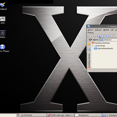
What is the icon set used in the first screenshot above? How can I get it? Thx
That icon set is called "Gorilla" URL: http://www.kde-look.org/content/show.php?content=6927
This is really a stunning style! I'm in love with it ;) But for some reason, the taskbuttons in my panel look as if they don't match... They seem too light. But that's just a minor detail, this style is truely amazing.
In my opinion, the buttons are a little bit too fat, still. Maybe this could be configurable?
This backport from activeheart-1.1.4 "Light weight widgets" really adds a whole new feel to ThinKeramik and looks really good... Awesome feature!
This theme is just great! Much better than 'fat' Keramic. One point of criticism: It's quite slow, but maybe it's too early to optimize things a bit?
the best style/deco i ever seen
Its one fantastic theme. Gr8 work man.
Before I try it on my KDE 3.2.1, is it compatible with KDE 3.2.1 and Qt 3.3? ALso, I think it looks great and where are the comments?
Yes. Although the comment is not written particularly, it has the compatibility in KDE3.2.1+QT3.3 environment. (In my environment, it is working without problems.)
use the date picker for comments
Hmm, I think the 3D effect of the "combination boxes" (the border which is around several widgets) has too much contrast (almost black and white). The colors should be changeable. For now I changed the contrast in the color dialog to minimum.
Wow this style rocks. The only thing i'd like to see now whould be groop box theming. Something like Baghira's groupshadows.
Honestly, this is a combination of the best elements of Keramik. I hope either this or Plastick become default in 4.0 or 3.3. Great job on it! BTW: Does anyone have many screenshots of TK on a high bandwith server, I want to post some on the Lindows forums and urge them to switch from Keramik to Thin Keramik.