


 ).
).Please tell me how you find it, and how you think it could be improved.


Source (link to git-repo or to original if based on someone elses unmodified work):
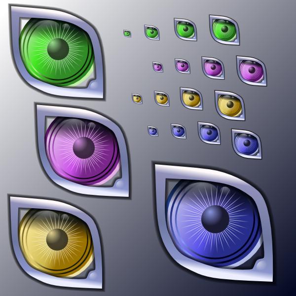
).Sorry markey, another eye, but this one is one the first 
- added 16x16 sizes in the archive
- updated screenshot
-----------------
Yet another version. Imrpoved the lighting and contrast, the border is now properly antialiased, and as requested new colors are available, make your choice ! 
Thanks for your feedback !
-----------------
Added another version, much clearer. It's now more perceived like an eye, and accomodate well on both clear and dark backgrounds, and in all sizes (see the screenshots).
-----------------
I added an alternate version, with thin film bands added to outline the eye. That's because amarok will be able to read videos, too. I kind of like this one, especially because of its look in the systray in 22*22.
Tell me your preference !


More Various Artwork from zekant:
Other Various Artwork:


Ratings & Comments
13 Comments
For me , it is simply currently the best icon. ++favs
Very nice! But it doesn't fit with Crystals
I disagree. Its quite shiny. It should be made the default amaroK icon IMHO.
Awsome icon! I hope it becomes the standard one :)
Nice Artwork. Any other colours of the iris planned?
Actually it does change it's color if you use it in the systray, because of the playback animation progress, whose overlay color fits your kde color theme. If you wanna give it a try, it will be soon committed to amarok cvs :) (Probably tonight). Anyway, i can add other color styles to the iris if you plan to use it as desktop icons. I agree it could be interesting to explore other looks.
Zekant, to see the icon in action, we will commit it to CVS right after the 1.1 branch is created, which will probably be in one week. We're still in a prolonged feature freeze / bugfixing mode for 1.1.1. I think then it will be easier to judge about the icon and also to make suggestions for improvements. In general I already like the icon a lot :)
Why don't you make a contest? Personally I don't think the woofer icon can represent what Amarok is. Whereas the latest Juk icon makes really sense.
And I forgot to ask: why don't you like the Sparkling icon (is it the representation, the quality of the graphic, other...)
that's great. looks nice and also fits most icon themes. i have to admit that i always disliked the original amaroK icon because it looks a lot like the mixer icon (and it's also kinda ugly i think). thanks for your good work!
Wow ...this one's great!! Is it going to be the standard amaroK icon? great work!
I submitted the icon to the core developper team, they seemed to find it really nice, but i cannot say more ... I wanted to have more feedback via kde-look to see what other users would think about it.
I think the two "dots" in the corner detract from the icon. Shrink the icon down into a 16x16 icon on the taskbar, and they're distracting. At least to me.