


Sitting around the gear (SVG only)
Yaba


Source (link to git-repo or to original if based on someone elses unmodified work):
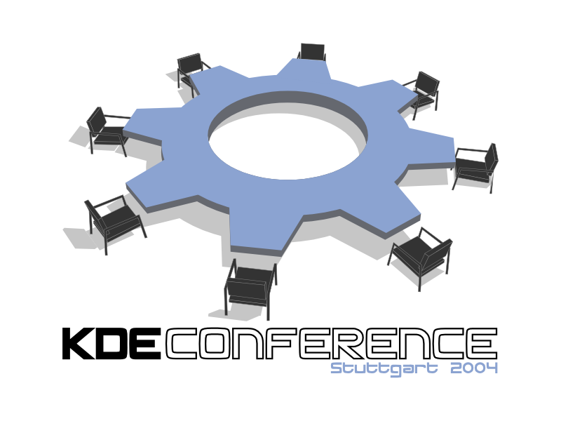
0.3: Added SVG version for occassion, where a low amount of flat colors is needed (Cheaper T-Shirts, Banners, Small Logos)
0.2.1 (04-01-21): Nothing new. I just added a screenshot of the latest Blender with the greatly enhanced UI to show, how this logo was created.
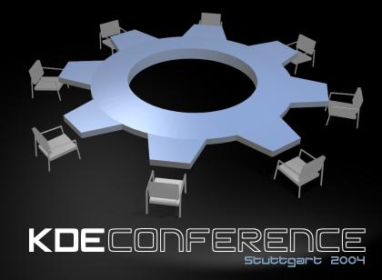
0.2.1: Added a second version for a "night session" in the conference room.
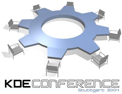
0.2: Changed lighting and all chairs are lined up properly.


More Various Artwork from Yaba:
Other Various Artwork:


Ratings & Comments
22 Comments
nice work ! I'm also working with blender on a conference logo and I must say that this is a very good idea with the sitting around the gear. Sorry for my poor English, I'm German.
hi, great work, looks very good :) however, one question: what's the name of the font in "kde conference"?
It's called "silicon". This font is free and available on the internet. However I do not know, where I got it. Just google for the truetype font or try one of the sites below: http://grsites.com/fonts/ http://www.1001fonts.com/
I wouldn't put the chair in the edge of the gear (ho to say that ??). Il you were at such table, you would sit between gear edges. just my 2 cents of euro :p
Wonderful concept, and excellent job!
I think the image is good as a 3d effect. but i think it wont be very suitable for a logo on a t-shirt Its too detailed for a logo as it will be costly to have the 3d effect printed on t-shirts, banners, etc and i think that a 2d logo would be more effective and suitable for being printed on t-shirts, banners etc
As I've written above, I intend to redo this image with SVG as a light alternative for T-Shirts. I just hope, that I will find the time.
Looks like a winner to me:)
can this logo be created using a two color print? Black and a color of blue? this is important when creating a logo.
Just two colors will become hard, since you will loose a lot. However if gradients are allowed, it currently contains just 2 colors. I'm thinking about creating a simplified version with no gradients and some colors, suitable for easy T-Shirt printing. However this requires me to redraw the image in SVG. Well, maybe some good Sodipodi practice ;-)
from experience, most logos are best when only two colors are needed. they use any color ink though so gradients to dark or light or even desaturation of the blue can be used. I was meaning to enter this contest but i fried my computer (updating the bios, oops :p ) so unless i can get it fixed soon i will probably just observe. You have my vote, good luck
First of all, congratulations for such a great idea. My only suggestion would be to fill the empty chairs with busy hackers. I know it will complexify the image so it might not be possible, but it would be nice because right now it looks a little bit as if all the conference attendees were at the coffee machine :-)
Hm... may be a good idea. I hope that I will find the time for trying that. Could be that it will make it look better or worse. Not sure yet, but it's worth a try.
Brilliant work :-) Tackat
utterly fantastic. This is a great concept delivered quite well. //me goes to rmdir kdeConfLogoEntry in shame
it's very nice! it communicates the message clearly and effectively (that it is a meeting about kde) in a rather clever way. i prefer the simple gear of the large picture, but the shadows and symmetry of the chairs of the second. the chairs look somehow unreal and too angular in contrast with the smooth lines of the cog..
Simple may be better, and this is definitely a nice image. But I was thinking, would putting a fat penguin in the center of the gear ruin it? It would be fun to see what happens, anyway. ;) Just a silly idea. Probably better off sans-penguin but thought I'd mention it anyway. I really like the technical simplicity of this image.
I thought of adding a world globe there, but I want to keep it simple. I definitely won't add a penguin, since I do not think that it's appropriate for a desktop that also runs on xBSD and Solaris. Anyway... thank you for your feedback. I will think about it.
yes, the first one is really great, congrats!
I love it congratulations!
Wow... what a honor to hear that from the master himself.
your work is very good if I could choose the contest was finished ;-)