Totem is a Gnome application, isn't it?
It's for that I post the Totem icon here.
I don't use KDE (like I said before)... but, if I use KDE, where is the problem : I have not right to use Totem after.
I think the trolling is a stupid thing.
I don't have favourite desktop but I use what it's better in every one.
It's the second time I propose something here. I think it's the last time.
Like I do in Kde-look. One time was enough for me. I proposed a dock icon for gFTP, the answers has been: is not Gnome-look here.
Very stupid.
I will try XFCE-look... maybe is more open-mind.
Totem is a Gnome application, isn't it?
It's for that I post the Totem icon here.
I don't use KDE (like I said before)... but, if I use KDE, where is the problem : I have not right to use Totem after.
I think the trolling is a stupid thing.
I don't have favourite desktop but I use what it's better in every one.
It's the second time I propose something here. I think it's the last time.
Like I do in Kde-look. One time was enough for me. I proposed a dock icon for gFTP, the answers had been: "is not Gnome-look here".
Very stupid.
I will try XFCE-look... maybe is more open-mind.
Yeah, we've got to get rid of people who say things like that first guy with his suck comment.
I mean, get rid of them altogether.
If you comment negatively, at least make sure to explain yourself and possibly offer a solution. This way, the author can learn from your opinion and in the future, create better icons or fix the existing one(s).
Don't just comment with ur icons suck. That's just rude and pointless.
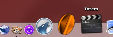
On a slightly related topic, I think that the icon is rather good, although perhaps fairly unoriginal (in the sense that I've seen a lot of icons very much like that one). Good work, we need icons.
Question, though. This is Gnome-look, for Gnome users. That icon is clearly aimed at a Mac interface. (I know that we have something similar, but check out the little triangle that we don't have in our version, and the dock is a Mac thing.)
Still, I'm sure that a large icon like that could very well be used in an icon theme.
Good looking!
I think the little triangle it's because I use "Engage" like a dock. And, all the icons we see in the screenshot are in the "eap" format (1).
And, actually, I don't use Gnome but XFCE with lot of GTK (and KDE-QT) applications.
The "Engage" behaviour is better in XFCE.
(1) I never found website who propose some "eap" icons: somebody knows it.


Ratings & Comments
8 Comments
Why post it here ? you are a KDE user isnt it ? got to www.kde-look.org
Totem is a Gnome application, isn't it? It's for that I post the Totem icon here. I don't use KDE (like I said before)... but, if I use KDE, where is the problem : I have not right to use Totem after. I think the trolling is a stupid thing. I don't have favourite desktop but I use what it's better in every one. It's the second time I propose something here. I think it's the last time. Like I do in Kde-look. One time was enough for me. I proposed a dock icon for gFTP, the answers has been: is not Gnome-look here. Very stupid. I will try XFCE-look... maybe is more open-mind.
Totem is a Gnome application, isn't it? It's for that I post the Totem icon here. I don't use KDE (like I said before)... but, if I use KDE, where is the problem : I have not right to use Totem after. I think the trolling is a stupid thing. I don't have favourite desktop but I use what it's better in every one. It's the second time I propose something here. I think it's the last time. Like I do in Kde-look. One time was enough for me. I proposed a dock icon for gFTP, the answers had been: "is not Gnome-look here". Very stupid. I will try XFCE-look... maybe is more open-mind.
Yeah, we've got to get rid of people who say things like that first guy with his suck comment. I mean, get rid of them altogether. If you comment negatively, at least make sure to explain yourself and possibly offer a solution. This way, the author can learn from your opinion and in the future, create better icons or fix the existing one(s). Don't just comment with ur icons suck. That's just rude and pointless. On a slightly related topic, I think that the icon is rather good, although perhaps fairly unoriginal (in the sense that I've seen a lot of icons very much like that one). Good work, we need icons. Question, though. This is Gnome-look, for Gnome users. That icon is clearly aimed at a Mac interface. (I know that we have something similar, but check out the little triangle that we don't have in our version, and the dock is a Mac thing.) Still, I'm sure that a large icon like that could very well be used in an icon theme.
Good looking! I think the little triangle it's because I use "Engage" like a dock. And, all the icons we see in the screenshot are in the "eap" format (1). And, actually, I don't use Gnome but XFCE with lot of GTK (and KDE-QT) applications. The "Engage" behaviour is better in XFCE. (1) I never found website who propose some "eap" icons: somebody knows it.
I think it's quite good. You don't usually see shitstains like ^^ except maybe in windows forums
ur icon sucks
ur comment sucks 2. You really need to learn proper grammar and how to criticise more specific!