


Gajim Ubuntu Iconset
draco


Source (link to git-repo or to original if based on someone elses unmodified work):
Version 0.2.5
-------------
- Switched most colors to ones from the Gnome 32 color palette
- added start-here icon
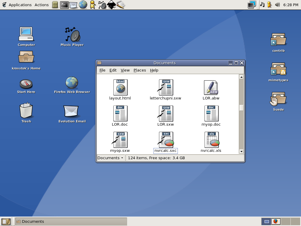
- new mimetype icons


Other Icon Sub-Sets:


Ratings & Comments
18 Comments
The icons are great. I'm using those bad boys as I type. :)
can you pls tell me the name of window border theme used in your screen shot. looks like industrial, but different colors and finish. regards
I love these icons, it's my favorite set. I wish it was more "complete." Keep up the good work!
First I want to thank u for your hard work. This is really the best iconset I've seen in a long time. I too hope that this will be the default gnome iconset :) I was wondering which theme you're using. It looks like the ximian one, but this one is definately less bright. A nice one!
I really like the Icons, nice flat look. Using them myself. svg rocks.
sorry for my beginer question but... I've already UnTared de file on my /.icons dir on my home, but now I don know how to actually use the icons... anyone? Thanks, Gabriel
Go into theme preferences, then theme details, and one of the tabs will let you change the icon theme.
I just wanted to say I personally think this is the best GNOME iconset in a long time, I hope one day it becomes the default. :) My newly created GNOME theme, BasicGNOME, (GTK+ 1 and 2 parts and index.theme are here in GTK 2.x, and the Metacity part is here in Metacity :)) use these for the icons. If I ever get decent at using Inkscape I would love to help work on Suede. Until then I'll just have to be satisfied with making various themes to go with it. :) Do you have any plans for the future of these icons so far? Because I'm serious about hoping this set becomes the GNOME default, it fits right in with the stock icons, and it's much more clean and sharp than Industrial (no offense to anyone who has worked on the Industrial icons), and the current default GNOME icons are a bit, well, dreary. :)
Mimetype icons for .doc files are smaller then others (pdf, swx etc..) in nautilus, somebody have this ?
Uh oh...I think I bundled the wrong set of mimetypes....fixes in the pipeline Ramanan
Hmm..it seems to render fine for me. What version of nautilus and librsvg are you using? Ramanan
I didn't really like this very much in the beginning, but it's getting much better with each release, great job! :)
Thanks :) This being my first icon set, and my imagination being pretty narrow, some icons look pretty drab. If an icon looks "fresh" , its thanks to defendguin :) Ramanan
Thanks alot. I really like this theme! Works perfect with 75% zoom. Many themes (including Industrial) shows the emblems on odd places for me, dunno why. This just works, and it has nice colors!
wonderful stuff, thanks for the effort!
this is an awesome icon theme that ties in perfectly with the existing gnome icons. I love watching it grow
Great Job, please more icons if possible :)
They look great. Nice job!