
Gray-ce-full Icon Theme
Source (link to git-repo or to original if based on someone elses unmodified work):
The latest of my icon sets, Gray-ce-full.
Its only at V.1 so don't be expecting too much.
If you have any Questions/Help/Advice/ please leave a comment below or email me at patrickclover@gmail.com
I also will need an uploader when the icon set grows so if anyone doesn't mind it would be a great help... Thanks, ENJOY!
Coming Soon:
- Better Application integration
- Devices, Mp3 Players, Hard Drives ect.
- Categorie Icons
- Network and Computer Icons
Website no up and running! Check it out...
http://gray-ce-full.blogspot.com
*V.1 - All - Most things done, well still lots to do ![]() Website now added
Website now added
*V.0.5 - Application's - Pidign Icon's, Firefox and Archives eg. (.zip, .deb ect.)
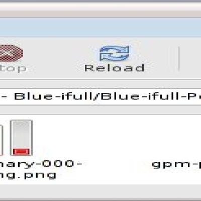
*V.0.4.5 - Volume Icons - Perfected* + Battery Icons fixed*, Help Icon added*
V.0.4 - Volume Icons (16x16, 8x8, Scalable, 22x22, 24x24) & Wine icon - Fully Implemented
V.0.3 - Arrow / Refresh / Stop Icons - Implemented
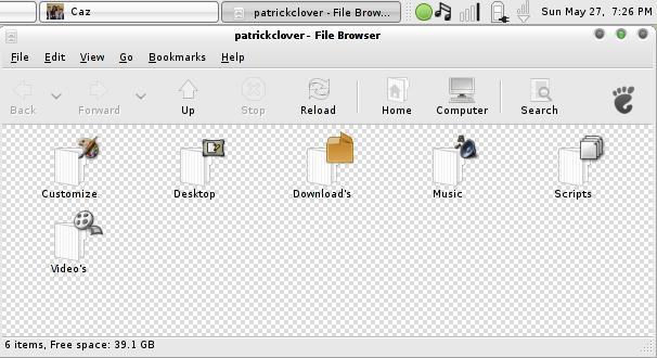
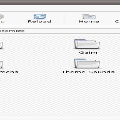
V.0.2 - Folder Icons - Semi Implemented
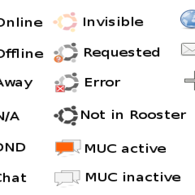
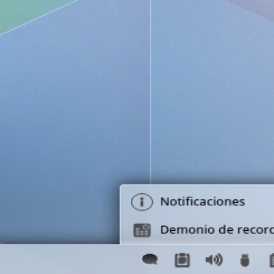
V.0.1 - Notification Icons - Implemented










Ratings & Comments
47 Comments
good stuff, however, my trash icons don't change. suggestions?
hmm... not too sure sorry i will work on it in the next release, i cant really test it at the moment because im not running linux. Can you be a bit more specific? as to which trash icons? and does anyone else have this problem?
the icon for trash full or trash empty. i'm using it on the panel.
Ok this is an issue i haven't fixed yet... does the icon on the desktop work?
Ok im on it i will try the best that i can, what about the icons i made my self?
You should probably chose a license to put them under - check out the differences between GPL and CC-ASA. You can then chuck them in with the relevant icons.
Ok im rarther confused i dont really understand the licensing issue but im nearly there, can someone help? like with me sorting this problem out?
You need to split the themes up by license into two seperate packages. Basically, different terms govern what you can do with GPL and Creative Commons icons. You'll need to find out which icons fall under which license and split them up based on that. For example, icons based on Tango icons are Creative Commons, and could be put in a package with ones derived from silvestre's Gion icons. Gnome based icons have to be GPL, and can only be put in a package with other GPL icons such as nuoveXT. These packages/archives have to be seperate, but you can get one to depend on the other. Also, at the risk of sounding a little anal you could potentially get dropped from adwords by asking people to click on the adverts.
nice theme,and just looking at it. one issue though the ubuntustudio and tango set are under the Creative Commons share alike license, also the gnome icons are under the gpl. basically you can't mix and match the 2 licenses and release it under the gpl. so you would have to strip out all the tango+ubuntu studio icons to keep the gpl license or strip out the gnome-icon-theme icons and release the theme under the Creative Commons share alike. i like the style in this theme alot too :) keep it up
oh :( any help any one??? :(
ok its simple all the icons that came from /usr/share/icons/gnome are gpl (http://www.gnu.org/licenses/gpl.txt) even when edited the ones from /usr/share/icons/tango and /usr/share/icons/Ubuntustudio are Creative Common Share alike.(http://creativecommons.org/licenses/by-sa/3.0/) as for the ones you make, you may license them what ever license takes your fancy :). but you can't mix and match icon sets with different licenses with out getting the owners of those icons's consent first. if you need help tell the difference i would be more than happy to help you out.
That's not necessarily true - you can make a 'Gray-ce-full GPL' and a 'Gray-ce'full CC' package, have them inherit each other. Alternatively, if you make them Tango compliant (lightsource top left, lighter inner border, shadow, 16x16, 22x22 & scalable sizes) I'll be more than happy to add them to my Tango Generator which gets round the problem in a slightly more elegant and transparent way.
thats a point, you can make 2 icon sets which depend on each other so that you get 1 full set.
seriously, there have been other white and grey themes but this one is it done right :) best theme in a long time voted up :)
thanks alot, i agree haha. im going to be taking a bit of a break... back to vista (shrug) ubuntu is not to great so im waiting for fedora 7 hopefully it will fill my needs a little better :D.. If anyone has any sugestions of easy to use linux OSS let me know :D thanks again :D
I've created an account on this site specifically to comment on this icon theme :-) It's friggin AWESOME! Thanks for creating it!
haha! thats great! :D glad you liked it, vote up please! it seems to be going down :(
I really like this theme. I've always been fond of the clean look. and you have realized it nicely. I know this is a "pre release" icon set, but I still want to make two comments: consistency; shadows were already mentioned, but the gloss effects are a little hit and miss as well, I've just been removing them. spot color; you have used this already for some of the status icons. I think the effect is quite dramatic. At 32px and smaller, some of the icons in this set just look like grey blobs. For example, the archive icon. I took mine and changed the fill on the arrow to #cbedab still a very subdued color, but quite effective in helping me distinguish one from another. Hope you take my advice as intended, mejogid said it best: "I only criticize things that are worth using" p.s. I have grey-ce'd edit-redo, edit-undo and go-jump and grey-scale firefox svgs if you'd like them.
Hi thanks for the feedback very helpful, If you wouldn't mind sending me the edits you have done that would be a great help, i agree on the shadows i think they should be non existent to maintain the simplicity but like i said drop me an email with the edits and i will put your name somewhere for helping... again Thanks :D
one thing you might want to do to keep up with develpment is to link the gaim.svg icon to pidgin.svg :)
ok... i dont really understand, can you tell me what that is? thanks.
Gaim is now Pidgin. http://en.wikipedia.org/wiki/Pidgin_%28software%29
I did not know that thanks for the update :D
I really like the way these are shaping up, very sharp looking :)
Thanks alot im trying ;)