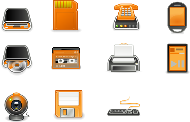
I am thinking of contributing in some way to icons, but the first to release something I would like your opinion.
What is your opinion?
-----
I have some problems with icons 16x16, 22x22 and 24x24.
I am restoring icon to icon, so the release wasn't complete.
Sorry.
--Translation by Google--















Ratings & Comments
26 Comments
Is this proyect still active? I love it, but it lacks of a lot of icons.
Yes, it is still active, but I am very busy with work. The guidelines are simple: 16x16 is based on a darker orange (# f57900) and very simple (almost icons son re one by one, not only in scale); 22x22 24x24 is a middle way between the simplicity / dark orange of 16x16 and the tango-style / light orange (# fcaf3e) 48x48, with a touch more "glamorous" (shine on mouseover, lines accentuated icons, etc. .. ). 48x48 is tango-style, with light colors (inspired Tangerine but with more black and less white), with only a few icons more "glamorous", for example folder.png I am also doing the icons for the panel, Leopard-style with a light touch of orange, but not only can finish it quickly. If someone wants to help is welcome.
Hi; the panel icons should have outlines; by example the battery icon when you have half battery (and if you use a dark panel, like me) appear as an orange rectangle; and doesn't tell clearly the amount of battery you have left. I will try to make some icons for this; this theme is amazing, also fits perfectly with the elegant brit theme
Can you show an image as example? Panel's icons have a nuance clear at the bottom, and a dark shade above. I also use a dark theme, my screenshot: http://img146.imageshack.us/img146/7788/shotyd3.png
Hi, the nuances are visibles; but you cant tell the icon is actually a battery http://img225.imageshack.us/img225/3169/batwz3.png
Ok, thank for comments. I'll fix it.
This is an amazing icon theme!
Would consider making a set with the Gnome logo? By the way, I love the set.
why not a orange man ? I never liked the (grey) gtk-media-xxx icons, I think something should be done... The scalable device are awesome :)
Your theme looks amazing. I really liked it! However, I think you can apply some more-professional appearance to them. And that green man running should be took off. Put some icon like the turn off one...
I can't believe that a little green man can be so hated! :D What suggested? The old Gnome's door, or the boy with other colors? I would like to keep as close as possible to something official, while renewing some icons.. Suggestions & comments, please. :)
I like the red power button in some icon themes. Door is good, too.
Great work, great work. Thanks a lot for these. I won't do any complains as it is in alpha but yeah, the green man oughta run away for real if you catch my drift:)
...but I think you can improve (or change) the logout icon (session exit, the green man running).
here here, i hate the green man running.
Congratulations, very good work
First off, great job with those icons. I've been waiting a while for them now, and well, the release was scheduled exactly fifteen days ago. And yet no icons? How come? Will these beauties ever be out?
For HH: I do not believe that these icons can be accepted, precisely because of the "limitations" of colors and themes with which they work. In a few days, once finished, will make available here and I will, however, a page for the Ubuntu Artwork. See you soon. :)
I hope you will continue to create this icon theme. It's the most professional I've seen on this site. Did you do some publicity on Ubuntu Website ?
Hello, your icons are very nice and looks proffessionals! I realy want them for Hardy! Can you suggest them in this adress? https://wiki.ubuntu.com/Artwork/Incoming/Hardy/Alternate/ So, this un real good work, and, so, good luck! ;) Thanks for these icons!
This is definitely nice work! Some of the outlines might need extra care though. Like for example the Computer icon, the outlines in the keyboard keys can be softer. Very promising. I'll vote on it next year for inclusion in Hardy Heron. Keep it up!
Nice work! I'm a big fan of orange+black for the desktop. I'll definitely use this theme once you've done it.
Hi please let me know when u will be releasing the entire icon theme, thanks, Raj
I'm working on it.. Soon other icons! ;)
If you released this, I would definitely use it. Great work!