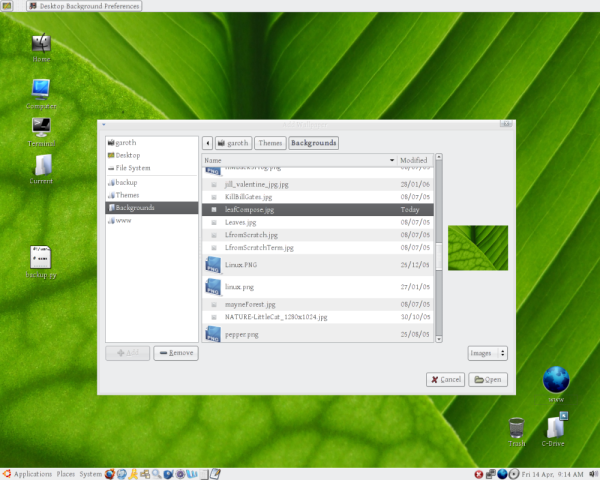
Description: This is my idea for how to improve the file browser. My inspiration wast that I couldn't stand having to memorize file names, and going through one image at a time seemed to be a bit of a pain. I realized that tiny thumbnails in the main window would be pointless, and large ones seem not to be what the developers were going for, so I decided that medium images off to the side were best.
Original: This only gives you one image. I give this 7/10.
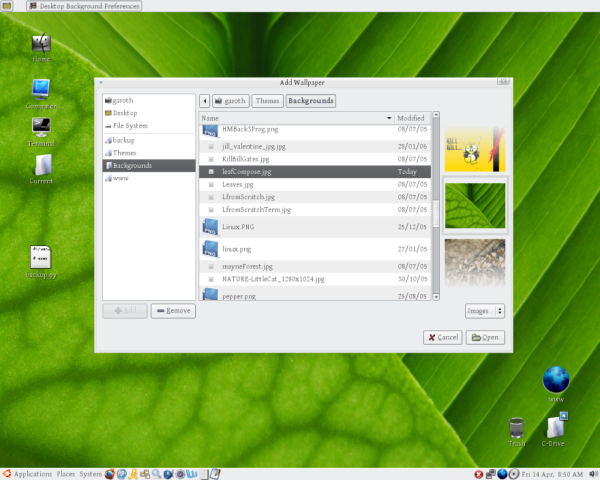
Preview1: This one has only three images and they fade out to show where they are and how important they are. I give this one 8/10.
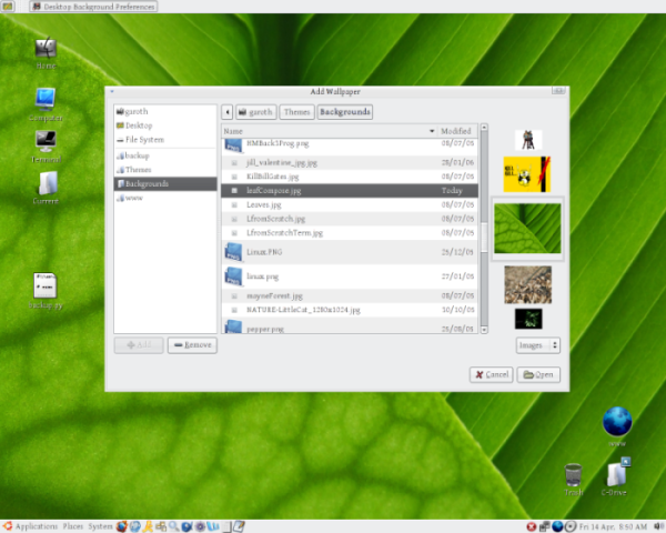
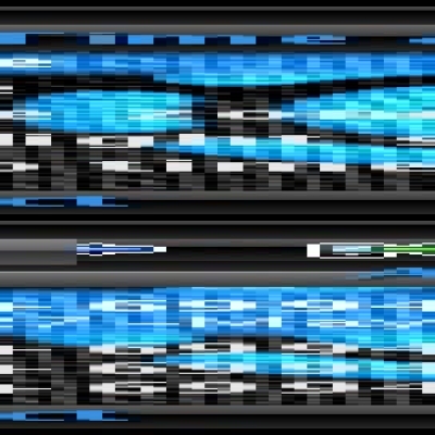
Preview2: This one has 5 images, so you really know what you're looking at, and it also has the images 30% smaller each time (in both directions), so that you really know what's going on. If anyone has ever used the timeline feature of Picasa, this is the kind of think I was going for. It allows you to see more images and makes the desktop more intuitive. I give this 9.5/10.
The scores are how useful I would find this if it were as such. My vote is for the last one. If it could scroll like Picasa does (images move and get larger and smaller), that would be worthy of drool. As such, I've put Preview2 as my large image at the bottom.
COMMENTS? IDEAS AND WANTS BECOME REALITY IN OPEN SOURCE.
-ATLast changelog:
NOTES:
If anyone is interested, my background is hot off the press (like a few hours ago) from Gnome-look.org. Find it here: http://www.gnome-look.org/content/show.php?content=37858
My icon theme is one I've customized by taking my favourite pieces of other people's icon themes and sticking them together. As such, I didn't feel right posting it back up, considering I did very little of the work.
I totally agree with the poster's logic. I too like having a preview, and this solves the problem. The best one is #2.
I can only hope this is accepted and integrated into Gnome.
Best wishes.
So, two years down the line and the Gnome developers still haven't implemented this very simple and very useful idea. So many people are asking for this and the lack of it makes even the basic task of attaching images to an e-mail in Evolution painful, requiring a separate window / image browser to be open.
Someone please come up with a useful solution....
the signle icon version looks the best, in my opinion.
the Pisca style looks like it could slow up your system, if you have a slow running computer.
The three icon version might get confusing, but each to there own.
The picasa style one wouldn't slow down your computer if you didn't make the images glide. The gliding could be a setting in a config somewhere, and since we're moving to more advanced rendering systems on Linux, this small piece of animation wouldn't cost the system anything.
But for old machienes, you could have it set so that it doesn't glide - just switch images when you go down one.
As for the three being confusing... somewhat, but I hoped that the fading out would make it obvious what was going on. If my image is confusing, then you could fade it so that it's just the tip of an image.
Thanks for your comment, it made me consider this my stand on this, but I don't see them as overly valid. Argument is good for making a good idea, though.


Ratings & Comments
6 Comments
I totally agree with the poster's logic. I too like having a preview, and this solves the problem. The best one is #2. I can only hope this is accepted and integrated into Gnome. Best wishes.
So, two years down the line and the Gnome developers still haven't implemented this very simple and very useful idea. So many people are asking for this and the lack of it makes even the basic task of attaching images to an e-mail in Evolution painful, requiring a separate window / image browser to be open. Someone please come up with a useful solution....
The 2nd is best IMO. Fading is subtle, the scaling seems too overwhelming to me.
the signle icon version looks the best, in my opinion. the Pisca style looks like it could slow up your system, if you have a slow running computer. The three icon version might get confusing, but each to there own.
The picasa style one wouldn't slow down your computer if you didn't make the images glide. The gliding could be a setting in a config somewhere, and since we're moving to more advanced rendering systems on Linux, this small piece of animation wouldn't cost the system anything. But for old machienes, you could have it set so that it doesn't glide - just switch images when you go down one. As for the three being confusing... somewhat, but I hoped that the fading out would make it obvious what was going on. If my image is confusing, then you could fade it so that it's just the tip of an image. Thanks for your comment, it made me consider this my stand on this, but I don't see them as overly valid. Argument is good for making a good idea, though.
I really like the idea, nice mockup. I hope gnome devs will notice this.